鸿蒙开发进阶:状态管理完全指南 - 从@State到@Provide深度解析
鸿蒙开发进阶:状态管理完全指南 - 从@State到@Provide深度解析
专栏说明:本文是《鸿蒙HarmonyOS新手入门系列》第三篇,建议先学习前两篇基础教程。本文将深入讲解鸿蒙开发中最重要的状态管理知识,帮助你掌握组件间数据通信的核心技能。所有代码严格遵循华为官方文档规范。
文章目录
一、为什么需要状态管理?
1.1 回顾:第二篇中的@State
在第二篇待办事项应用中,我们使用了@State来管理数据:
@State taskList: Task[] = []  // 任务列表
@State inputText: string = ''  // 输入框内容
这种方式很好用,但只能管理单个组件内部的状态。
1.2 真实开发中的问题
想象一下这些场景:
场景1:父组件想把数据传给子组件
父组件(用户信息)
  └─ 子组件(用户头像)  ← 如何接收父组件的数据?
场景2:子组件想修改父组件的数据
父组件(购物车总价)
  └─ 子组件(商品项)  ← 如何修改父组件的总价?
场景3:跨层级组件通信
祖父组件(主题颜色)
  └─ 父组件
      └─ 孙子组件  ← 如何直接获取祖父组件的主题?
这就是状态管理要解决的问题!
1.3 状态管理装饰器全家福
| 装饰器 | 作用 | 使用场景 | 难度 |
|---|---|---|---|
| @State | 组件内部状态 | 单组件数据管理 | ⭐ 简单 |
| @Prop | 父传子(单向) | 子组件接收父组件数据 | ⭐⭐ 简单 |
| @Link | 父子双向绑定 | 子组件可修改父组件数据 | ⭐⭐⭐ 中等 |
| @Provide/@Consume | 跨层级传递 | 祖先→后代数据共享 | ⭐⭐⭐⭐ 较难 |
| @Observed/@ObjectLink | 复杂对象监听 | 深层对象、数组监听 | ⭐⭐⭐⭐⭐ 困难 |
二、@State:组件内部状态(复习)
2.1 基本用法
@State是最基础的状态管理装饰器,用于管理组件内部的响应式数据。
@Entry
@Component
struct StateDemo {
  @State count: number = 0
  @State message: string = 'Hello'
  @State isVisible: boolean = true

  build() {
    Column({ space: 20 }) {
      Text(`计数:${this.count}`)
        .fontSize(24)

      Text(this.message)
        .fontSize(20)

      Button('增加计数')
        .onClick(() => {
          this.count++  // 修改后UI自动刷新
        })

      Button('切换显示')
        .onClick(() => {
          this.isVisible = !this.isVisible
        })
    }
    .width('100%')
    .height('100%')
    .justifyContent(FlexAlign.Center)
  }
}
2.2 @State的特点
支持的类型:
- 基本类型:
number、string、boolean - 对象类型:
Object、自定义类型 - 集合类型:
Array、Map、Set
核心特性:
- 数据变化后,UI自动刷新
- 只能在
@Component装饰的组件中使用 - 必须在
build()方法外声明
⚠️ 常见错误:
// ❌ 错误:直接修改数组元素不会触发刷新
this.list[0] = newValue

// ✅ 正确:创建新数组
this.list = [...this.list]
this.list[0] = newValue
三、@Prop:父传子(单向数据流)
3.1 什么是@Prop?
@Prop用于父组件向子组件传递数据,是单向数据流,子组件不能修改@Prop的值。
数据流向:父组件 → 子组件(单向)
3.2 基础示例
// ========== 子组件 ==========
@Component
struct UserCard {
  @Prop username: string = ''  // 接收父组件传来的用户名
  @Prop age: number = 0        // 接收父组件传来的年龄

  build() {
    Column({ space: 10 }) {
      Text(this.username)
        .fontSize(20)
        .fontWeight(FontWeight.Bold)

      Text(`年龄:${this.age}岁`)
        .fontSize(16)
        .fontColor('#666666')
    }
    .width('90%')
    .padding(20)
    .backgroundColor('#F0F0F0')
    .borderRadius(12)
  }
}

// ========== 父组件 ==========
@Entry
@Component
struct PropDemo {
  @State name: string = '张三'
  @State userAge: number = 25

  build() {
    Column({ space: 20 }) {
      Text('父组件数据')
        .fontSize(24)
        .fontWeight(FontWeight.Bold)

      // 传递数据给子组件
      UserCard({
        username: this.name,
        age: this.userAge
      })

      Button('修改用户信息')
        .onClick(() => {
          this.name = '李四'
          this.userAge = 30
          // 父组件数据变化,子组件自动更新
        })
    }
    .width('100%')
    .padding(20)
  }
}
3.3 @Prop的特点
✅ 特点:
- 父组件数据变化,子组件自动更新
- 子组件不能修改@Prop的值(只读)
- 适合展示型组件
⚠️ 注意事项:
@Component
struct ChildComponent {
  @Prop count: number = 0

  build() {
    Button('增加')
      .onClick(() => {
        this.count++  //  错误!@Prop是只读的
      })
  }
}
3.4 实战:自定义任务卡片组件
// ========== 任务数据模型 ==========
interface TaskInfo {
  id: number
  title: string
  status: string
  priority: string
}

// ========== 子组件:任务卡片 ==========
@Component
struct TaskCard {
  @Prop task: TaskInfo = { id: 0, title: '', status: '', priority: '' }

  build() {
    Row() {
      Column({ space: 5 }) {
        Text(this.task.title)
          .fontSize(18)
          .fontWeight(FontWeight.Bold)

        Row({ space: 10 }) {
          Text(this.task.status)
            .fontSize(14)
            .fontColor(this.task.status === '已完成' ? '#52C41A' : '#FF4D4F')

          Text(`优先级:${this.task.priority}`)
            .fontSize(14)
            .fontColor('#999999')
        }
      }
      .alignItems(HorizontalAlign.Start)
      .layoutWeight(1)
    }
    .width('100%')
    .padding(15)
    .backgroundColor(Color.White)
    .borderRadius(8)
    .margin({ bottom: 10 })
  }
}

// ========== 父组件:任务列表 ==========
@Entry
@Component
struct TaskListPage {
  @State tasks: TaskInfo[] = [
    { id: 1, title: '学习鸿蒙开发', status: '进行中', priority: '高' },
    { id: 2, title: '完成项目文档', status: '已完成', priority: '中' },
    { id: 3, title: '代码审查', status: '待开始', priority: '低' }
  ]

  build() {
    Column() {
      Text('我的任务')
        .fontSize(24)
        .fontWeight(FontWeight.Bold)
        .margin({ bottom: 20 })

      // 循环渲染任务卡片
      ForEach(this.tasks, (task: TaskInfo) => {
        TaskCard({ task: task })  // 传递任务对象给子组件
      }, (task: TaskInfo) => task.id.toString())
    }
    .width('100%')
    .padding(20)
    .backgroundColor('#F5F5F5')
  }
}
四、@Link:父子双向绑定
4.1 什么是@Link?
@Link用于父子组件之间的双向数据同步,子组件可以修改父组件的数据。
数据流向:父组件 ↔ 子组件(双向)
4.2 @Prop vs @Link 对比
| 特性 | @Prop | @Link |
|---|---|---|
| 数据流向 | 单向(父→子) | 双向(父↔子) |
| 子组件能否修改 | 不能 | 能 |
| 父组件传值方式 | child: this.value |
child: $value |
| 使用场景 | 展示型组件 | 交互型组件 |
4.3 基础示例
// ========== 子组件 ==========
@Component
struct Counter {
  @Link count: number  // 双向绑定父组件的数据

  build() {
    Row({ space: 15 }) {
      Button('-')
        .onClick(() => {
          this.count--  // ✅ 可以修改,父组件的count也会变
        })

      Text(this.count.toString())
        .fontSize(24)
        .width(60)
        .textAlign(TextAlign.Center)

      Button('+')
        .onClick(() => {
          this.count++  // ✅ 可以修改,父组件的count也会变
        })
    }
  }
}

// ========== 父组件 ==========
@Entry
@Component
struct LinkDemo {
  @State totalCount: number = 0

  build() {
    Column({ space: 30 }) {
      Text('父组件显示')
        .fontSize(20)

      Text(`总计数:${this.totalCount}`)
        .fontSize(32)
        .fontWeight(FontWeight.Bold)
        .fontColor('#1890FF')

      Divider()

      Text('子组件操作')
        .fontSize(20)

      // ⚠️ 注意:传递时使用 $ 符号
      Counter({ count: $totalCount })

      Text('说明:在子组件中修改,父组件的值也会同步更新')
        .fontSize(14)
        .fontColor('#999999')
    }
    .width('100%')
    .height('100%')
    .justifyContent(FlexAlign.Center)
    .padding(20)
  }
}
4.4 实战:筛选器组件
// ========== 筛选条件类型 ==========
class FilterCondition {
  category: string = '全部'
  sortBy: string = '时间'
  showCompleted: boolean = true
}

// ========== 子组件:筛选器 ==========
@Component
struct FilterPanel {
  @Link filter: FilterCondition  // 双向绑定筛选条件

  private categories: string[] = ['全部', '工作', '生活', '学习']
  private sortOptions: string[] = ['时间', '优先级', '名称']

  build() {
    Column({ space: 15 }) {
      Text('筛选条件')
        .fontSize(18)
        .fontWeight(FontWeight.Bold)

      // 分类选择
      Row({ space: 10 }) {
        Text('分类:')
          .fontSize(16)

        ForEach(this.categories, (cat: string) => {
          Button(cat)
            .fontSize(14)
            .backgroundColor(this.filter.category === cat ? '#1890FF' : '#F0F0F0')
            .fontColor(this.filter.category === cat ? Color.White : '#333333')
            .onClick(() => {
              this.filter.category = cat  // 修改父组件的数据
            })
        })
      }

      // 排序选择
      Row({ space: 10 }) {
        Text('排序:')
          .fontSize(16)

        ForEach(this.sortOptions, (sort: string) => {
          Button(sort)
            .fontSize(14)
            .backgroundColor(this.filter.sortBy === sort ? '#1890FF' : '#F0F0F0')
            .fontColor(this.filter.sortBy === sort ? Color.White : '#333333')
            .onClick(() => {
              this.filter.sortBy = sort  // 修改父组件的数据
            })
        })
      }

      // 显示已完成
      Row({ space: 10 }) {
        Toggle({ type: ToggleType.Checkbox, isOn: this.filter.showCompleted })
          .onChange((isOn: boolean) => {
            this.filter.showCompleted = isOn  // 修改父组件的数据
          })
        Text('显示已完成')
          .fontSize(16)
      }
    }
    .width('100%')
    .padding(15)
    .backgroundColor('#F0F0F0')
    .borderRadius(12)
  }
}

// ========== 父组件 ==========
@Entry
@Component
struct TaskFilterPage {
  @State filterCondition: FilterCondition = new FilterCondition()

  build() {
    Column({ space: 20 }) {
      Text('任务管理')
        .fontSize(24)
        .fontWeight(FontWeight.Bold)

      // 筛选器组件
      FilterPanel({ filter: $filterCondition })

      // 显示当前筛选条件
      Column({ space: 10 }) {
        Text('当前筛选条件:')
          .fontSize(18)
          .fontWeight(FontWeight.Bold)

        Text(`分类:${this.filterCondition.category}`)
          .fontSize(16)
        Text(`排序:${this.filterCondition.sortBy}`)
          .fontSize(16)
        Text(`显示已完成:${this.filterCondition.showCompleted ? '是' : '否'}`)
          .fontSize(16)
      }
      .width('100%')
      .padding(15)
      .backgroundColor(Color.White)
      .borderRadius(12)
    }
    .width('100%')
    .padding(20)
    .backgroundColor('#F5F5F5')
  }
}
4.5 @Link使用注意事项
重要提示:
- 传递时使用$符号:
//  错误
Child({ value: this.count })

//  正确
Child({ value: $count })
- @Link变量不能有初始值:
//  错误
@Link count: number = 0

//  正确
@Link count: number
- @Link必须从父组件传入:
// 父组件必须传递,子组件不能独立使用@Link
五、@Provide/@Consume:跨层级传递
5.1 为什么需要跨层级传递?
看这个组件树:
祖父组件(主题颜色)
  └─ 父组件(页面布局)
      └─ 子组件(按钮)
          └─ 孙子组件(图标)  ← 想用祖父的主题颜色
如果用@Prop/@Link,需要一层层传递,非常麻烦:
//  太麻烦了
祖父 → 父 → 子 → 孙子
@Provide/@Consume 可以直接跨层级访问:
//  方便
祖父 ⇢ 孙子(直接访问)
5.2 基础用法
// ========== 祖父组件 ==========
@Entry
@Component
struct GrandParent {
  @Provide('themeColor') color: string = '#1890FF'  // 提供数据

  build() {
    Column({ space: 20 }) {
      Text('祖父组件')
        .fontSize(24)
        .fontColor(this.color)

      Parent()  // 不需要传递color

      Button('切换主题')
        .onClick(() => {
          this.color = this.color === '#1890FF' ? '#52C41A' : '#1890FF'
        })
    }
    .width('100%')
    .padding(20)
  }
}

// ========== 父组件 ==========
@Component
struct Parent {
  build() {
    Column({ space: 15 }) {
      Text('父组件')
        .fontSize(20)

      Child()  // 也不需要传递color
    }
    .width('100%')
    .padding(15)
    .backgroundColor('#F0F0F0')
    .borderRadius(8)
  }
}

// ========== 子组件 ==========
@Component
struct Child {
  @Consume('themeColor') color: string  // 消费数据(直接从祖父组件获取)

  build() {
    Column({ space: 10 }) {
      Text('子组件')
        .fontSize(18)
        .fontColor(this.color)  // 使用祖父组件的颜色

      Button('按钮')
        .backgroundColor(this.color)  // 使用祖父组件的颜色
    }
    .width('100%')
    .padding(10)
    .backgroundColor(Color.White)
    .borderRadius(8)
  }
}
5.3 实战:全局主题管理
// ========== 主题配置类 ==========
class ThemeConfig {
  primaryColor: string = '#1890FF'
  backgroundColor: string = '#F5F5F5'
  textColor: string = '#333333'
  fontSize: number = 16
}

// ========== 根组件 ==========
@Entry
@Component
struct AppRoot {
  @Provide('theme') themeConfig: ThemeConfig = new ThemeConfig()
  @State isDarkMode: boolean = false

  // 切换主题
  private toggleTheme() {
    if (this.isDarkMode) {
      // 亮色主题
      this.themeConfig.primaryColor = '#1890FF'
      this.themeConfig.backgroundColor = '#F5F5F5'
      this.themeConfig.textColor = '#333333'
    } else {
      // 暗色主题
      this.themeConfig.primaryColor = '#177DDC'
      this.themeConfig.backgroundColor = '#1F1F1F'
      this.themeConfig.textColor = '#FFFFFF'
    }
    this.isDarkMode = !this.isDarkMode
  }

  build() {
    Column({ space: 0 }) {
      // 顶部导航栏
      TopBar({ onThemeChange: () => this.toggleTheme() })

      // 主内容区
      ContentArea()
    }
    .width('100%')
    .height('100%')
    .backgroundColor(this.themeConfig.backgroundColor)
  }
}

// ========== 顶部导航栏 ==========
@Component
struct TopBar {
  @Consume('theme') theme: ThemeConfig
  onThemeChange: () => void = () => {}

  build() {
    Row() {
      Text('我的应用')
        .fontSize(20)
        .fontWeight(FontWeight.Bold)
        .fontColor(this.theme.textColor)
        .layoutWeight(1)

      Button('切换主题')
        .fontSize(14)
        .backgroundColor(this.theme.primaryColor)
        .onClick(() => {
          this.onThemeChange()
        })
    }
    .width('100%')
    .height(56)
    .padding({ left: 20, right: 20 })
    .backgroundColor(this.theme.primaryColor)
  }
}

// ========== 内容区域 ==========
@Component
struct ContentArea {
  @Consume('theme') theme: ThemeConfig

  build() {
    Column({ space: 15 }) {
      // 卡片1
      Card({ title: '卡片标题1', content: '这是卡片内容...' })

      // 卡片2
      Card({ title: '卡片标题2', content: '主题颜色会自动应用到所有子组件' })

      // 按钮
      Button('主题按钮')
        .width('90%')
        .backgroundColor(this.theme.primaryColor)
    }
    .width('100%')
    .layoutWeight(1)
    .padding(20)
  }
}

// ========== 卡片组件 ==========
@Component
struct Card {
  @Consume('theme') theme: ThemeConfig
  @Prop title: string = ''
  @Prop content: string = ''

  build() {
    Column({ space: 10 }) {
      Text(this.title)
        .fontSize(18)
        .fontWeight(FontWeight.Bold)
        .fontColor(this.theme.textColor)

      Text(this.content)
        .fontSize(this.theme.fontSize)
        .fontColor(this.theme.textColor)
    }
    .width('100%')
    .padding(15)
    .backgroundColor(this.theme.backgroundColor === '#F5F5F5' ? Color.White : '#2A2A2A')
    .borderRadius(12)
  }
}
5.4 @Provide/@Consume注意事项
关键点:
- 必须使用相同的key:
@Provide('theme') config: ThemeConfig  // 提供
@Consume('theme') config: ThemeConfig  // 消费(key必须相同)
- 只能向下传递:
祖先 → 后代 ✅
后代 → 祖先 ❌
兄弟 → 兄弟 ❌
- 类型必须匹配:
@Provide('count') num: number = 0
@Consume('count') num: string  //  错误,类型不匹配
六、@Observed/@ObjectLink:复杂对象监听
6.1 为什么需要@Observed?
先看一个问题:
class Person {
  name: string = ''
  age: number = 0
}

@Component
struct Demo {
  @State person: Person = new Person()

  build() {
    Column() {
      Text(`${this.person.name}, ${this.person.age}岁`)

      Button('修改年龄')
        .onClick(() => {
          this.person.age++  //  UI不会刷新!
        })
    }
  }
}
问题:修改对象的属性,UI不会自动刷新!
原因:@State只监听对象的引用变化,不监听对象内部属性的变化。
解决方案:使用@Observed和@ObjectLink
6.2 基础用法
// ========== 数据模型(使用@Observed装饰) ==========
@Observed
class Person {
  name: string = ''
  age: number = 0

  constructor(name: string, age: number) {
    this.name = name
    this.age = age
  }
}

// ========== 子组件(使用@ObjectLink接收) ==========
@Component
struct PersonCard {
  @ObjectLink person: Person  // 深度监听对象属性

  build() {
    Column({ space: 10 }) {
      Text(this.person.name)
        .fontSize(20)
        .fontWeight(FontWeight.Bold)

      Text(`年龄:${this.person.age}岁`)
        .fontSize(16)

      Button('增加年龄')
        .onClick(() => {
          this.person.age++  //  UI会自动刷新
        })
    }
    .width('100%')
    .padding(15)
    .backgroundColor('#F0F0F0')
    .borderRadius(12)
  }
}

// ========== 父组件 ==========
@Entry
@Component
struct ObservedDemo {
  @State person: Person = new Person('张三', 25)

  build() {
    Column({ space: 20 }) {
      Text('父组件显示')
        .fontSize(18)

      Text(`${this.person.name}, ${this.person.age}岁`)
        .fontSize(24)

      Divider()

      Text('子组件操作')
        .fontSize(18)

      PersonCard({ person: this.person })
    }
    .width('100%')
    .padding(20)
  }
}
6.3 实战:购物车管理
// ========== 商品数据模型 ==========
@Observed
class Product {
  id: number
  name: string
  price: number
  quantity: number

  constructor(id: number, name: string, price: number, quantity: number = 1) {
    this.id = id
    this.name = name
    this.price = price
    this.quantity = quantity
  }

  // 计算小计
  getSubtotal(): number {
    return this.price * this.quantity
  }
}

// ========== 购物车数据模型 ==========
@Observed
class ShoppingCart {
  products: Product[] = []

  // 添加商品
  addProduct(product: Product) {
    const existingProduct = this.products.find(p => p.id === product.id)
    if (existingProduct) {
      existingProduct.quantity++
    } else {
      this.products.push(product)
    }
  }

  // 移除商品
  removeProduct(id: number) {
    const index = this.products.findIndex(p => p.id === id)
    if (index !== -1) {
      this.products.splice(index, 1)
    }
  }

  // 计算总价
  getTotal(): number {
    return this.products.reduce((sum, p) => sum + p.getSubtotal(), 0)
  }
}

// ========== 商品项组件 ==========
@Component
struct ProductItem {
  @ObjectLink product: Product
  onRemove: (id: number) => void = () => {}

  build() {
    Row() {
      Column({ space: 5 }) {
        Text(this.product.name)
          .fontSize(16)
          .fontWeight(FontWeight.Bold)

        Text(`¥${this.product.price}`)
          .fontSize(14)
          .fontColor('#FF4D4F')
      }
      .alignItems(HorizontalAlign.Start)
      .layoutWeight(1)

      // 数量控制
      Row({ space: 10 }) {
        Button('-')
          .width(30)
          .height(30)
          .fontSize(20)
          .onClick(() => {
            if (this.product.quantity > 1) {
              this.product.quantity--  //  会触发UI刷新
            }
          })

        Text(this.product.quantity.toString())
          .fontSize(16)
          .width(40)
          .textAlign(TextAlign.Center)

        Button('+')
          .width(30)
          .height(30)
          .fontSize(20)
          .onClick(() => {
            this.product.quantity++  //  会触发UI刷新
          })
      }

      // 删除按钮
      Button('删除')
        .fontSize(14)
        .backgroundColor('#FF4D4F')
        .onClick(() => {
          this.onRemove(this.product.id)
        })
    }
    .width('100%')
    .padding(15)
    .backgroundColor(Color.White)
    .borderRadius(8)
    .margin({ bottom: 10 })
  }
}

// ========== 购物车页面 ==========
@Entry
@Component
struct ShoppingCartPage {
  @State cart: ShoppingCart = new ShoppingCart()

  aboutToAppear() {
    // 初始化一些商品
    this.cart.addProduct(new Product(1, 'iPhone 15', 5999, 1))
    this.cart.addProduct(new Product(2, 'AirPods Pro', 1999, 2))
    this.cart.addProduct(new Product(3, 'iPad Air', 4399, 1))
  }

  build() {
    Column({ space: 0 }) {
      // 标题栏
      Row() {
        Text('购物车')
          .fontSize(24)
          .fontWeight(FontWeight.Bold)
      }
      .width('100%')
      .height(56)
      .padding({ left: 20, right: 20 })
      .backgroundColor('#1890FF')

      // 商品列表
      List({ space: 0 }) {
        ForEach(this.cart.products, (product: Product) => {
          ListItem() {
            ProductItem({
              product: product,
              onRemove: (id: number) => {
                this.cart.removeProduct(id)
              }
            })
          }
        }, (product: Product) => product.id.toString())
      }
      .width('100%')
      .layoutWeight(1)
      .padding(15)
      .backgroundColor('#F5F5F5')

      // 底部结算栏
      Row() {
        Column({ space: 5 }) {
          Text('总计')
            .fontSize(14)
            .fontColor('#999999')

          Text(`¥${this.cart.getTotal().toFixed(2)}`)
            .fontSize(24)
            .fontWeight(FontWeight.Bold)
            .fontColor('#FF4D4F')
        }
        .alignItems(HorizontalAlign.Start)
        .layoutWeight(1)

        Button('去结算')
          .fontSize(18)
          .width(120)
          .height(50)
          .backgroundColor('#FF4D4F')
          .onClick(() => {
            console.info('结算金额:', this.cart.getTotal())
          })
      }
      .width('100%')
      .height(80)
      .padding({ left: 20, right: 20 })
      .backgroundColor(Color.White)
      .shadow({ radius: 8, color: '#00000020', offsetX: 0, offsetY: -2 })
    }
    .width('100%')
    .height('100%')
  }
}
6.4 @Observed/@ObjectLink使用规则
必须配合使用:
@Observed  // 装饰class
class MyClass {}

@ObjectLink obj: MyClass  // 装饰变量
适用场景:
- 监听对象属性变化
- 监听数组元素变化
- 嵌套对象的深度监听
⚠️ 注意事项:
//  错误:@ObjectLink不能有初始值
@ObjectLink product: Product = new Product()

//  正确:
@ObjectLink product: Product

//  错误:直接修改数组
this.products[0].quantity = 10

//  正确:通过@ObjectLink修改
productItem.product.quantity = 10
七、综合实战:带深色模式的个人设置页面
7.1 项目功能说明
这是一个整合了所有5种装饰器的综合实战项目,功能包括:
主要功能:
- 用户信息展示(头像、昵称、年龄)
- 深色模式切换(真实的颜色变化)
- 通知开关设置
- 实时设置状态显示
演示的装饰器:
- @State:管理用户信息
- @Prop:传递数据给Avatar头像组件
- @Provide/@Consume:跨组件传递设置信息
- @Observed:深度监听UserInfo和AppSettings对象
7.2 数据模型设计
用户信息模型
@Observed
class UserInfo {
  nickname: string = '游客'
  avatar: string = ''
  age: number = 18

  constructor(nickname: string, age: number) {
    this.nickname = nickname
    this.age = age
  }
}
应用设置模型(含主题系统)
@Observed
class AppSettings {
  fontSize: number = 16
  isDarkMode: boolean = false
  enableNotification: boolean = true
  language: string = '中文'

  //  主题颜色管理方法
  getBackgroundColor(): string {
    return this.isDarkMode ? '#1F1F1F' : '#F5F5F5'
  }

  getCardColor(): string {
    return this.isDarkMode ? '#2A2A2A' : '#FFFFFF'
  }

  getTextColor(): string {
    return this.isDarkMode ? '#FFFFFF' : '#333333'
  }

  getSecondaryTextColor(): string {
    return this.isDarkMode ? '#AAAAAA' : '#999999'
  }
}
设计说明:
- 使用方法返回颜色,而不是直接存储颜色值
- 方便统一管理主题配色方案
- 切换isDarkMode后,所有颜色自动计算
7.3 深色模式主题系统设计
配色方案:
| 元素 | 浅色模式 | 深色模式 |
|---|---|---|
| 页面背景 | #F5F5F5 浅灰 |
#1F1F1F 深黑 |
| 卡片背景 | #FFFFFF 白色 |
#2A2A2A 深灰 |
| 主文字 | #333333 深色 |
#FFFFFF 白色 |
| 次要文字 | #999999 灰色 |
#AAAAAA 浅灰 |
| 调试区背景 | #FFFBE6 浅黄 |
#3A3A00 深黄 |
实现原理:
- AppSettings类中定义颜色获取方法
- 所有UI组件调用这些方法获取颜色
- 切换isDarkMode后,方法返回值变化
- 因为settings是@Observed,UI自动刷新
7.4 组件拆分与职责划分
组件树结构:
SettingsPage (主页面)
├─ @State userInfo          管理用户信息
├─ @Provide settings        提供全局设置
│
├─ Avatar组件               显示用户头像
│  └─ @Prop nickname        接收用户名
│  └─ @Prop avatarSize      接收头像尺寸
│
└─ SettingsPanel组件        设置面板
   └─ @Consume settings     消费全局设置
职责说明:
- SettingsPage:管理数据,组合子组件
- Avatar:纯展示组件,不修改数据
- SettingsPanel:操作设置,修改settings对象
7.5 完整代码实现
// ========== 用户信息数据模型 ==========
@Observed
class UserInfo {
  nickname: string = '游客'
  avatar: string = ''
  age: number = 18

  constructor(nickname: string, age: number) {
    this.nickname = nickname
    this.age = age
  }
}

// ========== 应用设置数据模型 ==========
@Observed
class AppSettings {
  fontSize: number = 16
  isDarkMode: boolean = false
  enableNotification: boolean = true
  language: string = '中文'

  //  主题颜色管理方法
  getBackgroundColor(): string {
    return this.isDarkMode ? '#1F1F1F' : '#F5F5F5'
  }

  getCardColor(): string {
    return this.isDarkMode ? '#2A2A2A' : '#FFFFFF'
  }

  getTextColor(): string {
    return this.isDarkMode ? '#FFFFFF' : '#333333'
  }

  getSecondaryTextColor(): string {
    return this.isDarkMode ? '#AAAAAA' : '#999999'
  }
}

// ========== 用户头像组件 ==========
@Component
struct Avatar {
  @Prop nickname: string = ''  // 父传子(只读)
  @Prop avatarSize: number = 60  // 改名:避免与内置size属性冲突

  build() {
    Column() {
      Text(this.nickname.substring(0, 1))
        .fontSize(24)
        .fontColor(Color.White)
    }
    .width(this.avatarSize)
    .height(this.avatarSize)
    .backgroundColor('#1890FF')
    .borderRadius(this.avatarSize / 2)
    .justifyContent(FlexAlign.Center)
  }
}

// ========== 设置面板组件 ==========
@Component
struct SettingsPanel {
  @Consume('settings') settings: AppSettings  // 跨层级消费

  build() {
    Column({ space: 1 }) {
      Text('应用设置')
        .fontSize(18)
        .fontWeight(FontWeight.Bold)
        .fontColor(this.settings.getTextColor())  //  文字颜色随主题变化
        .width('100%')
        .padding(15)

      // 字体大小设置项
      Row() {
        Text('字体大小')
          .fontSize(16)
          .fontColor(this.settings.getTextColor())  //  主题色
          .layoutWeight(1)
        Text(`${this.settings.fontSize}px`)
          .fontSize(16)
          .fontColor(this.settings.getSecondaryTextColor())  //  次要文字色
      }
      .width('100%')
      .height(50)
      .padding({ left: 15, right: 15 })
      .backgroundColor(this.settings.getCardColor())  //  卡片背景色

      // 深色模式设置项
      Row() {
        Text('深色模式')
          .fontSize(16)
          .fontColor(this.settings.getTextColor())
          .layoutWeight(1)
        Toggle({ type: ToggleType.Switch, isOn: this.settings.isDarkMode })
          .onChange((isOn: boolean) => {
            this.settings.isDarkMode = isOn  // 切换后整个界面颜色会变化
          })
      }
      .width('100%')
      .height(50)
      .padding({ left: 15, right: 15 })
      .backgroundColor(this.settings.getCardColor())

      // 通知提醒设置项
      Row() {
        Text('通知提醒')
          .fontSize(16)
          .fontColor(this.settings.getTextColor())
          .layoutWeight(1)
        Toggle({ type: ToggleType.Switch, isOn: this.settings.enableNotification })
          .onChange((isOn: boolean) => {
            this.settings.enableNotification = isOn
          })
      }
      .width('100%')
      .height(50)
      .padding({ left: 15, right: 15 })
      .backgroundColor(this.settings.getCardColor())

      // 语言设置项
      Row() {
        Text('语言')
          .fontSize(16)
          .fontColor(this.settings.getTextColor())
          .layoutWeight(1)
        Text(this.settings.language)
          .fontSize(16)
          .fontColor(this.settings.getSecondaryTextColor())
      }
      .width('100%')
      .height(50)
      .padding({ left: 15, right: 15 })
      .backgroundColor(this.settings.getCardColor())
    }
    .width('100%')
    .backgroundColor(this.settings.getCardColor())  //  整体背景色
    .borderRadius(12)
  }
}

// ========== 主页面 ==========
@Entry
@Component
struct SettingsPage {
  @State userInfo: UserInfo = new UserInfo('张三', 25)
  @Provide('settings') settings: AppSettings = new AppSettings()  // 提供全局设置

  build() {
    Column({ space: 20 }) {
      // 顶部标题
      Text('个人设置')
        .fontSize(28)
        .fontWeight(FontWeight.Bold)
        .fontColor(this.settings.getTextColor())  //  标题颜色随主题变化
        .width('100%')

      // 用户信息卡片
      Row({ space: 15 }) {
        Avatar({
          nickname: this.userInfo.nickname,
          avatarSize: 70
        })

        Column({ space: 5 }) {
          Text(this.userInfo.nickname)
            .fontSize(20)
            .fontWeight(FontWeight.Bold)
            .fontColor(this.settings.getTextColor())  //  文字颜色

          Text(`${this.userInfo.age}岁`)
            .fontSize(14)
            .fontColor(this.settings.getSecondaryTextColor())  //  次要文字颜色
        }
        .alignItems(HorizontalAlign.Start)
        .layoutWeight(1)

        Button('年龄+1')
          .fontSize(14)
          .onClick(() => {
            this.userInfo.age++  // 演示@Observed对象属性变化
          })
      }
      .width('100%')
      .padding(20)
      .backgroundColor(this.settings.getCardColor())  //  卡片背景色
      .borderRadius(12)

      // 设置面板
      SettingsPanel()

      // 调试信息
      Column({ space: 5 }) {
        Text('当前设置:')
          .fontSize(16)
          .fontWeight(FontWeight.Bold)
          .fontColor(this.settings.getTextColor())  //  文字颜色
        Text(`字体:${this.settings.fontSize}px`)
          .fontSize(14)
          .fontColor(this.settings.getSecondaryTextColor())
        Text(`深色模式:${this.settings.isDarkMode ? '开' : '关'}`)
          .fontSize(14)
          .fontColor(this.settings.getSecondaryTextColor())
        Text(`通知:${this.settings.enableNotification ? '开' : '关'}`)
          .fontSize(14)
          .fontColor(this.settings.getSecondaryTextColor())
      }
      .width('100%')
      .padding(15)
      .backgroundColor(this.settings.isDarkMode ? '#3A3A00' : '#FFFBE6')  //  调试区背景
      .borderRadius(12)
      .alignItems(HorizontalAlign.Start)
    }
    .width('100%')
    .height('100%')
    .padding(20)
    .backgroundColor(this.settings.getBackgroundColor())  //  页面背景色
  }
}
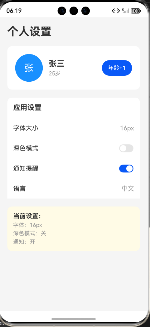
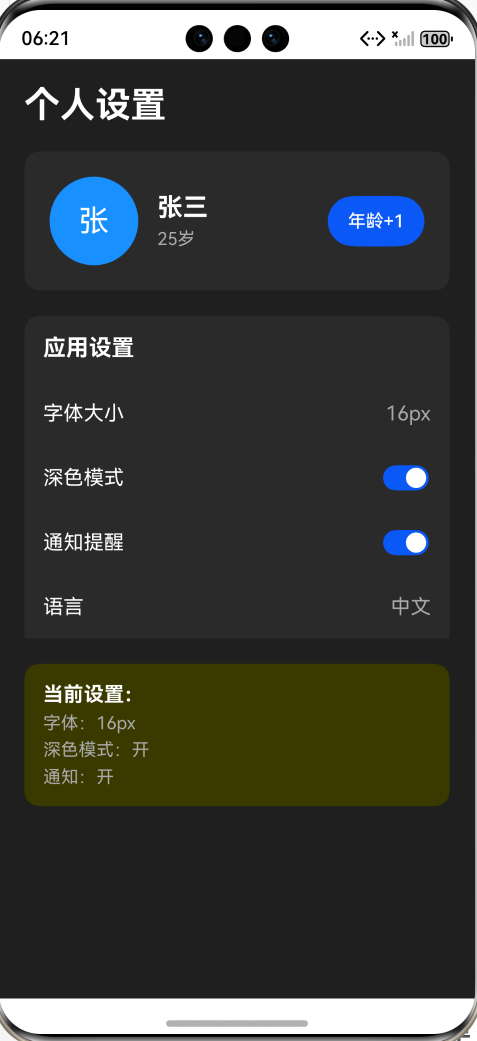
7.6 运行效果展示
浅色模式(默认):
深色模式(开启后):
7.7 功能测试清单
测试1:@State + @Observed(用户信息)
操作:点击"年龄+1"按钮
预期:
✅ 年龄从25变为26、27、28...
✅ 用户信息卡片中的年龄同步更新
✅ UI立即刷新
测试2:@Prop(头像组件)
操作:观察头像组件
预期:
✅ 显示蓝色圆形头像
✅ 头像中显示"张"字(nickname的第一个字)
✅ 头像大小为70px
测试3:@Provide/@Consume(全局设置)
操作:切换"深色模式"开关
预期:
✅ 整个页面背景从浅灰变为深黑
✅ 所有卡片背景从白色变为深灰
✅ 所有文字从深色变为白色
✅ 底部调试区显示"深色模式:开"
测试4:@Observed(设置对象)
操作:切换"通知提醒"开关
预期:
✅ 底部调试区立即显示"通知:开/关"
✅ UI无延迟刷新
7.8 装饰器应用总结
本案例中各装饰器的作用:
| 装饰器 | 使用位置 | 作用 | 效果 |
|---|---|---|---|
| @State | userInfo: UserInfo |
管理用户信息状态 | 点击"年龄+1",UI更新 |
| @Prop | Avatar的nickname和avatarSize | 父组件传数据给子组件 | 头像显示用户名首字母 |
| @Provide | settings: AppSettings |
提供全局设置数据 | 多个组件共享设置 |
| @Consume | SettingsPanel中的settings | 消费全局设置数据 | 直接访问主页面的settings |
| @Observed | UserInfo和AppSettings类 | 深度监听对象属性 | 对象属性变化触发UI刷新 |
数据流向图:
主页面(SettingsPage)
│
├─ @State userInfo ────> Avatar组件
│  └─ age属性变化          └─ @Prop接收nickname
│     (点击年龄+1)              显示用户名首字
│
└─ @Provide settings ──> SettingsPanel组件
   │                       └─ @Consume接收settings
   │                          ├─ 切换深色模式
   │                          └─ 切换通知开关
   │
   └─ 影响整个页面
      └─ 所有颜色实时变化
🔗 参考资料
作者寄语:状态管理是鸿蒙开发的核心技能,建议反复练习每个装饰器的用法。不要着急,慢慢掌握每一个概念,多写代码多实践。期待在第四篇中与你继续学习!
如果本文对你有帮助,欢迎点赞👍、收藏⭐、关注➕!有问题欢迎评论区讨论!
这个链接是我参与鸿蒙培训的班级链接,该活动由鸿蒙官方组织。如果你感兴趣,可以进入班级一起学习(https://developer.huawei.com/consumer/cn/training/classDetail/ffcb0f4a66a44a3f870797de8f4faa9b?type=1?ha_source=hmosclass&ha_sourceId=89000248
标签:#HarmonyOS #鸿蒙开发 #ArkTS #状态管理 #装饰器 #组件通信
版权声明:本文为作者原创文章,遵循 CC 4.0 BY-SA 版权协议,转载请附上原文出处链接和本声明。

讨论HarmonyOS开发技术,专注于API与组件、DevEco Studio、测试、元服务和应用上架分发等。
更多推荐

 22
22 0
0- 0


 已为社区贡献4条内容

所有评论(0)