《鸿蒙 Electron 界面开发实战:自适应布局适配手机 / PC / 智慧屏》
鸿蒙 Electron 界面开发实战:自适应布局适配手机 / PC / 智慧屏
鸿蒙 Electron 作为“一次开发,多端部署”的核心载体,界面自适应是实现“全场景体验一致”的关键——同一套代码需在手机(小屏触控)、PC(大屏键鼠)、智慧屏(超大屏遥控)三种完全不同的设备形态下正常显示并保证交互流畅。本文从“鸿蒙设备屏幕规范→核心适配技术→实战案例落地”三个层面展开,重点讲解 CSS Media Query 断点设计、Flex/Grid 弹性布局的实战运用,最终实现一个“设备信息展示界面”在三种设备上的完美适配。
前置基础:掌握 HTML/CSS 基础,了解 Flex/Grid 布局概念;已搭建鸿蒙 Electron 开发环境(建议使用 Vue 3 模板,组件化开发更高效)。
一、先搞懂:鸿蒙多设备屏幕尺寸与交互规范
自适应布局的核心是“适配不同设备的屏幕尺寸和交互方式”,在开发前需明确鸿蒙主流设备的屏幕参数和设计规范,避免盲目设计断点。
1.1 三大设备屏幕核心参数
鸿蒙官方对手机、PC、智慧屏的屏幕尺寸、分辨率、像素密度(DPI)有明确规范,直接决定自适应断点的设计:
|
设备类型 |
屏幕尺寸范围 |
主流分辨率 |
像素密度(DPI) |
交互方式 |
|---|---|---|---|---|
|
手机(Phone) |
4.7-7.2 英寸 |
1080×2340(FHD+)、2340×1080(折叠屏外屏) |
320-480(高密度) |
触控为主,单指/双指操作 |
|
PC(Computer) |
13-27 英寸 |
1920×1080(FHD)、2560×1440(QHD)、3840×2160(4K) |
96-144(中低密度) |
键鼠为主,支持拖拽、快捷键 |
|
智慧屏(Smart TV) |
43-75 英寸 |
1920×1080(FHD)、3840×2160(4K) |
50-100(低密度) |
遥控为主,焦点导航,远距离观看 |
1.2 自适应设计核心原则
结合鸿蒙设备特性,自适应布局需遵循三大原则,避免“适配后能用但不好用”的问题:
-
尺寸弹性化:避免使用固定像素(如
width: 300px),优先使用相对单位(rem、vw/vh、百分比); -
布局响应式:小屏(手机)用单列布局,中屏(平板)用双列布局,大屏(PC/智慧屏)用多列布局,随屏幕宽度动态调整;
-
交互适配性:手机端按钮尺寸≥48px(触控友好),PC端支持hover效果(键鼠友好),智慧屏端焦点样式明显(遥控友好)。
1.3 关键断点设计(基于屏幕宽度)
根据鸿蒙设备屏幕宽度,设计三个核心断点(Breakpoint),覆盖95%以上的鸿蒙设备场景:
|
断点范围(屏幕宽度) |
对应设备 |
布局策略 |
Media Query 语法 |
|---|---|---|---|
|
≤ 768px |
手机(竖屏/横屏)、小屏平板 |
单列布局,组件垂直排列,大按钮 |
@media (max-width: 768px) { ... } |
|
769px - 1200px |
平板(横屏)、小屏PC |
双列布局,核心内容左列,辅助内容右列 |
@media (min-width: 769px) and (max-width: 1200px) { ... } |
|
≥ 1201px |
PC、智慧屏 |
三列布局,侧边栏+主内容+工具栏,多组件并列 |
@media (min-width: 1201px) { ... } |
二、核心技术:Flex + Grid + Media Query 组合拳
鸿蒙 Electron 界面自适应的核心技术栈是“Flex 弹性布局(处理组件排列)+ Grid 网格布局(处理页面分区)+ Media Query(根据断点切换样式)”,三者结合可高效实现多设备适配。
2.1 基础单位适配:rem + vw 实现全设备尺寸兼容
首先统一基础单位,解决“不同屏幕尺寸下字体、间距比例失调”问题:
(1)rem 适配字体与间距
将根元素(html)的字体大小设置为屏幕宽度的 1/100(即 1vw = 屏幕宽度的 1%),则 1rem = 1vw,后续所有字体、间距均使用 rem 单位:
/* 响应式根元素字体设置 */
html {
  font-size: 1vw; /* 1rem = 视口宽度的1% (1920px屏幕下1rem=19.2px) */
  min-width: 320px; /* 支持最小移动设备宽度 */
  max-width: 3840px; /* 适配4K显示器 */
  margin: 0 auto;
}

/* 响应式单位示例 */
.title {
  font-size: 2.5rem; /* 保持等比缩放 */
  margin-bottom: 1.5rem; /* 响应式间距 */
}

.button {
  padding: 0.8rem 1.6rem; /* 弹性内边距 */
  font-size: 1.2rem;
}

/* 移动端字体优化 */
@media (max-width: 375px) {
  html {
    font-size: 12px; /* 确保小屏幕可读性 */
  }
}
(2)vw/vh 适配容器尺寸
容器宽度、高度使用 vw/vh 单位(1vw=屏幕宽度1%,1vh=屏幕高度1%),实现“容器大小随屏幕尺寸同比缩放”:
/* 主容器:90%视窗宽度,80%视窗高度,水平居中 */
.main-container {
  width: 90vw;
  height: 80vh;
  margin: 0 auto;
}

/* 卡片组件:100%父容器宽度,自适应高度,带圆角和内边距 */
.card {
  width: 100%;
  height: auto;
  border-radius: 0.8rem;
  padding: 1.2rem;
}
2.2 Flex 布局:处理组件弹性排列
Flex 布局适用于“组件线性排列”场景(如导航栏、按钮组、列表),通过 flex-direction 控制排列方向,flex-wrap 控制换行,实现不同屏幕下的排列切换:
/* 导航栏容器:采用Flex布局 */
.nav-container {
  display: flex;
  justify-content: space-between; /* 两端对齐 */
  align-items: center; /* 垂直居中 */
  padding: 1rem;
  background-color: #007dff;
  color: white;
}

/* 导航菜单:默认横向排列 */
.nav-menu {
  display: flex;
  gap: 1.5rem; /* 设置菜单项间距 */
}

/* 响应式设计:移动端适配 */
@media (max-width: 768px) {
  .nav-menu {
    flex-direction: column; /* 改为纵向排列 */
    gap: 1rem;
    position: absolute;
    top: 5rem;
    left: 0;
    width: 100%;
    background-color: #007dff;
    padding: 1rem;
    display: none; /* 默认隐藏,通过点击切换显示 */
  }

  /* 移动端菜单切换按钮 */
  .menu-toggle {
    display: block;
    font-size: 1.5rem;
    cursor: pointer;
  }
}
2.3 Grid 布局:处理页面分区适配
Grid 布局适用于“页面多区域划分”场景(如主内容区+侧边栏+工具栏),通过 grid-template-columns 控制列数和宽度比例,实现不同屏幕下的分区切换:
/* 主页面布局:响应式Grid布局 */
.page-layout {
  display: grid;
  grid-template-columns: 1fr; /* 单列布局(移动端) */
  gap: 1.5rem;
  padding: 1rem;
  height: 90vh;
}

/* 平板设备:双列布局(1:3比例) */
@media (min-width: 769px) and (max-width: 1200px) {
  .page-layout {
    grid-template-columns: 1fr 3fr;
  }
}

/* 桌面设备:三列布局(1:3:1比例) */
@media (min-width: 1201px) {
  .page-layout {
    grid-template-columns: 1fr 3fr 1fr;
  }
}

/* 通用区域样式 */
.sidebar,
.toolbar {
  background-color: #f5f5f5;
  border-radius: 0.8rem;
  padding: 1.2rem;
}

.main-content {
  background-color: white;
  border-radius: 0.8rem;
  padding: 1.2rem;
  overflow: auto;
}

/* 工具栏显示控制 */
.toolbar {
  display: none;
}

@media (min-width: 1201px) {
  .toolbar {
    display: block;
  }
}
2.4 交互样式适配:多设备操作友好
不同设备交互方式不同,需通过 Media Query 适配交互样式,提升用户体验
/* 基础按钮样式 */
.btn {
  border: none;
  border-radius: 0.8rem;
  cursor: pointer;
  transition: all 0.3s;
}

/* 移动端适配:大尺寸触控按钮 */
@media (max-width: 768px) {
  .btn {
    width: 100%;
    height: 3.5rem;
    font-size: 1.4rem;
  }
}

/* PC端适配:悬停交互优化 */
@media (min-width: 1201px) {
  .btn {
    width: auto;
    padding: 0.8rem 1.6rem;
    font-size: 1.2rem;
  }
  .btn:hover {
    background-color: #0066cc;
    transform: scale(1.05);
  }
}

/* 智慧屏适配:焦点状态增强 */
@media (min-width: 1920px) {
  .btn {
    font-size: 1.5rem;
    padding: 1rem 2rem;
  }
  .btn:focus {
    outline: 0.3rem solid #007dff;
    outline-offset: 0.2rem;
  }
}
三、实战案例:设备信息展示界面多端适配
以“鸿蒙设备信息展示界面”为案例,完整实现手机、PC、智慧屏三端适配,包含侧边栏(设备列表)、主内容区(设备详情)、工具栏(操作按钮)三大模块,使用 Vue 3 组件化开发(原生 JS 可直接复用样式逻辑)。
3.1 项目结构与组件拆分
基于 Vue 3 模板创建项目,组件拆分遵循“页面布局→功能模块→基础组件”的层级:
src/renderer/src/ ├── components/ │ ├── Navbar.vue # 导航栏组件(自适应) │ ├── Sidebar.vue # 侧边栏(设备列表) │ ├── DeviceCard.vue # 设备详情卡片(弹性布局) │ └── Toolbar.vue # 工具栏(操作按钮) ├── views/ │ └── DeviceInfo.vue # 主页面(Grid布局) └── App.vue # 根组件
3.2 核心组件代码实现
(1)主页面布局:DeviceInfo.vue(Grid + 断点适配)
<template>
  <div class="page-container">
    <Navbar />
    <div class="page-layout">
      <Sidebar :devices="deviceList" @select-device="selectDevice" />
      <MainContent :device="selectedDevice" />
      <Toolbar @refresh="fetchDevices" />
    </div>
  </div>
</template>

<script setup lang="ts">
import { ref, onMounted } from 'vue'
import Navbar from '@/components/Navbar.vue'
import Sidebar from '@/components/Sidebar.vue'
import MainContent from '@/components/MainContent.vue'
import Toolbar from '@/components/Toolbar.vue'

// 模拟鸿蒙分布式设备列表
const deviceList = ref([
  { id: 1, name: '我的手机', type: 'phone', status: 'online', version: 'HarmonyOS 4.0' },
  { id: 2, name: '我的PC', type: 'pc', status: 'online', version: 'HarmonyOS 4.0' },
  { id: 3, name: '客厅智慧屏', type: 'tv', status: 'offline', version: 'HarmonyOS 3.0' }
])

const selectedDevice = ref(deviceList.value[0]) // 默认选中第一个设备

// 设备选择处理
const selectDevice = (device) => {
  selectedDevice.value = device
}

// 刷新设备列表(模拟鸿蒙分布式API调用)
const fetchDevices = () => {
  // 实际开发中调用:window.hmosApi.getDeviceList()
  console.log('刷新设备列表')
}
</script>

<style scoped>
/* 基础页面布局 */
.page-layout {
  display: grid;
  grid-template-columns: 1fr;
  gap: 1.5rem;
  padding: 1rem;
  height: calc(100vh - 5rem); /* 减去导航栏高度 */
}

/* 平板适配 */
@media (min-width: 769px) and (max-width: 1200px) {
  .page-layout {
    grid-template-columns: 1fr 3fr;
  }
}

/* PC/智慧屏适配 */
@media (min-width: 1201px) {
  .page-layout {
    grid-template-columns: 1fr 3fr 1fr;
  }
}
</style>
(2)设备详情卡片:DeviceCard.vue(Flex + 响应式样式)
<template>
  <div class="device-card">
    <div class="card-header">
      <span class="device-type" :class="device.type">
        {{ getDeviceIcon(device.type) }}
      </span>
      <h2 class="device-name">{{ device.name }}</h2>
      <span class="device-status" :class="device.status">
        {{ device.status === 'online' ? '在线' : '离线' }}
      </span>
    </div>

    <div class="card-body">
      <div class="info-item">
        <label>设备类型:</label>
        <span>{{ getDeviceTypeName(device.type) }}</span>
      </div>
      <div class="info-item">
        <label>系统版本:</label>
        <span>{{ device.version }}</span>
      </div>
      <div class="info-item">
        <label>连接方式:</label>
        <span>鸿蒙分布式网络</span>
      </div>
      <div class="info-item">
        <label>最后在线:</label>
        <span>{{ new Date().toLocaleString() }}</span>
      </div>
    </div>

    <div class="card-footer">
      <button class="btn connect-btn" @click="connectDevice">
        {{ device.status === 'online' ? '断开连接' : '连接设备' }}
      </button>
    </div>
  </div>
</template>

<script setup lang="ts">
import { defineProps } from 'vue';

const props = defineProps({
  device: {
    type: Object,
    required: true
  }
});

const getDeviceTypeName = (type) => {
  const deviceTypes = {
    phone: '手机',
    pc: '个人电脑',
    tv: '智慧屏'
  };
  return deviceTypes[type] || '未知设备';
};

const getDeviceIcon = (type) => {
  const icons = {
    phone: '📱',
    pc: '💻',
    tv: '📺'
  };
  return icons[type] || '❓';
};

const connectDevice = () => {
  console.log(`${props.device.status === 'online' ? '断开' : '连接'}设备:`, props.device.name);
};
</script>

<style scoped>
.device-card {
  width: 100%;
  height: 100%;
  border-radius: 1rem;
  box-shadow: 0 0.2rem 1rem rgba(0,0,0,0.1);
  overflow: hidden;
  display: flex;
  flex-direction: column;
}

.card-header {
  display: flex;
  align-items: center;
  justify-content: space-between;
  padding: 1.2rem;
  background-color: #007dff;
  color: white;
}

.device-type {
  font-size: 2rem;
}

.device-name {
  font-size: 1.8rem;
  font-weight: 600;
}

.device-status {
  padding: 0.4rem 0.8rem;
  border-radius: 0.4rem;
  font-size: 1.2rem;
}

.device-status.online {
  background-color: #00c853;
}

.device-status.offline {
  background-color: #ff4444;
}

.card-body {
  flex: 1;
  padding: 1.5rem;
  display: flex;
  flex-direction: column;
  gap: 1.2rem;
  overflow: auto;
}

.info-item {
  display: flex;
  flex-direction: column;
  gap: 0.4rem;
}

.info-item label {
  font-size: 1.2rem;
  color: #666;
  font-weight: 500;
}

.info-item span {
  font-size: 1.4rem;
  color: #333;
}

.card-footer {
  padding: 1.2rem;
  border-top: 1px solid #f5f5f5;
}

.connect-btn {
  width: 100%;
  height: 3rem;
  background-color: #007dff;
  color: white;
  border: none;
  border-radius: 0.8rem;
  font-size: 1.4rem;
  cursor: pointer;
}

@media (min-width: 769px) and (max-width: 1200px) {
  .card-body {
    flex-direction: row;
    flex-wrap: wrap;
    gap: 2rem;
  }

  .info-item {
    width: calc(50% - 1rem);
  }

  .connect-btn {
    width: 50%;
    margin: 0 auto;
  }
}

@media (min-width: 1201px) {
  .card-body {
    flex-direction: row;
    flex-wrap: wrap;
    gap: 2rem;
  }

  .info-item {
    width: calc(33.33% - 1.3rem);
  }

  .connect-btn {
    width: 30%;
    margin: 0;
  }

  .connect-btn:hover {
    background-color: #0066cc;
    transform: scale(1.05);
  }
}
</style>
3.3 三端运行效果对比
通过鸿蒙 Electron 模拟器切换不同设备类型,查看适配效果,核心差异体现在布局、组件排列和交互样式上:
(1)手机端(≤768px)效果
-
布局:单列布局,侧边栏默认隐藏(点击导航栏图标展开),工具栏隐藏;
-
组件:设备卡片内部垂直排列,信息项上下分布,按钮全屏宽度;
-
交互:按钮尺寸 3rem(触控友好),无 hover 效果,侧边栏滑动展开。
效果示意图:顶部导航栏(含菜单图标),中间设备卡片(信息垂直排列),底部全屏按钮,整体简洁紧凑,适配手机屏幕。
(2)PC端(≥1201px)效果
-
布局:三列布局,侧边栏(左)+ 主内容(中)+ 工具栏(右)并列显示;
-
组件:设备卡片内部三列布局,信息项横向分布,按钮宽度 30%;
-
交互:按钮支持 hover 放大效果,侧边栏固定显示,工具栏提供刷新、导出等操作。
效果示意图:左侧显示设备列表,中间显示设备详情(三列信息),右侧显示操作工具栏,布局清晰,符合 PC 端键鼠操作习惯。
(3)智慧屏端(≥1920px)效果
-
布局:三列布局,组件间距放大,字体尺寸增大 20%(远距离可见);
-
组件:设备卡片阴影加深,按钮尺寸放大,信息项字体加粗;
-
交互:按钮焦点样式明显(蓝色粗边框),支持遥控方向键导航,无 hover 效果。
效果示意图:整体元素放大,焦点状态突出,适合远距离观看和遥控操作,符合智慧屏使用场景。
四、适配避坑指南与优化技巧
4.1 常见适配问题及解决方案
|
问题现象 |
产生原因 |
解决方案 |
|---|---|---|
|
小屏手机内容溢出 |
使用固定像素高度,内容过多时无法滚动 |
容器使用 |
|
大屏字体比例失调 |
仅使用 rem 单位,未限制根字体最大尺寸 |
在 html 样式中添加 |
|
智慧屏焦点导航混乱 |
未设置 tabindex,焦点顺序不明确 |
为交互组件添加 |
|
不同设备间距不一致 |
使用固定像素间距,未随屏幕缩放 |
统一使用 rem 或 vw 单位设置间距,确保比例一致 |
4.2 进阶优化技巧
(1)使用 CSS 变量统一管理样式
定义全局 CSS 变量,统一管理颜色、间距、字体大小,减少重复代码并便于维护:
/* 全局CSS变量定义 */
:root {
  --primary-color: #007dff;
  --secondary-color: #f5f5f5;
  --text-color: #333;
  --gap-sm: 0.8rem;
  --gap-md: 1.5rem;
  --gap-lg: 2rem;
  --font-size-sm: 1.2rem;
  --font-size-md: 1.4rem;
  --font-size-lg: 1.8rem;
}

/* 组件样式 */
.device-card {
  background: white;
  border-radius: var(--gap-sm);
  padding: var(--gap-md);
}

.device-name {
  font-size: var(--font-size-lg);
  color: var(--text-color);
}
(2)结合鸿蒙 API 动态适配设备类型
通过鸿蒙扩展 API 获取当前运行的设备类型,动态调整布局(比纯 CSS 断点更精准):
<script setup lang="ts">
import { ref, onMounted } from 'vue'
import { harmony } from '@hmos/electron'

const deviceType = ref('phone') // 默认设备类型为手机

onMounted(async () => {
  // 获取设备类型信息
  const systemInfo = await harmony.system.getSystemInfo()
  deviceType.value = systemInfo.deviceType // 可能值为 'phone'/'pc'/'tv'
})
</script>

<template>
  <div class="page-layout" :class="deviceType">
    <Sidebar v-if="deviceType !== 'phone'" />
    <MainContent />
    <Toolbar v-if="['pc', 'tv'].includes(deviceType)" />
  </div>
</template>
(3)性能优化:避免过度重绘
多设备适配时避免频繁修改 DOM 样式,可通过以下方式优化:
-
使用 CSS 变换(
transform)替代width/height调整尺寸,避免回流; -
媒体查询断点避免设置过多,建议不超过 3 个核心断点;
-
隐藏组件时使用
display: none而非visibility: hidden,减少渲染负担。
五、总结:自适应布局的核心逻辑
鸿蒙 Electron 多设备自适应布局的核心逻辑是“基础单位相对化 + 布局弹性化 + 样式响应式 + 交互适配性”:
-
基础单位是前提:通过 rem + vw 实现“尺寸随屏幕同比缩放”,避免固定像素导致的适配问题;
-
弹性布局是核心:Flex 处理组件线性排列,Grid 处理页面分区,两者结合实现布局动态调整;
-
媒体查询是手段:通过断点切换样式,适配不同设备的屏幕尺寸;
-
交互适配是关键:结合设备交互方式优化样式,确保“适配后不仅能用,更要好用”。
实际开发中,建议先通过 CSS 断点实现基础适配,再结合鸿蒙设备 API 进行精准调整,最后优化交互样式和性能。遵循这套流程,可高效实现“一次开发,多端完美适配”的鸿蒙 Electron 应用。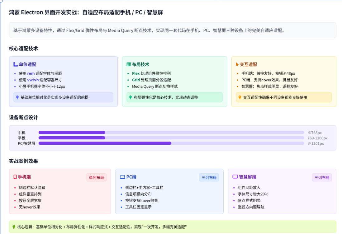

讨论HarmonyOS开发技术,专注于API与组件、DevEco Studio、测试、元服务和应用上架分发等。
更多推荐
 14
14 0
0- 0


 已为社区贡献6条内容

所有评论(0)