鸿蒙开发之 Tabs 底部导航与自定义 TabBar 实战
在 HarmonyOS NEXT 应用开发中,底部 Tab 导航 是 App 最核心的交互模式之一。ArkUI 提供了 Tabs 组件来实现多 Tab 切换,配合 TabContent 和自定义 tabBar 构建器,可以轻松打造美观实用的底部导航栏。本文将手把手带你实现一个完整的三 Tab 底部导航页面,代码可直接复制到 DevEco Studio 中运行。
一、效果预览
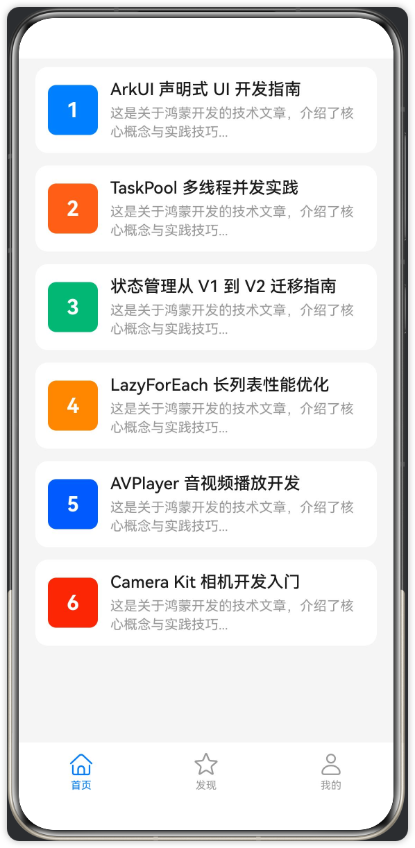
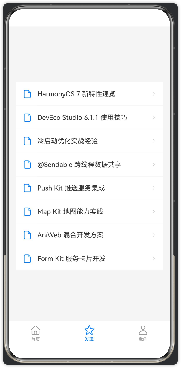
最终实现的 Demo 包含以下功能:
-
底部 3 个 Tab:首页、发现、我的
-
首页:文章列表,带封面图标和摘要
-
发现:功能入口列表,带图标和分割线
-
我的:用户信息卡片 + 菜单列表 + 退出登录按钮
-
自定义 TabBar 样式,选中态高亮
-
Toast 交互反馈
 |
 |
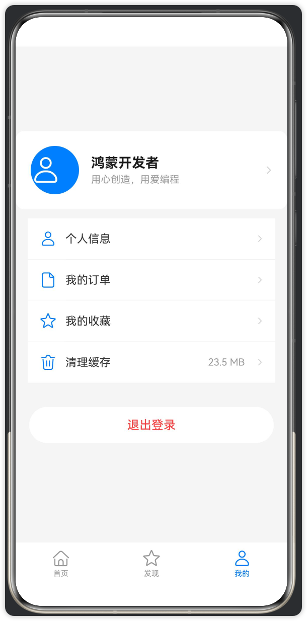 |
| ▲ 首页列表 | ▲ 发现页 | ▲ 我的页 |
二、核心概念
| 组件/API | 作用 |
|---|---|
Tabs |
标签页容器,管理多个 Tab 的切换 |
TabContent |
单个标签页的内容区域 |
.tabBar() |
自定义标签栏样式构建器 |
BarPosition.End |
标签栏位置:底部 |
@Builder |
可复用的 UI 构建函数,用于自定义 TabBar |
SymbolGlyph |
鸿蒙系统图标组件,1500+ 矢量图标库 |
promptAction.showToast |
轻提示反馈 |
三、完整代码
以下代码整合在一个 .ets 文件中,包含主入口页面和三个 Tab 子页面。可直接作为 pages/Index.ets 使用。
// pages/Index.ets
// 鸿蒙 Tabs + 自定义 TabBar 实战 Demo
// API 24 Release (HarmonyOS 6.1.1) 适用

import { promptAction } from '@kit.ArkUI';

// ============================================================
// 模拟数据
// ============================================================

const MOCK_ARTICLES: string[] = [
  'ArkUI 声明式 UI 开发指南',
  'TaskPool 多线程并发实践',
  '状态管理从 V1 到 V2 迁移指南',
  'LazyForEach 长列表性能优化',
  'AVPlayer 音视频播放开发',
  'Camera Kit 相机开发入门',
];

const MOCK_DISCOVER_ITEMS: string[] = [
  'HarmonyOS 7 新特性速览', 'DevEco Studio 6.1.1 使用技巧',
  '冷启动优化实战经验', '@Sendable 跨线程数据共享',
  'Push Kit 推送服务集成', 'Map Kit 地图能力实践',
  'ArkWeb 混合开发方案', 'Form Kit 服务卡片开发',
];

// ============================================================
// 首页 Tab
// ============================================================

@Component
struct HomeTab {
  build() {
    List({ space: 12 }) {
      ForEach(MOCK_ARTICLES, (item: string, index: number) => {
        ListItem() {
          Row({ space: 12 }) {
            // 左侧序号色块
            Row() {
              Text(`${index + 1}`)
                .fontSize(20)
                .fontColor(Color.White)
                .fontWeight(FontWeight.Bold)
            }
            .width(48)
            .height(48)
            .borderRadius(8)
            .backgroundColor(['#007DFF', '#FF6B35', '#00B578', '#FF8F1F',
              '#0A59F7', '#E84026'][index % 6])
            .justifyContent(FlexAlign.Center)

            Column({ space: 4 }) {
              Text(item)
                .fontSize(16)
                .fontWeight(FontWeight.Medium)
                .fontColor('#1A1A1A')
              Text('这是关于鸿蒙开发的技术文章,介绍了核心概念与实践技巧...')
                .fontSize(13)
                .fontColor('#999999')
                .maxLines(2)
                .textOverflow({ overflow: TextOverflow.Ellipsis })
                .lineHeight(18)
            }
            .alignItems(HorizontalAlign.Start)
            .layoutWeight(1)
          }
          .width('100%')
          .padding(12)
          .backgroundColor(Color.White)
          .borderRadius(12)
          .onClick(() => {
            const action = this.getUIContext().getPromptAction();
            action.showToast({ message: `打开: ${item}`, duration: 2000 });
          })
        }
      })
    }
    .padding({ left: 16, right: 16, top: 8, bottom: 16 })
    .width('100%')
    .height('100%')
    .backgroundColor('#F5F5F5')
    .edgeEffect(EdgeEffect.Spring)
  }
}

// ============================================================
// 发现 Tab
// ============================================================

@Component
struct DiscoverTab {
  build() {
    Scroll() {
      Column({ space: 0 }) {
        ForEach(MOCK_DISCOVER_ITEMS, (item: string, index: number) => {
          Row() {
            SymbolGlyph($r('sys.symbol.doc'))
              .fontSize(20)
              .fontColor(['#007DFF'])
              .margin({ right: 12 })

            Text(item)
              .fontSize(15)
              .fontColor('#333333')
              .layoutWeight(1)

            SymbolGlyph($r('sys.symbol.chevron_right'))
              .fontSize(16)
              .fontColor(['#CCCCCC'])
          }
          .width('100%')
          .padding({ left: 16, right: 16, top: 16, bottom: 16 })
          .backgroundColor(Color.White)
          .onClick(() => {
            const action = this.getUIContext().getPromptAction();
            action.showToast({ message: `进入: ${item}`, duration: 2000 });
          })

          if (index < MOCK_DISCOVER_ITEMS.length - 1) {
            Divider()
              .strokeWidth(0.5)
              .color('#F0F0F0')
              .margin({ left: 48 })
          }
        })
      }
      .borderRadius(12)
      .margin({ left: 16, right: 16, top: 12 })
    }
    .width('100%')
    .height('100%')
    .backgroundColor('#F5F5F5')
  }
}

// ============================================================
// 我的 Tab
// ============================================================

@Component
struct MineTab {
  @State userName: string = '鸿蒙开发者';
  @State cacheSize: string = '23.5 MB';

  // 菜单行构建器($r() 只能在 @Builder 或 build() 中使用)
  @Builder
  MenuRowBuilder(icon: Resource, title: string, showCache: boolean) {
    Row({ space: 12 }) {
      SymbolGlyph(icon)
        .fontSize(22)
        .fontColor(['#007DFF'])

      Text(title)
        .fontSize(15)
        .fontColor('#333333')
        .layoutWeight(1)

      if (showCache) {
        Text(this.cacheSize)
          .fontSize(13)
          .fontColor('#999999')
          .margin({ right: 4 })
      }

      SymbolGlyph($r('sys.symbol.chevron_right'))
        .fontSize(16)
        .fontColor(['#CCCCCC'])
    }
    .width('100%')
    .padding({ left: 16, right: 16, top: 16, bottom: 16 })
    .backgroundColor(Color.White)
    .onClick(() => {
      const action = this.getUIContext().getPromptAction();
      action.showToast({ message: `点击了: ${title}`, duration: 2000 });
    })
  }

  build() {
    Scroll() {
      Column({ space: 0 }) {
        // 用户信息头部
        Row({ space: 16 }) {
          SymbolGlyph($r('sys.symbol.person'))
            .fontSize(40)
            .fontColor([Color.White])
            .width(64)
            .height(64)
            .borderRadius(32)
            .backgroundColor('#007DFF')

          Column({ space: 4 }) {
            Text(this.userName)
              .fontSize(18)
              .fontWeight(FontWeight.Bold)
              .fontColor('#1A1A1A')
            Text('用心创造,用爱编程')
              .fontSize(13)
              .fontColor('#999999')
          }
          .alignItems(HorizontalAlign.Start)

          Blank()

          SymbolGlyph($r('sys.symbol.chevron_right'))
            .fontSize(18)
            .fontColor(['#CCCCCC'])
        }
        .width('100%')
        .padding(20)
        .backgroundColor(Color.White)
        .borderRadius(12)
        .margin({ left: 16, right: 16, top: 12 })

        // 菜单项($r() 必须在 build 上下文中使用,不能通过数组变量传递)
        Column() {
          this.MenuRowBuilder($r('sys.symbol.person'), '个人信息', false)
          Divider().strokeWidth(0.5).color('#F0F0F0').margin({ left: 50 })
          this.MenuRowBuilder($r('sys.symbol.doc'), '我的订单', false)
          Divider().strokeWidth(0.5).color('#F0F0F0').margin({ left: 50 })
          this.MenuRowBuilder($r('sys.symbol.star'), '我的收藏', false)
          Divider().strokeWidth(0.5).color('#F0F0F0').margin({ left: 50 })
          this.MenuRowBuilder($r('sys.symbol.trash'), '清理缓存', true)
        }
        .borderRadius(12)
        .margin({ left: 16, right: 16, top: 12 })

        // 退出登录按钮
        Button('退出登录')
          .width('90%')
          .height(48)
          .fontSize(16)
          .fontColor('#FF4444')
          .backgroundColor(Color.White)
          .borderRadius(24)
          .margin({ top: 32, bottom: 32 })
      }
      .width('100%')
    }
    .width('100%')
    .height('100%')
    .backgroundColor('#F5F5F5')
  }
}

// ============================================================
// 主入口页面 - @Entry
// ============================================================

@Entry
@Component
struct MainPage {
  @State currentTabIndex: number = 0;

  build() {
    Tabs({ barPosition: BarPosition.End, index: this.currentTabIndex }) {
      // Tab 0: 首页
      TabContent() {
        HomeTab()
      }
      .tabBar(this.TabBarItem(0, '首页', $r('sys.symbol.house')))

      // Tab 1: 发现
      TabContent() {
        DiscoverTab()
      }
      .tabBar(this.TabBarItem(1, '发现', $r('sys.symbol.star')))

      // Tab 2: 我的
      TabContent() {
        MineTab()
      }
      .tabBar(this.TabBarItem(2, '我的', $r('sys.symbol.person')))
    }
    .barHeight(56)
    .width('100%')
    .height('100%')
    .scrollable(false)
    .onChange((index: number) => {
      this.currentTabIndex = index;
    })
  }

  // 自定义 TabBar 项构建器
  @Builder
  TabBarItem(index: number, title: string, icon: Resource) {
    Column({ space: 2 }) {
      SymbolGlyph(icon)
        .fontSize(24)
        .fontColor([index === this.currentTabIndex ? '#007DFF' : '#999999'])
      Text(title)
        .fontSize(10)
        .fontColor(index === this.currentTabIndex ? '#007DFF' : '#999999')
    }
    .width('100%')
    .height('100%')
    .justifyContent(FlexAlign.Center)
  }
}
四、代码拆解说明
4.1 Tabs 容器
Tabs({ barPosition: BarPosition.End, index: this.currentTabIndex }) {
  TabContent() { HomeTab() }
    .tabBar(this.TabBarItem(0, '首页', $r('sys.symbol.house')))
  TabContent() { DiscoverTab() }
    .tabBar(this.TabBarItem(1, '发现', $r('sys.symbol.star')))
  TabContent() { MineTab() }
    .tabBar(this.TabBarItem(2, '我的', $r('sys.symbol.person')))
}
.barHeight(56)         // TabBar 高度
.scrollable(false)     // 禁止左右滑动切换 Tab
.width('100%')
.height('100%')
barPosition: BarPosition.End— 标签栏在底部,改为BarPosition.Start则到顶部index双向绑定@State currentTabIndex,响应式切换scrollable(false)— 禁用滑动切换,仅通过点击 Tab 切换(常见于主 Tab 页面)
4.2 自定义 TabBar 样式
@Builder
TabBarItem(index: number, title: string, icon: Resource) {
  Column({ space: 2 }) {
    SymbolGlyph(icon)
      .fontSize(24)
      .fontColor([index === this.currentTabIndex ? '#007DFF' : '#999999'])
    Text(title)
      .fontSize(10)
      .fontColor(index === this.currentTabIndex ? '#007DFF' : '#999999')
  }
  .width('100%')
  .height('100%')
  .justifyContent(FlexAlign.Center)
}
SymbolGlyph使用鸿蒙系统图标库,1500+ 矢量图标,支持多层着色- 通过
index === this.currentTabIndex判断选中态,切换颜色 .tabBar()接收一个返回@Builder的调用,框架自动传入当前 index
4.3 Tab 内容区撑满
每个 Tab 子组件的根容器必须设置 .width('100%').height('100%'):
// HomeTab — List
List({ space: 12 }) { /* ... */ }
  .width('100%').height('100%')

// DiscoverTab — Scroll
Scroll() { /* ... */ }
  .width('100%').height('100%')

// MineTab — Scroll
Scroll() { /* ... */ }
  .width('100%').height('100%')
同时 Tabs 自身也需要 .width('100%').height('100%'),否则 Tab 内容无法填满屏幕。
4.4 Toast 交互反馈
.onClick(() => {
  const action = this.getUIContext().getPromptAction();
  action.showToast({ message: `打开: ${item}`, duration: 2000 });
})
⚠️
promptAction.showToast()已废弃,推荐使用this.getUIContext().getPromptAction().showToast()。
4.5 菜单行 Builder 复用
我的页面的 4 个菜单项结构相同、仅图标和文字不同。使用 @Builder 方法封装复用逻辑:
@Builder
MenuRowBuilder(icon: Resource, title: string, showCache: boolean) {
  Row({ space: 12 }) {
    SymbolGlyph(icon) /* ... */
    Text(title)       /* ... */
    // showCache 为 true 时显示缓存大小
  }
  .onClick(() => { /* Toast */ })
}
在 build() 中直接调用:
this.MenuRowBuilder($r('sys.symbol.person'), '个人信息', false)
Divider()...
this.MenuRowBuilder($r('sys.symbol.doc'), '我的订单', false)
// ...
五、关键踩坑提醒
$r()不能放在模块顶层 const 数组中:$r()是编译期宏,只能在build()或@Builder中使用。菜单图标必须通过在 build 中直接传$r()给@Builder方法的方式使用。- 每个 Tab 内容的根容器必须设
width/height 100%:否则 TabContent 无法撑满屏幕,内容只占据自身大小。 Tabs自身也需要width/height 100%:否则内部的 TabContent 再设 100% 也无效。scrollable(false)是可选偏好:去掉后用户可以左右滑动切换 Tab,根据产品需求决定。SymbolGlyph的fontColor参数是数组:支持多层着色,单色场景用单元素数组[Color.xxx]。
六、运行效果
将此代码复制到 DevEco Studio 项目的 entry/src/main/ets/pages/Index.ets 中,运行后将看到:
- 底部三个 Tab(首页/发现/我的),点击切换
- 首页:6 条文章列表,左侧有序号色块,点击弹 Toast
- 发现:8 个功能入口,带图标和分割线,点击弹 Toast
- 我的:用户头像 + 4 个菜单项 + 退出登录按钮
- TabBar 选中态高亮为蓝色,未选中为灰色
七、扩展方向
| 扩展项 | 实现思路 |
|---|---|
| Tab 角标/红点 | 在 TabBarItem 的 Column 内叠加 Badge 组件 |
| 页面导航 | 在外层包裹 Navigation + NavPathStack 实现子页面跳转 |
| 深色模式适配 | 背景/文字颜色使用 $r('sys.color.xxx') 系统资源 |
| LazyForEach | 首页数据量大时,将 ForEach 替换为 LazyForEach |
| 下拉刷新 | 在 List 外层包裹 Refresh 组件 |
希望本文能帮助你快速上手 Tabs + 自定义 TabBar 的开发。完整代码经过 API 24 Release SDK 编译验证,可直接运行截图。
如果你对鸿蒙开发有任何疑问,欢迎下方咨询我们,一对一给你解答。

讨论HarmonyOS开发技术,专注于API与组件、DevEco Studio、测试、元服务和应用上架分发等。
更多推荐


 0
0 0
0- 0


 已为社区贡献13条内容

所有评论(0)