案例集合Tabs:分段按钮组件
🎯 案例集合Tabs:分段按钮组件
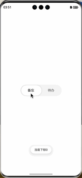
🏷️ 效果图
📖 参考
🧩 拆解
-
自定义分段按钮组件(V1-V2组件都可用)推荐
@Component export struct customSegmentButton { @State xLocation: number = 0 changeXLocation(str: string) { if (str === '备忘') { this.xLocation = 0 return } this.xLocation = (200 - 6) / 2 } build() { Row() { Text('备忘') .borderRadius('50') .height(50) .layoutWeight(1) .textAlign(TextAlign.Center) .onClick(() => { this.changeXLocation('备忘') }) Text('待办') .borderRadius('50') .height(50) .layoutWeight(1) .textAlign(TextAlign.Center) .onClick(() => { this.changeXLocation('待办') }) Text() .borderRadius('50') .position({ x: this.xLocation }) .height('100%') .width((200 - 6) / 2) .animation({ curve: Curve.Smooth, duration: 250 }) .backgroundColor(Color.White) .zIndex(-1) .shadow({ radius: 20, color: '#26000000' }) } .padding(3) .width(200) .height(56) .backgroundColor($r('sys.color.segment_button_v2_tab_button_background')) .borderRadius('50') } } -
SegmentButton(V1)不推荐
```javascript
import { LengthMetrics, SegmentButton, SegmentButtonOptions } from '@kit.ArkUI';
/**
-
分段按钮使用当前区域可使用的最大宽度作为组件宽度,并且根据按钮个数平均分配每个按钮宽度
-
分段按钮高度根据按钮内容(文本及图片)自动适应,其最小高度为28vp
-
/
@Component
export struct SegmentButtonV1Case {
@State tabOptions: SegmentButtonOptions =
SegmentButtonOptions.capsule({buttons: [{ text: '备忘' }, { text: '待办' }], buttonPadding: 3, // 整个按钮组内边距 backgroundColor: $r('sys.color.segment_button_v2_tab_button_background'), // 整个按钮组背景 selectedBackgroundColor: Color.White, // 选中的按钮背景色 selectedFontColor: Color.Black, // 选中的按钮文字颜色 fontWeight: FontWeight.Normal, // 按钮文字加粗 fontSize: 16, // 按钮文字大小 selectedFontSize: 16,// 选中按钮文字大小 localizedButtonPadding: { top: new LengthMetrics(16), bottom: new LengthMetrics(16) }, // // 选中按钮内边距})
@State tabSelectedIndexes: number[] = [0]build() {
SegmentButton({options: this.tabOptions, selectedIndexes: $tabSelectedIndexes, // 默认选择某项的下标 onItemClicked: (idx: number) => { // 选中某项下标 this.getUIContext().getPromptAction().showToast({ message: `当前下标${idx}` }) },})
.width(200)}
}
```
- SegmentButtonV2(V2)推荐
```javascript
import { LengthMetrics, SegmentButtonV2Items, TabSegmentButtonV2 } from "@kit.ArkUI";
@ComponentV2
export struct SegmentButtonV2Case {
@Local textSelectedIndex: number = 0
build() {
TabSegmentButtonV2({
items: new SegmentButtonV2Items([
{ text: '备忘' },
{ text: '待办' },
]),
selectedIndex: this.textSelectedIndex!!, // 默认选择某项的下标
buttonMinHeight: new LengthMetrics(50), // 整个按钮组的高度
buttonBorderRadius: new LengthMetrics(50), // 整个按钮组的圆角
buttonPadding: new LengthMetrics(3), // 整个按钮组的内边距
itemMinHeight: new LengthMetrics(50), // 每个按钮的高度
itemBorderRadius: new LengthMetrics(50), // 每个按钮的圆角
itemFontSize: new LengthMetrics(16), // 每个按钮的文字大小
itemSelectedFontSize: new LengthMetrics(16), // 选中按钮的文字大小
itemSelectedFontWeight: FontWeight.Normal, // 选中按钮的文字加粗
onItemClicked: (idx: number) => { // 选中某项下标
this.getUIContext().getPromptAction().showToast({ message: 当前下标${idx} })
},
})
.width(200)
}
}
```
🌍 案例集合Tabs
🌸🌼🌺

讨论HarmonyOS开发技术,专注于API与组件、DevEco Studio、测试、元服务和应用上架分发等。
更多推荐
 0
0 0
0- 0


 已为社区贡献45条内容

所有评论(0)