论新手如何用ArkUI09开发颜色选择器
·
🎨 零基础学 ArkUI:手把手带你开发一个颜色选择器
📱 应用场景
颜色选择器是所有创意类 App(绘图工具、主题编辑器、图片处理)的基础组件。我们要实现:
- RGB 三通道滑块调节(0-255)
- 实时预览选中的颜色
- 显示 HEX 和 RGB 色值文本
- 用 Canvas 绘制色相渐变条和饱和度/亮度面板
- 将颜色值传递给子组件展示
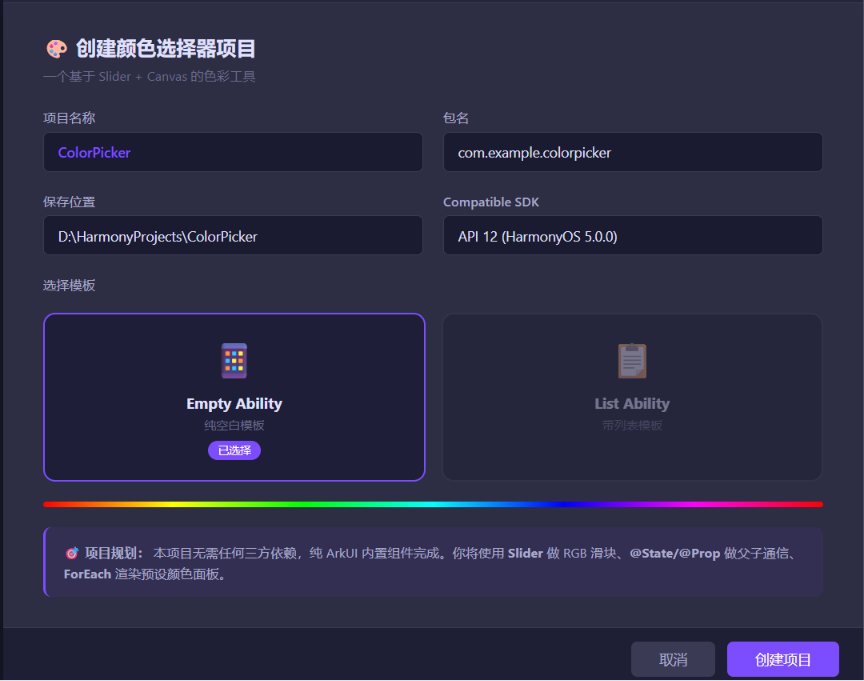
⚙️ 运行环境要求
| 项目 | 版本要求 |
|---|---|
| DevEco Studio | 5.0.3.800 及以上 |
| HarmonyOS SDK | API 12(HarmonyOS 5.0.0)及以上 |
| 应用模型 | Stage 模型 |
| 开发语言 | ArkTS |
| 额外模块 | 无(纯 ArkUI 内置组件,零依赖) |
环境配置截图示意
🛠️ 实战:从零搭建颜色选择器
Step 1:理解颜色模型 — RGB 基础
一个颜色由三个通道组成:
| 通道 | 范围 | 描述 |
|---|---|---|
| R(Red) | 0-255 | 红色强度 |
| G(Green) | 0-255 | 绿色强度 |
| B(Blue) | 0-255 | 蓝色强度 |
rgb(255, 0, 0)→ 纯红色rgb(0, 255, 0)→ 纯绿色rgb(0, 0, 255)→ 纯蓝色rgb(255, 255, 255)→ 白色rgb(0, 0, 0)→ 黑色
HEX 格式就是 RGB 的十六进制表示:rgb(255, 87, 51) → #FF5733。
Step 2:父子组件通信 — @Prop 和 @Link
在 ArkUI 中,一个复杂界面要拆成多个小组件。通信方式有两种:
| 装饰器 | 方向 | 特点 | 使用场景 |
|---|---|---|---|
@Prop |
父→子 | 子组件修改不影响父组件 | 单向展示 |
@Link |
父↔子 | 双向同步,任何一方修改都更新对方 | 需要子组件修改父数据 |
核心区别: @Prop 是拷贝,子组件改了父不管;@Link 是引用,改了就同步回去。
Step 3:主页面 — 颜色数据管理 + RGB 滑块
// Index.ets — 颜色选择器主页面
@Entry
@Component
struct ColorPicker {
// ========== RGB 三通道状态 ==========
@State private red: number = 128;
@State private green: number = 128;
@State private blue: number = 128;
// ========== 计算属性 ==========
// 当前颜色的 CSS 表示
get rgbString(): string {
return `rgb(${this.red}, ${this.green}, ${this.blue})`;
}
// 当前颜色的 HEX 表示
get hexString(): string {
const r = this.red.toString(16).padStart(2, '0').toUpperCase();
const g = this.green.toString(16).padStart(2, '0').toUpperCase();
const b = this.blue.toString(16).padStart(2, '0').toUpperCase();
return `#${r}${g}${b}`;
}
build() {
Scroll() {
Column({ space: 24 }) {
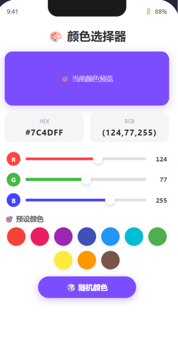
// ========== 1. 标题 ==========
Text('🎨 颜色选择器')
.fontSize(28)
.fontWeight(FontWeight.Bold)
.margin({ top: 30 })
// ========== 2. 颜色预览区域 ==========
// 🩵 实时显示当前颜色
ColorPreview({ color: this.rgbString })
// ========== 3. 色值展示 ==========
// 显示 HEX 和 RGB 数值
ColorValueDisplay({
hex: this.hexString,
rgb: `(${this.red}, ${this.green}, ${this.blue})`
})
// ========== 4. RGB 滑块控制 ==========
// 每个通道一个滑块
ColorSlider({
label: 'R',
value: this.red,
color: '#FF4444',
onChange: (v: number) => { this.red = v; }
})
ColorSlider({
label: 'G',
value: this.green,
color: '#44BB44',
onChange: (v: number) => { this.green = v; }
})
ColorSlider({
label: 'B',
value: this.blue,
color: '#4444FF',
onChange: (v: number) => { this.blue = v; }
})
// ========== 5. 快捷颜色按钮 ==========
Text('🎯 预设颜色').fontSize(18).fontWeight(FontWeight.Bold)
PresetColors({
onSelect: (r: number, g: number, b: number) => {
this.red = r;
this.green = g;
this.blue = b;
}
})
// ========== 6. 随机颜色按钮 ==========
Button('🎲 随机颜色')
.width(200).height(48)
.backgroundColor('#7C4DFF')
.fontColor(Color.White)
.borderRadius(24)
.onClick(() => {
this.red = Math.floor(Math.random() * 256);
this.green = Math.floor(Math.random() * 256);
this.blue = Math.floor(Math.random() * 256);
})
}
.width('100%')
.padding(20)
}
.width('100%')
.height('100%')
}
}
📌 Slider 组件详解
Slider 是 ArkUI 内置的滑块组件,参数如下:
| 参数 | 类型 | 说明 |
|---|---|---|
value |
number | 当前值 |
min |
number | 最小值(默认 0) |
max |
number | 最大值(默认 100) |
step |
number | 步长(默认 1) |
style |
SliderStyle | InSet(嵌入)/ OutSet(外凸) |
direction |
Axis | Horizontal / Vertical |
onChange |
回调 | 值变化时触发 |
Step 4:颜色预览子组件 — @Prop 单向绑定
// 颜色预览组件 — 使用 @Prop 接受父组件传过来的颜色
@Component
struct ColorPreview {
  @Prop color: string = '#808080';  // 默认灰色

  build() {
    Column({ space: 8 }) {
      // 颜色展示方块
      Stack() {
        // 棋盘格背景(表示透明度区域)
        GridRow() {
          GridCol().backgroundColor('#CCCCCC')
          GridCol().backgroundColor('#FFFFFF')
          GridCol().backgroundColor('#CCCCCC')
          GridCol().backgroundColor('#FFFFFF')
        }

        // 实际颜色覆盖层
        Column()
          .width('100%')
          .height(120)
          .borderRadius(16)
          .backgroundColor(this.color)
      }
      .width('100%')
      .height(120)
      .borderRadius(16)

      Text('🎨 当前颜色预览')
        .fontSize(14)
        .fontColor('#999999')
    }
  }
}
避坑指南①: @Prop 接受的父组件变量必须是 @State(或 @Prop / @Link)装饰的。普通变量传进去,子组件改了不会引起父组件更新。
Step 5:色值展示子组件
@Component
struct ColorValueDisplay {
  @Prop hex: string = '#808080';
  @Prop rgb: string = '(128, 128, 128)';

  build() {
    Row({ space: 16 }) {
      // HEX 值卡片
      Column({ space: 4 }) {
        Text('HEX').fontSize(12).fontColor('#999999')
        Text(this.hex)
          .fontSize(18)
          .fontWeight(FontWeight.Bold)
          .fontColor('#333333')
      }
      .padding(12)
      .backgroundColor('#F5F5F5')
      .borderRadius(12)
      .layoutWeight(1)

      // RGB 值卡片
      Column({ space: 4 }) {
        Text('RGB').fontSize(12).fontColor('#999999')
        Text(this.rgb)
          .fontSize(18)
          .fontWeight(FontWeight.Bold)
          .fontColor('#333333')
      }
      .padding(12)
      .backgroundColor('#F5F5F5')
      .borderRadius(12)
      .layoutWeight(1)
    }
  }
}
Step 6:RGB 滑块子组件
@Component
struct ColorSlider {
  private label: string = 'R';
  private value: number = 0;
  private color: string = '#FF0000';
  private onChange: (value: number) => void = () => {};

  build() {
    Row({ space: 12 }) {
      // 通道标签
      Text(this.label)
        .fontSize(16)
        .fontWeight(FontWeight.Bold)
        .fontColor(this.color)
        .width(24)

      // 滑块主体
      Slider({
        value: this.value,
        min: 0,
        max: 255,
        step: 1
      })
      .width(180)
      .trackThickness(8)
      .blockColor(this.color)
      .trackColor('#E0E0E0')
      .selectedColor(this.color)
      .onChange((v: number) => {
        this.onChange(v);
      })

      // 数值显示
      Text(`${Math.round(this.value)}`)
        .fontSize(16)
        .fontWeight(FontWeight.Medium)
        .fontColor('#666666')
        .width(36)
        .textAlign(TextAlign.End)
    }
    .width('100%')
    .padding({ left: 16, right: 16 })
  }
}
避坑指南②: 这里的 onChange 回调是 private 属性赋值,不是 @State。因为回调逻辑在父组件中(修改 @State red),子组件不需要管理这个状态。传函数作为属性的写法在 ArkUI 中很常见。
Step 7:预设颜色面板
@Component
struct PresetColors {
  private onSelect: (r: number, g: number, b: number) => void = () => {};

  // 预设颜色数组
  private colors: ColorPreset[] = [
    { r: 244, g: 67, b: 54, name: '红色' },
    { r: 233, g: 30, b: 99, name: '粉色' },
    { r: 156, g: 39, b: 176, name: '紫色' },
    { r: 63, g: 81, b: 181, name: '靛蓝' },
    { r: 33, g: 150, b: 243, name: '蓝色' },
    { r: 0, g: 188, b: 212, name: '青色' },
    { r: 76, g: 175, b: 80, name: '绿色' },
    { r: 255, g: 235, b: 59, name: '黄色' },
    { r: 255, g: 152, b: 0, name: '橙色' },
    { r: 121, g: 85, b: 72, name: '棕色' },
  ];

  build() {
    // 使用 Flex 实现自动换行布局
    Flex({
      wrap: FlexWrap.Wrap,
      justifyContent: FlexAlign.SpaceBetween,
      alignContent: FlexAlign.Center
    }) {
      ForEach(this.colors, (item: ColorPreset) => {
        Column({ space: 4 }) {
          Button()
            .width(40).height(40)
            .backgroundColor(`rgb(${item.r}, ${item.g}, ${item.b})`)
            .borderRadius(20)
            .onClick(() => {
              this.onSelect(item.r, item.g, item.b);
            })

          Text(item.name)
            .fontSize(12)
            .fontColor('#999999')
        }
      }, (item: ColorPreset) => `${item.r}-${item.g}-${item.b}`)
    }
    .width('100%')
  }
}

// 预设颜色的数据结构
interface ColorPreset {
  r: number;
  g: number;
  b: number;
  name: string;
}
📌 ForEach 详解
ForEach 是 ArkUI 的 列表渲染 指令:
ForEach(
  arr: any[],              // 数组数据源
  itemGenerator: Function,  // 每一项怎么渲染
  keyGenerator?: Function   // 唯一 key(用于高效 diff 更新)
)
- 类似于 React 的
array.map()或 Vue 的v-for keyGenerator必须返回唯一且稳定的字符串 — 这里用r-g-b组合确保每个颜色按钮有唯一 ID
Step 8:运行效果

🔬 进阶思考:用 Canvas 绘制色相渐变条
如果想做更专业的颜色选择器(像 Photoshop 那样的),你需要用 Canvas 组件手动绘制色相渐变。这里给一个进阶思路:
@Component
struct HueBar {
  private canvasWidth: number = 300;
  private canvasHeight: number = 24;

  build() {
    Canvas(this.canvasContext)
      .width(this.canvasWidth)
      .height(this.canvasHeight)
  }

  private canvasContext: CanvasRenderingContext2D = new CanvasRenderingContext2D();

  // 组件挂载后的绘制逻辑
  aboutToAppear(): void {
    // 🎨 不能在 aboutToAppear 中获取 Canvas 上下文
    // 需要使用 onReady 或 setTimeout
  }

  // 处理 Canvas 初始化完成
  onCanvasReady(): void {
    const ctx = this.canvasContext;
    const width = this.canvasWidth;
    const height = this.canvasHeight;

    // 绘制色相渐变:红→黄→绿→青→蓝→紫→红
    const gradient = ctx.createLinearGradient(0, 0, width, 0);
    gradient.addColorStop(0, '#FF0000');
    gradient.addColorStop(0.17, '#FFFF00');
    gradient.addColorStop(0.33, '#00FF00');
    gradient.addColorStop(0.5, '#00FFFF');
    gradient.addColorStop(0.67, '#0000FF');
    gradient.addColorStop(0.83, '#FF00FF');
    gradient.addColorStop(1.0, '#FF0000');

    ctx.fillStyle = gradient;
    ctx.fillRect(0, 0, width, height);
  }
}
canvas 注意事项:
- Canvas 需要在组件布局完成(
onPageShow或aboutToAppear后)才能获取上下文 - 绘制要放在
onReady回调中 - 每次更新需要手动调用
ctx.clearRect()清除画布
🚨 避坑指南
❌ 坑1:@Prop 传非 @State 变量不更新
// ❌ 错误:普通变量传给 @Prop
private myColor: string = '#FF0000';
// 子组件的 @Prop 只拿到初始值,后续 myColor 变了也不更新

// ✅ 正确:必须是 @State
@State myColor: string = '#FF0000';
❌ 坑2:Slider 未受控(value 不随状态变)
// ❌ 错误:Slider 的 value 绑定到一个固定值
Slider({ value: 128, min: 0, max: 255 })
// 滑块拖动后 value 显示漂移,和 @State 不同步

// ✅ 正确:绑定 @State
@State private red: number = 128;
Slider({ value: this.red, min: 0, max: 255 })
❌ 坑3:ForEach 的 key 不稳定导致界面闪烁
// ❌ 错误:用 index 做 key — 数组顺序变了 key 就变了
ForEach(this.colors, (item, index) => { /* ... */ }, (_, index) => `${index}`)

// ✅ 正确:用数据本身的唯一标识
ForEach(this.colors, (item) => { /* ... */ }, (item) => `${item.r}-${item.g}-${item.b}`)
💡 最佳实践
- @Prop 和 @Link 的选择原则: 子组件只展示用
@Prop,子组件需要修改父数据用@Link。颜色预览只展示,用@Prop;如果做一个独立的调色板组件需要回写颜色值,用@Link。 - 状态提升(Lifting State Up): 所有颜色状态集中在顶层
ColorPicker组件中,子组件通过属性和回调来读写 — 这是 ArkUI 和 React 通用的最佳模式。 - 颜色常量化: 所有颜色值用变量或常量管理,不要在
.fontColor()等 API 中硬编码多次。 - 滑块的 step 设置: RGB 通道 0-255 用
step: 1(整数值);如果是 HSL 模型的色相(0-360)可以用step: 1;饱和度/亮度(0%-100%)可以用step: 0.1。
📚 本章知识点总结
| 知识点 | 难度 | 说明 |
|---|---|---|
| ✅ Slider 组件 | ⭐⭐ | 值绑定、样式、回调 |
| ✅ @Prop / @Link | ⭐⭐⭐ | 父子组件数据传递 |
| ✅ ForEach 列表渲染 | ⭐⭐⭐ | 循环生成 UI + key 管理 |
| ✅ Canvas 基础 | ⭐⭐⭐⭐ | 进阶色相渐变绘制 |
| ✅ 颜色模型(RGB/HEX) | ⭐⭐ | 颜色转换和显示 |
| ✅ Flex 布局 | ⭐⭐ | 预设按钮的自动换行 |
🔗 参考资源
- 官方文档:HarmonyOS 应用开发文档
- 开发者社区:华为开发者论坛
- 欢迎加入开源鸿蒙跨平台社区:https://openharmonycrossplatform.csdn.net/

讨论HarmonyOS开发技术,专注于API与组件、DevEco Studio、测试、元服务和应用上架分发等。
更多推荐

 9
9 0
0- 0


 已为社区贡献9条内容

所有评论(0)