HarmonyOS 弹窗最佳实践:基于 DialogHub 的工程化方案与「喵屿」弹窗场景全解析
HarmonyOS 弹窗最佳实践:基于 DialogHub 的工程化方案与「喵屿」弹窗场景全解析
本文基于 DialogHub v1.1.3(
@hadss/dialoghub),以「喵屿」应用中 14 种弹窗 Builder 的完整实践为实例,系统讲解 DialogHub 的架构原理、核心 API、工程化落地模式与最佳实践。
目录
1. 什么是 DialogHub 以及鸿蒙中弹窗问题
1.1 鸿蒙原生弹窗的痛点
HarmonyOS 提供了多种原生弹窗能力:CustomDialogController、promptAction.openCustomDialog()、bindContextMenu、bindSheet 等。但在实际项目迭代中,开发者会逐渐遇到以下问题:
(1)弹窗与页面生命周期脱节
原生 CustomDialogController 通过构造函数与页面绑定,但页面通过 Navigation 或 router 跳转时,弹窗并不会自动关闭。页面已经离开,弹窗仍然悬浮——这既是一种内存泄漏隐患,也会在返回时造成 UI 状态异常。
(2)弹窗代码分散,缺乏统一管理
一个中等规模的应用通常有 10~30 种弹窗。原生方案下,每种弹窗的创建、配置、显示、关闭逻辑分散在各个页面组件中,缺乏统一的:
- 样式规范(圆角、蒙层效果、动画方向)
- 行为规范(是否模态、是否点击蒙层关闭)
- 生命周期回调(弹出/关闭/销毁钩子)
(3)弹窗层级冲突
当多个弹窗同时触发时(如网络错误弹窗 + 操作确认弹窗),原生方案缺乏层级管理能力——哪个弹窗在上层?按什么优先级排列?Back 键应关闭哪个?这些问题需要业务代码自行处理。
(4)缺乏模板复用机制
项目中大量弹窗共享相同的结构模式(标题 + 内容 + 双按钮 / 标题 + 内容 + 单按钮),但原生方案每次都需要从零构建 @CustomDialog 或 ComponentContent,无法将"模式"抽象为可复用的模板。
1.2 DialogHub 是什么
DialogHub(@hadss/dialoghub)是 ArkUI 通用弹窗解决方案,已开源至 OpenHarmony 三方库中心仓(Apache-2.0 许可证)。它不是对原生弹窗 API 的简单封装,而是在原生能力之上构建了一套完整的弹窗基础设施:
| 能力层 | 具体功能 |
|---|---|
| 生命周期管理 | 弹窗绑定页面生命周期,页面切换/销毁时自动清理;支持全局生命周期监听 |
| 四种弹窗类型 | CustomDialog(自定义弹窗)、Toast(轻提示)、Popup(气泡弹窗)、Sheet(底部面板) |
| 链式 Builder API | getCustomDialog() → setOperableContent() → setConfig() → setAnimation() → setStyle() → build() → show() |
| 模板系统 | 创建 → 注册 → 复用,支持运行时更新模板内容 |
| 层级管理 | setLayerIndex() 控制 Z 轴顺序,topDialogPriority 定义冲突策略 |
| Back 键分发 | dispatchBackPressToDialog() 自动分发 Back 键到顶层弹窗 |
| 键盘避让 | keyboardAvoidMode 支持 INPUT_AVOID 和 CONTENT_AVOID 两种模式 |
1.3 核心架构
DialogHub 的内部架构遵循 Builder → Proxy → Template → Dialog 的分层模型:
DialogHub (静态入口)
  ├── getCustomDialog() → CustomBuilder → .build() → InfCustomDialog
  ├── getToast()        → ToastBuilder   → .build() → InfToast
  ├── getPopup()        → PopupBuilder   → .build() → InfPopup
  ├── getSheet()        → SheetBuilder   → .build() → InfSheet
  ├── create*Template() → *Template      → .register()
  └── get*Template()    → *Builder       → .build()
- Builder:链式配置器,负责收集参数。继承链:
CustomBuilder → CustomProxy → DialogAdaptorProxy - Proxy:将配置写入
BaseOption/CustomOption对象,其中CustomProxy额外支持setAnimation、setConfig、setLayerIndex、setLevelMode、setLevelUniqueId - Template:将一组配置持久化为命名模板,后续可通过
get*Template(name)快速复用 - Dialog:最终的可操作实例,提供
show()、dismiss()、hide()、updateContent()、updateStyle()等方法
DialogHub.init(uiContext) 初始化时,内部会注册 routerPageUpdate 和 navDestinationSwitch 的 UIObserver 监听,实现弹窗随页面切换自动感知——这是它与原生方案最根本的差异。
2. 快速开始以及常用 API 介绍
2.1 安装与初始化
ohpm i @hadss/dialoghub
import { DialogHub } from '@hadss/dialoghub';

// 在页面入口(EntryAbility 或第一个 @Entry 组件)中初始化
DialogHub.init(this.getUIContext());
2.2 四种弹窗类型速览
| 方法 | 返回 Builder | 构建实例类型 | 典型场景 |
|---|---|---|---|
DialogHub.getCustomDialog() |
CustomBuilder |
InfCustomDialog |
确认框、表单弹窗、信息展示 |
DialogHub.getToast() |
ToastBuilder |
InfToast |
操作结果轻提示 |
DialogHub.getPopup() |
PopupBuilder |
InfPopup |
绑定组件的解释气泡 |
DialogHub.getSheet() |
SheetBuilder |
InfSheet |
底部面板选择器 |
2.3 链式调用 API 详解
2.3.1 setOperableContent — 可操作内容绑定
这是项目中使用最频繁的方法。与 setContent 的区别在于:回调函数接收一个 DialogAction 参数,使 Builder 内部可以主动调用 action.dismiss() 关闭弹窗。
setOperableContent<T extends Object>(
  customContent: WrappedBuilder<[param: T]>,
  interactiveParam: (dialogAction: DialogAction) => T
): this
customContent:通过wrapBuilder(YourBuilderFunction)包装的@Builder函数interactiveParam:工厂函数,接收DialogAction,返回 Builder 所需的参数对象
DialogAction 接口定义:
export interface DialogAction {
  show: () => void;
  dismiss: () => void;
  hide: () => void;
}
典型用法——在参数对象中透传 action,Builder 内部通过 params.action.dismiss() 关闭自身:
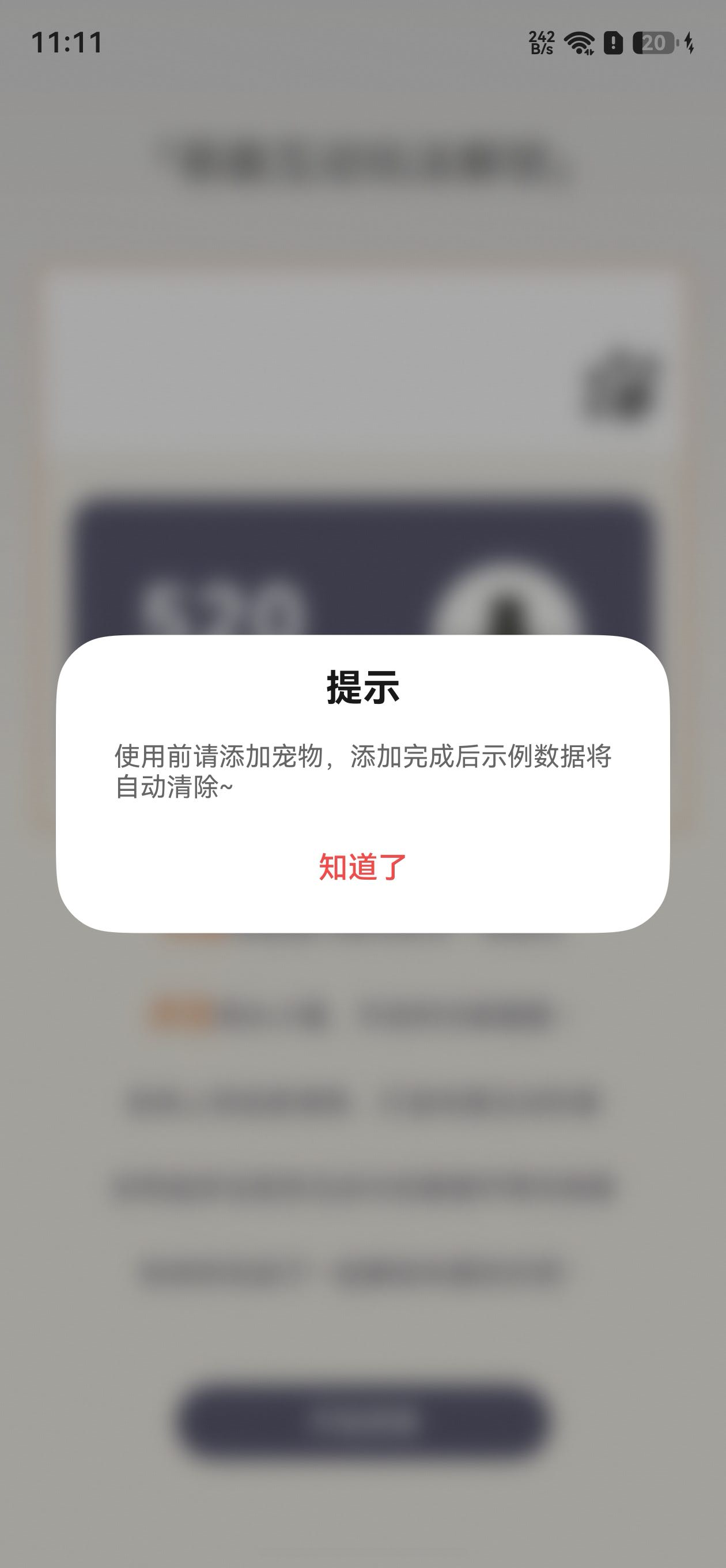
DialogHub.getCustomDialog()
  .setOperableContent(wrapBuilder(AutoCloseBuilder), (action: DialogAction) => {
    return new AutoCloseParams("提示", "使用前请添加宠物", "知道了",
      () => {
        // 业务逻辑...
        action.dismiss();
      })
  })
2.3.2 setConfig — 行为配置
setConfig(config: DialogConfig): this
DialogConfig 结构:
interface DialogConfig {
  dialogBehavior?: DialogBehavior;
  dialogPosition?: DialogPosition;
  dialogMode?: DialogMode;
}

interface DialogBehavior {
  isModal?: boolean;            // 是否模态(是否显示蒙层),默认 true
  autoDismiss?: boolean;        // 点击蒙层是否自动关闭,默认 true
  passThroughGesture?: boolean; // 手势是否穿透到下层页面,默认 false
  keyboardAvoidMode?: CustomKeyboardAvoidMode; // 键盘避让模式
  keyboardAvoidSpace?: Dimension;              // 避让间距
  maskRect?: Rectangle;         // 蒙层区域
  layerPolicy?: DialogLayerPolicy; // 层级策略
  requestFocusWhenShow?: boolean; // 弹出时是否转移焦点
  levelMode?: LevelMode;
  levelUniqueId?: number;
}

interface DialogPosition {
  alignment?: DialogAlignment;  // 对齐方式
  offset?: Offset;              // 偏移量
}
「喵屿」中的标准配置:
// 确认类弹窗 — 不允许点击蒙层关闭
{ dialogBehavior: { isModal: true, autoDismiss: false, passThroughGesture: false } }

// 信息类弹窗 — 允许点击蒙层关闭
{ dialogBehavior: { isModal: true, autoDismiss: true, passThroughGesture: false } }
2.3.3 setAnimation — 动画配置
setAnimation(dialogAnimation: DialogAnimation): this
DialogAnimation 支持两种动画指定方式:
- 枚举值:
AnimationType.NONE/FADE_IN_AND_OUT/BOTTOM_UP/UP_DOWN/LEFT_TO_RIGHT/RIGHT_TO_LEFT - 自定义:直接传入
TransitionEffect对象,实现完全自定义的出入场动画
// 枚举方式(「喵屿」全部使用此方式)
.setAnimation({ dialogAnimation: AnimationType.BOTTOM_UP })

// 自定义 TransitionEffect 方式
.setAnimation({
  dialogAnimation: TransitionEffect.move(TransitionEdge.BOTTOM)
    .animation({ duration: 300, curve: Curve.EaseOut })
    .combine(TransitionEffect.opacity(0))
})
枚举方式内部通过 AnimatorFactory.getAnimationEffect() 将枚举映射为预置的 TransitionEffect,默认 duration 为 300ms。
2.3.4 setStyle — 视觉样式
setStyle(style: DialogStyle): this
DialogStyle 结构:
interface DialogStyle {
  height?: Dimension;
  width?: Dimension;
  radius?: Dimension | BorderRadiuses;        // 圆角
  shadow?: ShadowOptions | ShadowStyle;       // 阴影
  borderWidth?: Dimension | EdgeWidths;       // 边框宽度
  borderColor?: ResourceColor | EdgeColors;   // 边框颜色
  borderStyle?: BorderStyle | EdgeStyles;     // 边框样式
  maskColor?: ResourceColor;                  // 蒙层颜色
  maskBackgroundEffect?: BackgroundEffectOptions; // 蒙层背景效果(模糊等)
  backgroundColor?: ResourceColor;            // 弹窗内容背景色
}
「喵屿」中的标准样式:
.setStyle({
  radius: 32,
  backgroundColor: Color.White, // 或 $r('[resource].color.base_bg')
  maskBackgroundEffect: {
    blurOptions: { grayscale: [50, 50] },
    radius: 10
  }
})
maskBackgroundEffect 实现了毛玻璃蒙层效果——对弹窗背后的内容进行灰度化 + 模糊处理,是项目中所有弹窗统一的视觉语言。
2.3.5 build — 构建实例
build<T>(params?: T): InfCustomDialog
InfCustomDialog 实例方法:
| 方法 | 说明 |
|---|---|
show(): boolean |
显示弹窗 |
dismiss(): boolean |
关闭弹窗 |
hide(): boolean |
隐藏弹窗(不销毁) |
getStatus(): DialogStatus |
获取当前状态 |
updateContent(params): void |
动态更新内容 |
updateStyle(style): void |
动态更新样式 |
updateConfig(config): void |
动态更新配置 |
resetIndex(index): void |
调整层级索引 |
getLayerIndex(): number |
获取当前层级 |
2.3.6 setContent — 不可操作内容绑定
setContent<T extends Object>(customContent: WrappedBuilder<[param: T]>, customParam?: T): this
与 setOperableContent 的区别在于不传递 DialogAction,适用于纯展示型弹窗:
DialogHub.getCustomDialog()
  .setContent(wrapBuilder(TextToastBuilder), new TextToastParams("操作成功"))
  .setConfig({ dialogBehavior: { isModal: true, autoDismiss: true } })
  .build()
  .show()
2.3.7 setLifeCycleListener — 生命周期监听
setLifeCycleListener(lifeCycle: DialogLifeCycle): this
支持监听弹窗的四个生命周期节点:即将弹出、已弹出、即将关闭、已关闭。
2.3.8 模板系统
DialogHub 的模板系统适用于高频复用的弹窗模式:
// 创建并注册模板
DialogHub.createCustomTemplate("confirmTemplate")
  .setContent(wrapBuilder(InfoDialogBuilder))
  .setStyle({ radius: 32, backgroundColor: Color.White })
  .setAnimation({ dialogAnimation: AnimationType.BOTTOM_UP })
  .register()

// 使用时直接获取模板 Builder
DialogHub.getCustomTemplate("confirmTemplate")
  ?.setOperableContent(wrapBuilder(InfoDialogBuilder), (action) => {
    return new InfoDialogParams("提示", "这是一条消息", "知道了", () => action.dismiss())
  })
  .build()
  .show()
模板相关 API 一览:
| 方法 | 说明 |
|---|---|
createCustomTemplate(name) |
创建自定义弹窗模板 |
createToastTemplate(name) |
创建 Toast 模板 |
getCustomTemplate(name) |
获取模板 Builder |
updateCustomTemplate(name) |
更新模板内容 |
removeTemplate(name) |
删除模板 |
isTemplateExist(name) |
查询模板是否存在 |
queryTemplate(name) |
查询模板类型 |
2.4 全局管理 API
| 方法 | 说明 |
|---|---|
DialogHub.getCurrentPageDialogs() |
获取当前页面所有显示中的弹窗 |
DialogHub.getCurrentPageDialogsByStatus(status) |
按状态筛选弹窗 |
DialogHub.dispatchBackPressToDialog() |
分发 Back 键事件到顶层弹窗 |
DialogHub.addEventListener(listener) |
注册全局弹窗事件监听(弹窗数量变化) |
DialogHub.removeEventListener(listener) |
移除监听 |
DialogHub.openLog('DEBUG') |
开启调试日志 |
3. 「喵屿」中的具体应用
「喵屿」共实现了 14 种弹窗 Builder,覆盖确认操作、数据交互、进度展示、好友管理、物品管理、评分引导、更新公告等场景。以下从工程化模式的角度分类介绍。
3.1 标准化弹窗构建模式
项目中所有弹窗遵循统一的 7 步构建链:
// Step 1: 获取 Builder
this.someDialog = DialogHub.getCustomDialog()

  // Step 2: 绑定内容(传递 DialogAction 实现主动关闭)
  .setOperableContent(wrapBuilder(SomeBuilder), (action: DialogAction) => {
    return new SomeParams(/* 业务参数 */, action)
  })

  // Step 3: 配置行为
  .setConfig({
    dialogBehavior: {
      isModal: true,
      autoDismiss: false,      // 确认类:不允许点蒙层关闭
      passThroughGesture: false // 禁止手势穿透
    }
  })

  // Step 4: 配置动画
  .setAnimation({ dialogAnimation: AnimationType.BOTTOM_UP })

  // Step 5: 配置样式(毛玻璃蒙层 + 圆角 + 主题背景)
  .setStyle({
    radius: 32,
    backgroundColor: $r('[resource].color.base_bg'),
    maskBackgroundEffect: {
      blurOptions: { grayscale: [50, 50] },
      radius: 10
    }
  })

  // Step 6: 构建实例
  .build()

// Step 7: 显示
this.someDialog.show()
3.2 两种基础弹窗范式
项目抽象出两种最常用的弹窗结构,覆盖了 80% 以上的弹窗场景。
3.2.1 ActiveCloseBuilder — 双按钮确认范式
适用于需要用户明确选择的操作(删除确认、放弃编辑等):
// ActiveCloseParams 数据模型
export class ActiveCloseParams {
  title: string;           // 标题
  content: string;         // 内容
  leftButton: string;      // 左侧按钮文字(取消)
  rightButton: string;     // 右侧按钮文字(确认)
  onCancel: () => void;    // 取消回调
  action?: () => void;     // 确认回调
  actionColor?: ResourceColor; // 确认按钮颜色,默认 #f24b49(红色警示)

  constructor(title: string, content: string, leftButton: string, rightButton: string,
    onCancel: () => void, action?: () => void, actionColor?: ResourceColor) {
    // ...
  }
}
弹窗内容组件使用 @Component + 交错入场动画:
@Component
struct ActiveCloseContent {
  @Prop title: string = '';
  @Prop content: string = '';
  @Prop leftButton: string = '';
  @Prop rightButton: string = '';
  @Prop actionColor: ResourceColor = '#f24b49';
  onCancel: () => void = () => {};
  action?: () => void;
  @State isShow: boolean = false;

  aboutToAppear(): void {
    this.isShow = true
  }

  build() {
    Column() {
      // 标题:350ms 动画,无延迟
      Text(this.title)
        .fontWeight(FontWeight.Bold).fontSize(20)
        .opacity(this.isShow ? 1 : 0)
        .translate({ y: this.isShow ? 0 : 12 })
        .animation({ duration: 350, delay: 0, curve: Curve.EaseOut })

      // 内容:延迟 60ms 入场
      Text(this.content)
        .fontSize(14)
        .opacity(this.isShow ? 1 : 0)
        .translate({ y: this.isShow ? 0 : 12 })
        .animation({ duration: 350, delay: 60, curve: Curve.EaseOut })

      // 双按钮:延迟 120ms 入场,SpaceBetween 分布
      Row() {
        Button(this.leftButton, { type: ButtonType.Capsule })
          .onClick(() => {
            VibrateUtil.buttonVibrate(VibrateEffect.soft)
            this.onCancel();
          })
        Button(this.rightButton, { type: ButtonType.Capsule })
          .onClick(() => {
            VibrateUtil.buttonVibrate(VibrateEffect.soft)
            this.action?.();
          })
      }
      .width('100%')
      .justifyContent(FlexAlign.SpaceBetween)
      .opacity(this.isShow ? 1 : 0)
      .translate({ y: this.isShow ? 0 : 10 })
      .animation({ duration: 350, delay: 120, curve: Curve.EaseOut })
    }
    .width(328)
    .padding({ left: 16, right: 16 })
  }
}

@Builder
export function ActiveCloseBuilder(params: ActiveCloseParams) {
  ActiveCloseContent({
    title: params.title,
    content: params.content,
    leftButton: params.leftButton,
    rightButton: params.rightButton,
    actionColor: params.actionColor ?? '#f24b49',
    onCancel: params.onCancel,
    action: params.action
  })
}
入场动画采用 @State isShow + aboutToAppear 模式,三个元素层级以 60ms 间隔依次入场。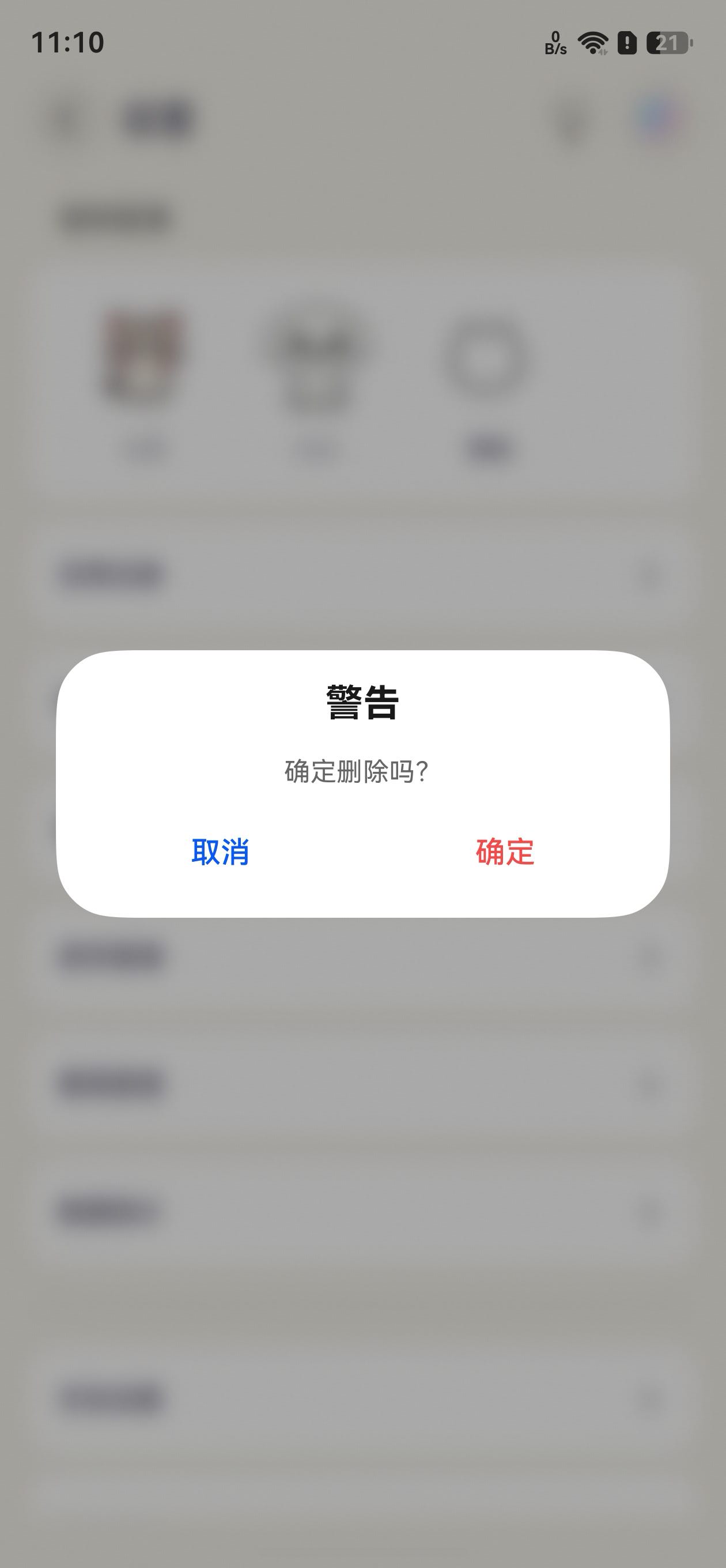
3.2.2 AutoCloseBuilder — 单按钮提示范式
适用于信息提示、操作引导(点击按钮后自动关闭):
export class AutoCloseParams {
  title: string;
  content: string;
  rightButton: string;
  action?: () => void;
  actionColor?: ResourceColor;

  constructor(title: string, content: string, rightButton: string,
    action?: () => void, actionColor?: ResourceColor) {
    // ...
  }
}

@Builder
export function AutoCloseBuilder(params: AutoCloseParams) {
  Column() {
    Text(params.title)
      .height(57)
      .fontWeight(FontWeight.Bold)
      .fontSize(20)
      .fontColor("#e6000000")

    Text(params.content)
      .fontSize(14)
      .fontColor("#99000000")
      .margin({ bottom: 15 })

    Row() {
      Button(params.rightButton, { type: ButtonType.Capsule })
        .onClick(() => {
          VibrateUtil.buttonVibrate(VibrateEffect.soft)
          params.action?.();
        })
    }
    .width('100%').justifyContent(FlexAlign.Center)
  }
  .width(328)
  .padding({ left: 16, right: 16 })
}
与 ActiveCloseBuilder 的关键差异:
| 维度 | ActiveCloseBuilder | AutoCloseBuilder |
|---|---|---|
| 按钮数量 | 双按钮(左取消 + 右确认) | 单按钮(居中确认) |
| 按钮分布 | SpaceBetween | Center |
| 入口动画 | 有(@Component + @State isShow) | 无(纯 @Builder) |
| 适用场景 | 需用户明确选择的破坏性操作 | 信息提示、操作引导 |
| 取消路径 | 左按钮 → onCancel() | 无(用户可点蒙层关闭或等待 autoDismiss) |
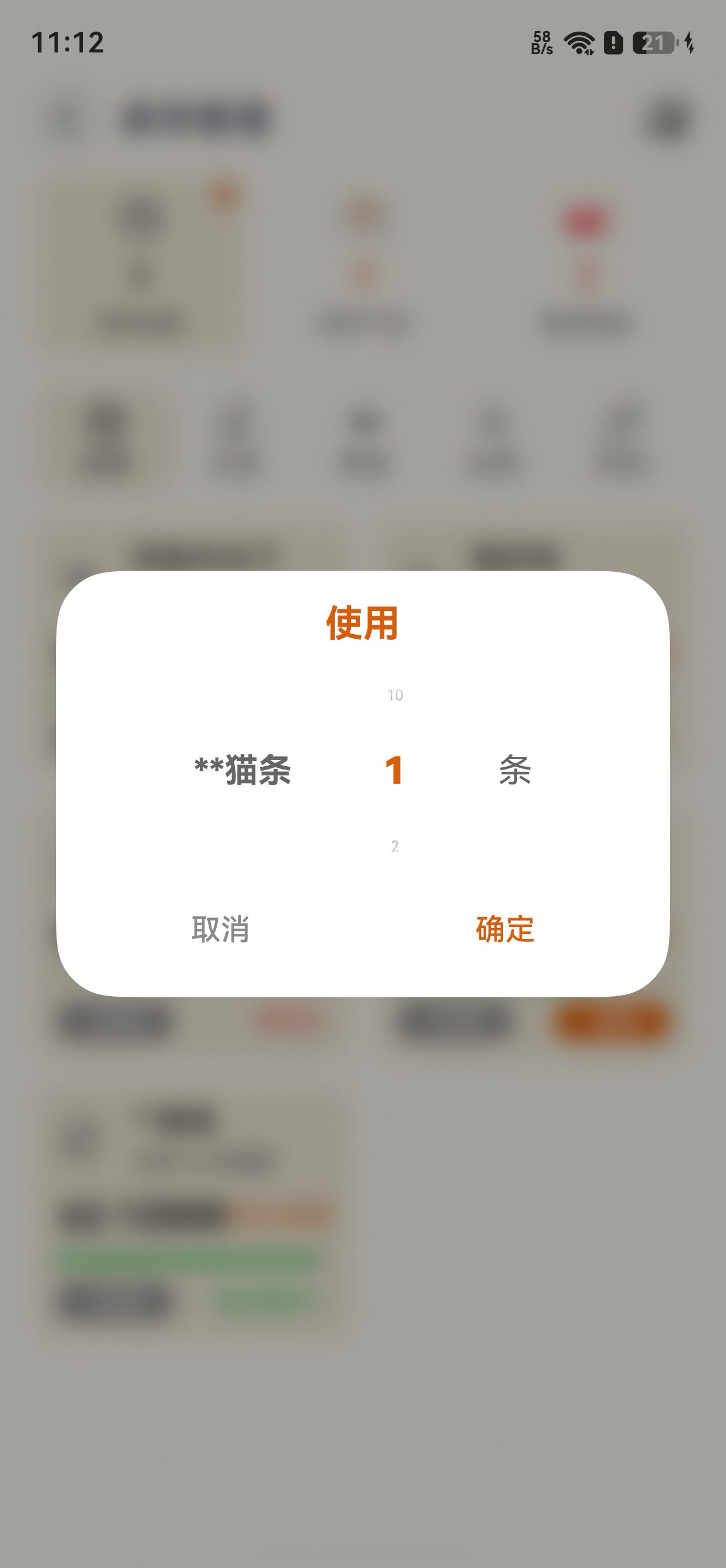
3.3 带数据交互的弹窗 — ItemDialogBuilder
ItemDialogBuilder.ets 展示了 DialogHub 与复杂 UI 组件(TextPicker、TextInput)的集成模式——弹窗不仅是"提示",而是轻量级的表单交互容器:
import { DialogAction } from '@hadss/dialoghub';

export class ItemDialogParams {
  item: ItemShow
  action: DialogAction       // 透传 DialogAction 实现弹窗内关闭
  index: number = 1
  consume: number = 0
  promptAction: PromptAction // 用于弹窗内 Toast 提示

  constructor(item: ItemShow, action: DialogAction, promptAction: PromptAction) {
    this.item = item
    this.action = action
    this.promptAction = promptAction
  }
}

@Builder
export function ItemConsumeDialogBuilder(params: ItemDialogParams) {
  Column() {
    Text("使用")
      .height(57)
      .fontWeight(FontWeight.Bold)
      .fontSize(20)
      .fontColor($r("[resource].color.orange"))

    Row({ space: 5 }) {
      Text(params.item.name)
        .fontSize(18)
        .maxLines(1)
        .textOverflow({ overflow: TextOverflow.MARQUEE })

      // 非重量单位 → TextPicker 数字选择器
      if (params.item.unit != 'kg' && params.item.unit != 'g') {
        TextPicker({ range: numArray, selected: 0 })
          .onChange((value, index) => {
            params.index = (index instanceof Array ? index[0] : index) + 1;
          })
          .divider(null)
          .height(100).width(100)
      } else {
        // 重量单位 → TextInput 精确输入
        TextInput({ placeholder: "请输入数量" })
          .type(InputType.NUMBER_DECIMAL)
          .backgroundColor(Color.Transparent)
          .maxLength(8)
          .onChange((value) => { params.consume = Number(value) })
          .width(120)
      }

      Text(params.item.unit == 'kg' ? 'g' : params.item.unit)
        .fontSize(18)
    }

    Row() {
      Button("取消", { type: ButtonType.Capsule })
        .onClick(() => {
          VibrateUtil.buttonVibrate(VibrateEffect.soft)
          params.action.dismiss()    // 弹窗内关闭
        })
      Button("确定", { type: ButtonType.Capsule })
        .onClick(() => {
          VibrateUtil.buttonVibrate(VibrateEffect.soft)
          // 数据校验 + 库存扣减
          if (item.remainingStock >= consume) {
            item.remainingStock = preciseSubtract(item.remainingStock, consume)
            ShowItemUpdateUtil.itemsDataDeal()
            emitter.emit(BaseConstants.ITEMS_EVENT)
          } else {
            VibrateUtil.alarmVibrate()
            params.promptAction.showToast({ message: "库存不足" })
          }
          params.action.dismiss()
        })
    }.width('100%').justifyContent(FlexAlign.SpaceBetween)
  }
  .width(328)
  .padding({ left: 16, right: 16, bottom: 16 })
}
设计要点:
params.action透传到 Builder 内部,按钮点击后调用params.action.dismiss()关闭params.promptAction用于弹窗内部的 Toast 提示(库存不足时),避免关闭弹窗后再弹 Toast 的割裂体验emitter.emit通知主页面刷新数据,弹窗操作与页面状态通过事件总线解耦- 根据物品单位动态切换
TextPicker(整数选择)和TextInput(精确小数输入)
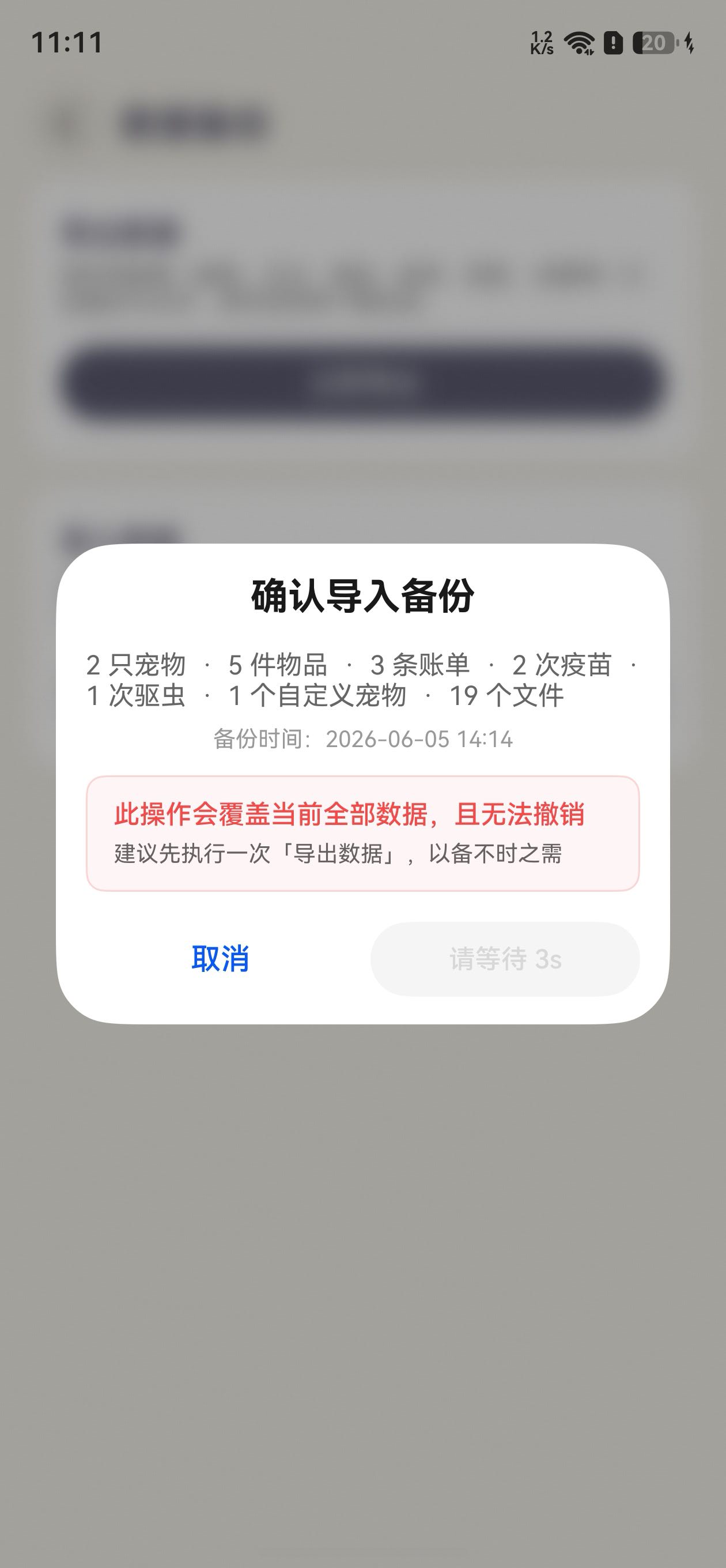
3.4 带倒计时的确认弹窗 — ImportConfirmBuilder
数据导入确认弹窗实现了一个 5 秒强制等待机制——防止用户未阅读警告就匆忙确认:
@Component
struct ImportConfirmContent {
  @State countdown: number = 5;
  @State isShow: boolean = false;
  private timerId?: number;

  aboutToAppear(): void {
    this.isShow = true
    this.timerId = setInterval(() => {
      if (this.countdown > 0) {
        this.countdown--;
      }
      if (this.countdown <= 0 && this.timerId) {
        clearInterval(this.timerId);
        this.timerId = undefined;
      }
    }, 1000);
  }

  aboutToDisappear(): void {
    if (this.timerId) {
      clearInterval(this.timerId);  // 防止内存泄漏
      this.timerId = undefined;
    }
  }

  build() {
    Column() {
      Text('确认导入备份')
        .fontWeight(FontWeight.Bold).fontSize(20)
        .opacity(this.isShow ? 1 : 0)
        .translate({ y: this.isShow ? 0 : 12 })
        .animation({ duration: 350, delay: 0, curve: Curve.EaseOut })

      Text(DataManager.getBackupSummaryText(this.manifest))
        .fontSize(14)
        .opacity(this.isShow ? 1 : 0)
        .translate({ y: this.isShow ? 0 : 12 })
        .animation({ duration: 350, delay: 50, curve: Curve.EaseOut })

      // 红色警告框 — 缩放入场
      Column() {
        Text('此操作会覆盖当前全部数据,且无法撤销')
          .fontSize(14).fontColor('#f24b49').fontWeight(FontWeight.Medium)
        Text('建议先执行一次「导出数据」,以备不时之需')
          .fontSize(12)
      }
      .padding(12)
      .borderRadius(10)
      .backgroundColor('#0df24b49')       // 半透明红色背景
      .border({ width: 1, color: '#33f24b49' })
      .opacity(this.isShow ? 1 : 0)
      .scale({ x: this.isShow ? 1 : 0.95, y: this.isShow ? 1 : 0.95 })
      .animation({ duration: 350, delay: 120, curve: Curve.EaseOut })

      Row() {
        Button('取消', { type: ButtonType.Capsule })
          .onClick(() => {
            VibrateUtil.buttonVibrate(VibrateEffect.soft)
            this.onCancel()
          })

        if (this.countdown > 0) {
          // 倒计时中的禁用按钮
          Button(`请等待 ${this.countdown}s`, { type: ButtonType.Capsule })
            .enabled(false)
        } else {
          // 倒计时结束后的确认按钮
          Button('确认导入', { type: ButtonType.Capsule })
            .fontColor('#f24b49')
            .onClick(() => {
              VibrateUtil.buttonVibrate(VibrateEffect.soft)
              this.onConfirm()
            })
        }
      }
      .width('100%')
      .justifyContent(FlexAlign.SpaceBetween)
      .opacity(this.isShow ? 1 : 0)
      .translate({ y: this.isShow ? 0 : 10 })
      .animation({ duration: 350, delay: 180, curve: Curve.EaseOut })
    }
    .width(328)
    .padding({ left: 16, right: 16 })
  }
}
关键设计决策:
aboutToDisappear中清除定时器——这是setInterval在弹窗中的标准安全实践- 倒计时中确认按钮为
enabled(false)的禁用态,倒计时结束后替换为可点击按钮,用if/else切换而非enabled属性动态控制,因为两按钮的样式完全不同 - 警告框使用
scale动画(0.95 → 1)而非单纯的translate,增加了"弹出"的强调感
3.5 三种弹窗调用模式
根据对弹窗调用模式,可以归纳出三种实例管理模式:
模式一:存储引用 — 需外部控制关闭
适用于长生命周期弹窗(可能在构建它的方法返回后被其他逻辑关闭):
// Settings.ets — 评分弹窗,需在两个不同回调中关闭
@State reviewDialog?: InfCustomDialog;

showReviewDialog(): void {
  this.reviewDialog = DialogHub.getCustomDialog()
    .setOperableContent(wrapBuilder(ReviewDialogBuilder), (action: DialogAction) => {
      return new ReviewDialogParams(
        () => { action.dismiss(); this.showCommentDialog() },  // 好评 → 跳转系统评论
        () => { action.dismiss(); /* 发邮件 */ },              // 吐槽 → 邮件反馈
        () => { action.dismiss() }                              // 关闭
      )
    })
    .setConfig({ dialogBehavior: { isModal: true, autoDismiss: false, passThroughGesture: false } })
    .setAnimation({ dialogAnimation: AnimationType.BOTTOM_UP })
    .setStyle({
      radius: 32,
      backgroundColor: Color.White,
      maskBackgroundEffect: { blurOptions: { grayscale: [50, 50] }, radius: 10 }
    })
    .build()
  this.reviewDialog.show()
}
模式二:即用即弃 — 不需要外部引用
适用于一次性信息展示弹窗,链式调用到 .build().show() 不再存储引用:
// ItemView.ets — 物品详情弹窗
DialogHub.getCustomDialog()
  .setOperableContent(wrapBuilder(ItemInfoDialogBuilder), (action: DialogAction) => {
    return new ItemInfoDialogParams(this.item, action)
  })
  .setConfig({ dialogBehavior: { isModal: true, autoDismiss: true, passThroughGesture: false } })
  .setAnimation({ dialogAnimation: AnimationType.BOTTOM_UP })
  .setStyle({
    radius: 32,
    backgroundColor: $r('[resource].color.base_bg'),
    maskBackgroundEffect: { blurOptions: { grayscale: [50, 50] }, radius: 10 }
  })
  .build()
  .show()  // 直接 show,不存储引用
模式三:单例复用 — 避免重复构建
适用于可能被频繁触发的弹窗(如编辑页的返回确认):
// AddDiaryView.ets — 返回确认弹窗,使用 ?? 保证只构建一次
this.backDialog = this.backDialog ?? DialogHub.getCustomDialog()
  .setOperableContent(wrapBuilder(ActiveCloseBuilder), (action: DialogAction) => {
    return new ActiveCloseParams("提示", "确定放弃编辑?", "取消", "确定",
      () => action.dismiss(),
      () => { /* 退出逻辑 */; action.dismiss() })
  })
  .setConfig({ dialogBehavior: { isModal: true, autoDismiss: false, passThroughGesture: false } })
  .setAnimation({ dialogAnimation: AnimationType.BOTTOM_UP })
  .setStyle({
    radius: 32,
    backgroundColor: $r('[resource].color.base_bg'),
    maskBackgroundEffect: { blurOptions: { grayscale: [50, 50] }, radius: 10 }
  })
  .build()

// 每次只需 show
this.backDialog.show()
三种模式的适用场景对比:
| 模式 | 特点 | 适用场景 |
|---|---|---|
| 存储引用 | 可外部 .dismiss() / .hide() / .updateContent() |
长生命周期弹窗,需在不同回调中操作 |
| 即用即弃 | 代码最简洁 | 一次性信息弹窗,由 Builder 内部自行关闭 |
| 单例复用 | 避免重复构建开销 | 高频触发弹窗(返回确认、快捷菜单) |
3.6 全局配置常量
Constants.ets 中定义了可复用的弹窗配置常量,减少重复代码:
import { DialogConfig, DialogPosition } from '@hadss/dialoghub';

static readonly CUSTOM_SAMPLE_POSITION: DialogPosition = {
  alignment: DialogAlignment.Bottom,
  offset: { dx: 0, dy: -100 }
};

static readonly CUSTOM_SAMPLE_CONFIG: DialogConfig = {
  dialogPosition: Constants.CUSTOM_SAMPLE_POSITION
};
4. 最佳实践和总结
4.1 与原生方案的协作
DialogHub 不排斥原生弹窗能力。在「喵屿」中:
- bindContextMenu(长按菜单)与 DialogHub 弹窗共用——长按弹出原生 ContextMenu,菜单项点击后通过 DialogHub 弹确认框
- promptAction.showToast() 用于 DialogHub 弹窗内部的轻提示(库存不足等),形成"弹窗内 Toast"的用户体验
- VibrateUtil.buttonVibrate() 作为所有弹窗按钮的统一触感反馈(VibrateUtil)
这种分层协作模式——既利用了 DialogHub 的生命周期管理优势,又保留了原生 API 的简洁性。
4.2 Builder 设计原则
(1)参数对象模式。 每个 Builder 配套一个 *Params 类,封装所有入参。Builder 函数通过 wrapBuilder 包装后传入 setOperableContent,回调工厂函数中实例化 Params 并注入 DialogAction。
// 标准模板
export class XxxParams {
  action: DialogAction;
  // ... 业务参数
  constructor(/* 业务参数 */, action: DialogAction) {
    this.action = action;
    // ...
  }
}

@Builder
export function XxxBuilder(params: XxxParams) {
  // 使用 params.action.dismiss() 关闭
}
(2)内容组件与 Builder 函数分离。 需要入场动画的弹窗使用 @Component 承载内容(利用 aboutToAppear 触发 @State isShow),再用独立的 @Builder 函数包装:
@Component struct XxxContent { /* 入场动画逻辑 */ }
@Builder export function XxxBuilder(params) { XxxContent({...}) }
不需要动画的简单弹窗直接使用 @Builder 函数,减少组件开销。
(3)按钮统一触感。 所有按钮的 onClick 首行调用 VibrateUtil.buttonVibrate(VibrateEffect.soft),确认类操作(删除等)使用 VibrateUtil.alarmVibrate()。
4.3 生命周期管理
DialogHub 的页面级生命周期绑定是其核心价值,但在使用中需要注意:
- **
DialogHub.init()使用前需要先初始化。 aboutToDisappear中清理资源。 弹窗内部的setInterval/setTimeout必须在aboutToDisappear中清除,防止弹窗关闭后回调仍然执行。- Back 键分发。 如需统一处理 Back 键(先关闭弹窗,再执行页面返回),可在
onBackPress中调用:
onBackPress(): boolean {
  if (DialogHub.dispatchBackPressToDialog() === DialogBackPressResult.TOP_DIALOG_DISMISSED) {
    return true; // 弹窗消费了 Back 键,阻止页面返回
  }
  return false; // 无弹窗,执行默认返回
}
4.4 视觉一致性
「喵屿」通过统一的 setStyle 配置维护弹窗的视觉一致性:
- 圆角:统一
radius: 32(进度弹窗使用16因为宽度更窄) - 宽度:统一
328(在 Builder 内部设置,不在 DialogHub 的 style 中设置) - 蒙层效果:统一
maskBackgroundEffect: { blurOptions: { grayscale: [50, 50] }, radius: 10 }——灰度 50% + 模糊,使背景内容可辨识但被显著弱化 - 动画:统一
AnimationType.BOTTOM_UP——从底部滑入,符合移动端操作的自然手势方向 - 按钮样式:通过
@Extend(Button) function commonButton()统一按钮尺寸(144×40dp)和字体(16sp, Medium)
4.5 总结
「喵屿」通过 DialogHub 构建了一套标准化、可复用、生命周期安全的弹窗体系。核心收益体现在四个方面:
| 维度 | 原生方案 | DialogHub 方案 |
|---|---|---|
| 生命周期 | 需手动管理弹窗与页面的绑定 | 自动绑定页面,切换/销毁时自动清理 |
| 代码复用 | 每个弹窗独立编写创建逻辑 | ActiveCloseBuilder/AutoCloseBuilder 覆盖 80% 场景,其余 20% 遵循统一 Params+Builder 模式 |
| 样式一致性 | 分散在各页面中,容易偏离规范 | 全局统一的 setStyle + setAnimation + setConfig |
| 维护成本 | 弹窗修改需逐个文件排查 | 基础范式修改一处,所有使用处自动跟随 |
DialogHub 不是替代原生弹窗 API,而是在原生之上构建了工程化基础设施——生命周期绑定、模板复用、层级管理、Back 键分发。对于弹窗超过 10 种的 HarmonyOS 应用,引入 DialogHub 能显著降低弹窗相关的维护成本,同时提升用户体验的一致性。
关键要点回顾:
- 弹窗 Builder 使用 Params +
@Builder函数配对模式,通过DialogAction实现内部主动关闭- 需要入场动画的弹窗使用
@Component+@State isShow模式实现交错动画- 配置遵循 isModal → autoDismiss → passThroughGesture 的决策顺序选择行为模式
- 所有按钮统一接入 VibrateUtil 触感反馈,区分 soft(普通)和 alarm(警示)
setInterval/setTimeout在aboutToDisappear中清理,防止内存泄漏

讨论HarmonyOS开发技术,专注于API与组件、DevEco Studio、测试、元服务和应用上架分发等。
更多推荐

 3
3 0
0- 0


 已为社区贡献19条内容

所有评论(0)