HarmonyOS ArkUI训练营入门-组件掌握系列-Radio 单选组件实现方案-PC版本
·
概述
单选组件是移动应用中常用的交互元素,用于在一组选项中选择唯一的选项。在 HarmonyOS ArkUI 中,虽然 Toggle 组件提供了 ToggleType.Radio 类型,但由于 API 兼容性问题,有时需要自定义实现单选效果。本文将从单选组件的基础概念、自定义实现方案、样式定制、交互处理、实际应用等多个维度,深入讲解单选组件的实现方法。
一、单选组件基础
1.1 单选的概念
单选组件用于在多个选项中选择唯一一个选项,具有以下特点:
| 特点 | 说明 |
|---|---|
| 互斥性 | 同一组中只能选择一个选项 |
| 唯一性 | 每个选项都有唯一的标识 |
| 反馈性 | 选中状态有明确的视觉反馈 |
1.2 适用场景
| 场景 | 示例 |
|---|---|
| 性别选择 | 男、女、其他 |
| 支付方式 | 支付宝、微信、银行卡 |
| 学历选择 | 小学、初中、高中、大学 |
| 优先级选择 | 高、中、低 |
1.3 实现方式对比
| 实现方式 | 优点 | 缺点 | 适用场景 |
|---|---|---|---|
| ToggleType.Radio | 官方支持,简单 | API 兼容性问题 | API Level 较高的项目 |
| 自定义实现 | 兼容性好,灵活 | 需要自己处理逻辑 | 所有项目 |
二、自定义单选组件实现
2.1 核心思路
通过状态变量跟踪选中项的索引,点击时更新索引并重新渲染:
@Entry
@Component
struct CustomRadio {
  @State selectedIndex: number = -1;
  private options: string[] = ['选项1', '选项2', '选项3'];

  build() {
    Column() {
      ForEach(this.options, (option: string, index: number) => {
        Row() {
          Text(this.selectedIndex === index ? '◉' : '○')
            .fontSize(18)
            .fontColor(this.selectedIndex === index ? '#0A59F7' : '#999999')
          Text(option)
            .fontSize(14)
            .margin({ left: 8 })
        }
        .padding(12)
        .backgroundColor(this.selectedIndex === index ? '#EAF4FF' : '#F5F5F5')
        .borderRadius(8)
        .onClick(() => {
          this.selectedIndex = index;
        })
      })
    }
    .padding(20)
  }
}
2.2 关键代码解析
// 状态变量,存储选中项的索引
@State selectedIndex: number = -1;

// 渲染选项列表
ForEach(this.options, (option: string, index: number) => {
  Row() {
    // 单选按钮图标
    Text(this.selectedIndex === index ? '◉' : '○')
      .fontSize(18)
      .fontColor(this.selectedIndex === index ? '#0A59F7' : '#999999')

    // 选项文字
    Text(option)
      .fontSize(14)
      .margin({ left: 8 })
  }
  .padding(12)
  .backgroundColor(this.selectedIndex === index ? '#EAF4FF' : '#F5F5F5')
  .borderRadius(8)
  .onClick(() => {
    // 点击时更新选中索引
    this.selectedIndex = index;
  })
})
2.3 基础示例
@Entry
@Component
struct BasicRadio {
  @State selectedGender: number = 0;
  private genders: string[] = ['男', '女', '其他'];

  build() {
    Column() {
      Text('选择性别')
        .fontSize(18)
        .fontWeight(FontWeight.Bold)
        .margin({ bottom: 16 })

      Row() {
        ForEach(this.genders, (label: string, idx: number) => {
          Row() {
            Text(this.selectedGender === idx ? '◉' : '○')
              .fontSize(20)
              .fontColor(this.selectedGender === idx ? '#0A59F7' : '#999999')
            Text(label)
              .fontSize(14)
              .margin({ left: 6 })
              .fontColor(this.selectedGender === idx ? '#0A59F7' : '#333333')
          }
          .padding({ left: 12, right: 12, top: 8, bottom: 8 })
          .backgroundColor(this.selectedGender === idx ? '#EAF4FF' : '#FFFFFF')
          .borderRadius(20)
          .borderWidth(1)
          .borderColor(this.selectedGender === idx ? '#0A59F7' : '#E5E5E5')
          .margin({ right: 12 })
          .onClick(() => {
            this.selectedGender = idx;
          })
        })
      }
    }
    .padding(20)
  }
}
三、样式定制
3.1 圆形单选样式
创建圆形的单选按钮样式:
@Entry
@Component
struct CircleRadio {
  @State selectedIndex: number = -1;
  private options: string[] = ['选项A', '选项B', '选项C'];

  build() {
    Column() {
      ForEach(this.options, (option: string, index: number) => {
        Row() {
          // 圆形单选按钮
          Stack() {
            Circle()
              .width(20)
              .height(20)
              .fill(this.selectedIndex === index ? '#0A59F7' : '#FFFFFF')
              .stroke(this.selectedIndex === index ? '#0A59F7' : '#999999')
              .strokeWidth(2)

            if (this.selectedIndex === index) {
              Circle()
                .width(8)
                .height(8)
                .fill('#FFFFFF')
            }
          }
          Text(option)
            .fontSize(14)
            .fontColor(this.selectedIndex === index ? '#0A59F7' : '#333333')
            .margin({ left: 8 })
        }
        .padding(12)
        .backgroundColor('#FFFFFF')
        .borderRadius(8)
        .onClick(() => {
          this.selectedIndex = index;
        })
      })
    }
    .padding(20)
    .width('100%')
    .height('100%')
    .backgroundColor('#F5F5F5')
  }
}
3.2 卡片式单选样式
创建卡片式的单选效果:
@Entry
@Component
struct CardRadio {
  @State selectedIndex: number = -1;
  private options: { label: string; desc: string; icon: string }[] = [
    { label: '支付宝', desc: '安全快捷', icon: '💰' },
    { label: '微信支付', desc: '方便易用', icon: '💬' },
    { label: '银行卡', desc: '大额支付', icon: '💳' }
  ];

  build() {
    Column() {
      Text('选择支付方式')
        .fontSize(18)
        .fontWeight(FontWeight.Bold)
        .margin({ bottom: 16 })

      ForEach(this.options, (option, index: number) => {
        Row() {
          Text(option.icon)
            .fontSize(24)

          Column() {
            Text(option.label)
              .fontSize(16)
              .fontWeight(FontWeight.Medium)
              .fontColor(this.selectedIndex === index ? '#0A59F7' : '#333333')
            Text(option.desc)
              .fontSize(12)
              .fontColor('#999999')
              .margin({ top: 4 })
          }
          .layoutWeight(1)
          .margin({ left: 12 })
          .alignItems(HorizontalAlign.Start)

          Text(this.selectedIndex === index ? '✓' : '')
            .fontSize(20)
            .fontColor('#0A59F7')
        }
        .width('100%')
        .padding(16)
        .backgroundColor(this.selectedIndex === index ? '#EAF4FF' : '#FFFFFF')
        .borderRadius(12)
        .borderWidth(2)
        .borderColor(this.selectedIndex === index ? '#0A59F7' : 'transparent')
        .margin({ bottom: 12 })
        .onClick(() => {
          this.selectedIndex = index;
        })
      })
    }
    .padding(20)
  }
}
3.3 分段式单选样式
创建分段式的单选效果:
@Entry
@Component
struct SegmentRadio {
  @State selectedIndex: number = 0;
  private options: string[] = ['低', '中', '高'];

  build() {
    Column() {
      Text('选择优先级')
        .fontSize(18)
        .fontWeight(FontWeight.Bold)
        .margin({ bottom: 16 })

      Stack() {
        // 背景
        Row() {
          ForEach(this.options, () => {
            Column()
              .layoutWeight(1)
          })
        }
        .width('100%')
        .height(44)
        .backgroundColor('#F5F5F5')
        .borderRadius(22)

        // 选中指示器
        Row()
          .width('33.33%')
          .height(40)
          .backgroundColor('#0A59F7')
          .borderRadius(20)
          .position({ left: this.selectedIndex * 33.33 + '%' })
          .translate({ x: -160 })

        // 选项文字
        Row() {
          ForEach(this.options, (option: string, index: number) => {
            Text(option)
              .fontSize(14)
              .fontWeight(FontWeight.Medium)
              .fontColor(this.selectedIndex === index ? '#FFFFFF' : '#666666')
              .layoutWeight(1)
              .textAlign(TextAlign.Center)
              .onClick(() => {
                this.selectedIndex = index;
              })
          })
        }
        .width('100%')
        .height(44)
      }
    }
    .padding(20)
  }
}
3.4 完整样式示例
@Entry
@Component
struct CompleteRadioStyle {
  @State selectedIndex: number = 1;
  private options: { label: string; icon: string; color: string }[] = [
    { label: '初级', icon: '🌱', color: '#34C759' },
    { label: '中级', icon: '🌿', color: '#FF9500' },
    { label: '高级', icon: '🌳', color: '#FF3B30' }
  ];

  build() {
    Column() {
      Text('选择难度等级')
        .fontSize(20)
        .fontWeight(FontWeight.Bold)
        .margin({ bottom: 20 })

      Row() {
        ForEach(this.options, (option, index: number) => {
          Column() {
            Text(option.icon)
              .fontSize(32)
            Text(option.label)
              .fontSize(14)
              .fontColor(this.selectedIndex === index ? '#FFFFFF' : '#666666')
              .margin({ top: 8 })
          }
          .width(100)
          .height(100)
          .backgroundColor(this.selectedIndex === index ? option.color : '#F5F5F5')
          .borderRadius(16)
          .alignItems(HorizontalAlign.Center)
          .justifyContent(FlexAlign.Center)
          .margin({ right: index < this.options.length - 1 ? 12 : 0 })
          .onClick(() => {
            this.selectedIndex = index;
          })
        })
      }
    }
    .padding(20)
    .width('100%')
    .height('100%')
    .backgroundColor('#FFFFFF')
    .justifyContent(FlexAlign.Center)
  }
}
四、交互处理
4.1 点击事件
处理单选按钮的点击事件:
@Entry
@Component
struct ClickRadio {
  @State selectedIndex: number = -1;
  private options: string[] = ['选项1', '选项2', '选项3'];

  build() {
    Column() {
      ForEach(this.options, (option: string, index: number) => {
        Row() {
          Text(this.selectedIndex === index ? '◉' : '○')
            .fontSize(18)
            .fontColor(this.selectedIndex === index ? '#0A59F7' : '#999999')
          Text(option)
            .fontSize(14)
            .margin({ left: 8 })
        }
        .padding(12)
        .backgroundColor(this.selectedIndex === index ? '#EAF4FF' : '#F5F5F5')
        .borderRadius(8)
        .onClick(() => {
          // 更新选中索引
          this.selectedIndex = index;
          console.info('选中:' + option);
        })
      })
    }
    .padding(20)
  }
}
4.2 选中状态监听
监听选中状态的变化:
@Entry
@Component
struct RadioListener {
  @State selectedIndex: number = -1;
  @State selectedValue: string = '';
  private options: string[] = ['苹果', '香蕉', '橙子'];

  updateSelection(index: number) {
    this.selectedIndex = index;
    this.selectedValue = this.options[index];
    // 可以在这里发送网络请求或保存数据
  }

  build() {
    Column() {
      Text('选中:' + (this.selectedValue || '未选择'))
        .fontSize(16)
        .fontColor('#0A59F7')
        .margin({ bottom: 16 })

      ForEach(this.options, (option: string, index: number) => {
        Row() {
          Text(this.selectedIndex === index ? '◉' : '○')
            .fontSize(18)
            .fontColor(this.selectedIndex === index ? '#0A59F7' : '#999999')
          Text(option)
            .fontSize(14)
            .margin({ left: 8 })
        }
        .padding(12)
        .backgroundColor(this.selectedIndex === index ? '#EAF4FF' : '#F5F5F5')
        .borderRadius(8)
        .onClick(() => {
          this.updateSelection(index);
        })
      })
    }
    .padding(20)
  }
}
4.3 禁用状态
实现禁用状态的单选按钮:
@Entry
@Component
struct DisabledRadio {
  @State selectedIndex: number = 0;
  @State isDisabled: boolean = false;
  private options: string[] = ['选项1', '选项2', '选项3'];

  build() {
    Column() {
      Toggle({ type: ToggleType.Switch, isOn: this.isDisabled })
        .margin({ bottom: 16 })
        .onChange((isOn: boolean) => {
          this.isDisabled = isOn;
        })

      ForEach(this.options, (option: string, index: number) => {
        Row() {
          Text(this.selectedIndex === index ? '◉' : '○')
            .fontSize(18)
            .fontColor(this.isDisabled ? '#CCCCCC' : (this.selectedIndex === index ? '#0A59F7' : '#999999'))
          Text(option)
            .fontSize(14)
            .margin({ left: 8 })
            .fontColor(this.isDisabled ? '#CCCCCC' : '#333333')
        }
        .padding(12)
        .backgroundColor(this.isDisabled ? '#F9F9F9' : (this.selectedIndex === index ? '#EAF4FF' : '#F5F5F5'))
        .borderRadius(8)
        .onClick(() => {
          if (!this.isDisabled) {
            this.selectedIndex = index;
          }
        })
      })
    }
    .padding(20)
  }
}
五、高级用法
5.1 多组单选
在同一页面中实现多组单选:
@Entry
@Component
struct MultiRadioGroup {
  @State gender: number = 0;
  @State education: number = -1;
  private genders: string[] = ['男', '女'];
  private educations: string[] = ['小学', '初中', '高中', '大学'];

  build() {
    Column() {
      // 性别选择
      Text('性别')
        .fontSize(16)
        .fontWeight(FontWeight.Bold)
        .margin({ bottom: 8 })

      Row() {
        ForEach(this.genders, (label: string, idx: number) => {
          Row() {
            Text(this.gender === idx ? '◉' : '○')
              .fontSize(18)
              .fontColor(this.gender === idx ? '#0A59F7' : '#999999')
            Text(label)
              .fontSize(14)
              .margin({ left: 6 })
          }
          .padding({ left: 16, right: 16, top: 8, bottom: 8 })
          .backgroundColor(this.gender === idx ? '#EAF4FF' : '#F5F5F5')
          .borderRadius(20)
          .margin({ right: 12 })
          .onClick(() => {
            this.gender = idx;
          })
        })
      }
      .margin({ bottom: 24 })

      // 学历选择
      Text('学历')
        .fontSize(16)
        .fontWeight(FontWeight.Bold)
        .margin({ bottom: 8 })

      Column() {
        ForEach(this.educations, (label: string, idx: number) => {
          Row() {
            Text(this.education === idx ? '◉' : '○')
              .fontSize(18)
              .fontColor(this.education === idx ? '#0A59F7' : '#999999')
            Text(label)
              .fontSize(14)
              .margin({ left: 8 })
          }
          .width('100%')
          .padding(12)
          .backgroundColor(this.education === idx ? '#EAF4FF' : '#F5F5F5')
          .borderRadius(8)
          .margin({ bottom: 8 })
          .onClick(() => {
            this.education = idx;
          })
        })
      }
    }
    .padding(20)
  }
}
5.2 动态选项
动态生成单选选项:
@Entry
@Component
struct DynamicRadio {
  @State selectedIndex: number = -1;
  @State options: string[] = [];

  aboutToAppear() {
    // 模拟从网络加载选项
    setTimeout(() => {
      this.options = ['选项A', '选项B', '选项C', '选项D'];
    }, 1000);
  }

  build() {
    Column() {
      if (this.options.length === 0) {
        Text('加载中...')
          .fontSize(14)
          .fontColor('#999999')
      } else {
        ForEach(this.options, (option: string, index: number) => {
          Row() {
            Text(this.selectedIndex === index ? '◉' : '○')
              .fontSize(18)
              .fontColor(this.selectedIndex === index ? '#0A59F7' : '#999999')
            Text(option)
              .fontSize(14)
              .margin({ left: 8 })
          }
          .padding(12)
          .backgroundColor(this.selectedIndex === index ? '#EAF4FF' : '#F5F5F5')
          .borderRadius(8)
          .margin({ bottom: 8 })
          .onClick(() => {
            this.selectedIndex = index;
          })
        })
      }
    }
    .padding(20)
  }
}
5.3 单选组件封装
将单选功能封装为独立组件:
@Component
struct RadioGroup {
  private options: string[] = [];
  @State selectedIndex: number = -1;

  build() {
    Column() {
      ForEach(this.options, (option: string, index: number) => {
        Row() {
          Text(this.selectedIndex === index ? '◉' : '○')
            .fontSize(18)
            .fontColor(this.selectedIndex === index ? '#0A59F7' : '#999999')
          Text(option)
            .fontSize(14)
            .margin({ left: 8 })
        }
        .padding(12)
        .backgroundColor(this.selectedIndex === index ? '#EAF4FF' : '#F5F5F5')
        .borderRadius(8)
        .margin({ bottom: 8 })
        .onClick(() => {
          this.selectedIndex = index;
        })
      })
    }
  }
}

@Entry
@Component
struct RadioGroupDemo {
  private genderOptions: string[] = ['男', '女'];
  private payOptions: string[] = ['支付宝', '微信', '银行卡'];

  build() {
    Column() {
      Text('性别选择')
        .fontSize(16)
        .fontWeight(FontWeight.Bold)
        .margin({ bottom: 8 })

      RadioGroup({ options: this.genderOptions })
        .margin({ bottom: 20 })

      Text('支付方式')
        .fontSize(16)
        .fontWeight(FontWeight.Bold)
        .margin({ bottom: 8 })

      RadioGroup({ options: this.payOptions })
    }
    .padding(20)
  }
}
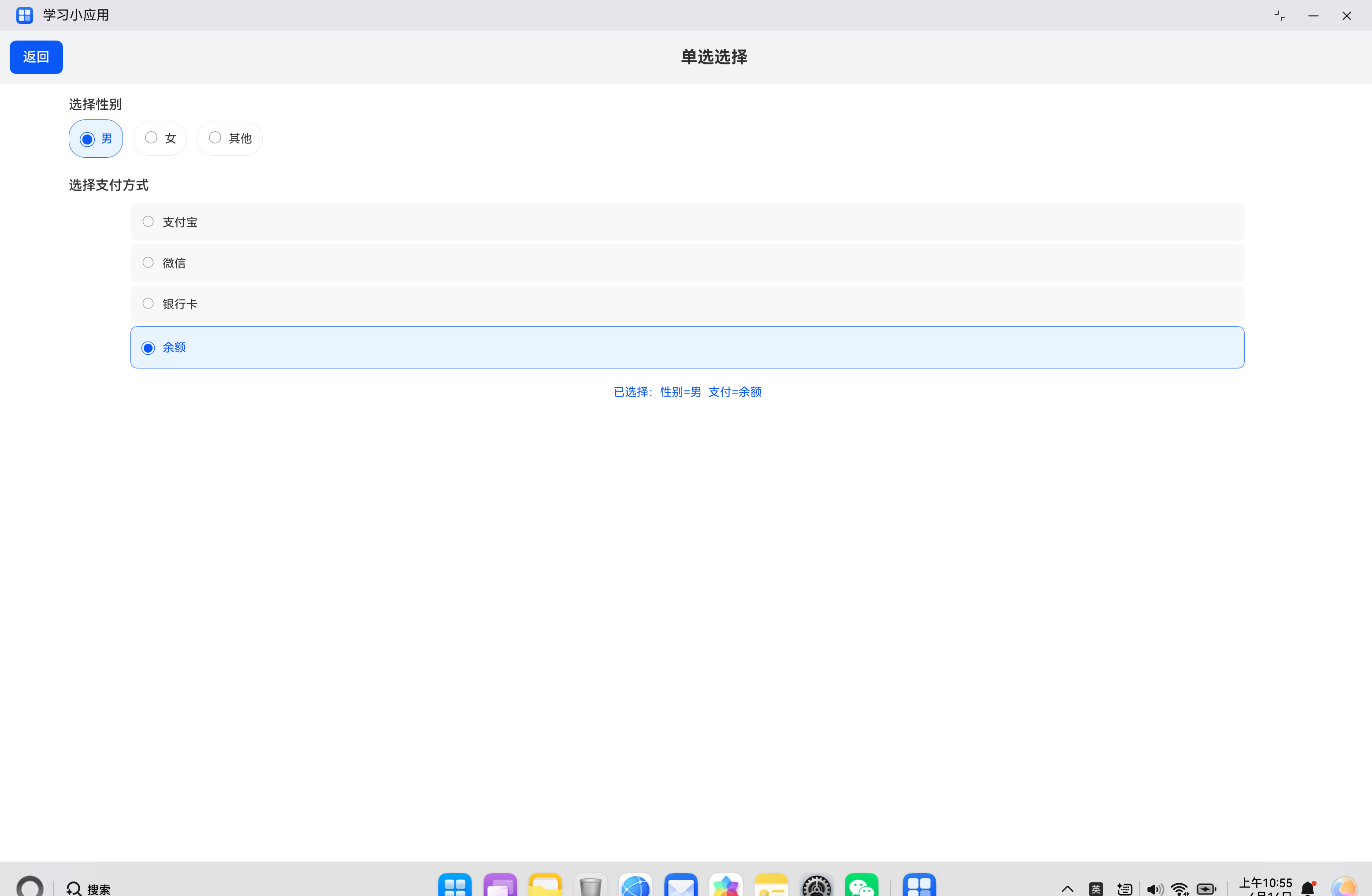
六、实际案例:表单页面
6.1 需求分析
构建一个表单页面,包含:
- 性别选择(水平排列)
- 支付方式选择(垂直排列)
- 选中状态反馈
- 已选择信息汇总
6.2 代码实现
import { router } from '@kit.ArkUI';

@Entry
@Component
struct FormPage {
  @State selectedGender: number = 0;
  @State selectedPay: number = -1;
  private genders: string[] = ['男', '女', '其他'];
  private pays: string[] = ['支付宝', '微信', '银行卡', '余额'];

  build() {
    Column() {
      // 顶部标题栏
      Row() {
        Button('返回')
          .onClick(() => {
            router.back();
          })
        Text('单选选择')
          .fontSize(20)
          .fontWeight(FontWeight.Bold)
          .layoutWeight(1)
          .textAlign(TextAlign.Center)
      }
      .width('100%')
      .padding(12)
      .backgroundColor('#F1F3F5')

      // 表单内容
      Column() {
        // 性别选择
        Text('选择性别')
          .fontSize(16)
          .fontWeight(FontWeight.Medium)
          .margin({ top: 16, bottom: 8 })
          .width('90%')

        Row() {
          ForEach(this.genders, (label: string, idx: number) => {
            Row() {
              Text(this.selectedGender === idx ? '◉' : '○')
                .fontSize(20)
                .fontColor(this.selectedGender === idx ? '#0A59F7' : '#999999')
              Text(label)
                .fontSize(14)
                .margin({ left: 6 })
                .fontColor(this.selectedGender === idx ? '#0A59F7' : '#333333')
            }
            .padding({ left: 12, right: 12, top: 8, bottom: 8 })
            .backgroundColor(this.selectedGender === idx ? '#EAF4FF' : '#FFFFFF')
            .borderRadius(20)
            .borderWidth(1)
            .borderColor(this.selectedGender === idx ? '#0A59F7' : '#E5E5E5')
            .margin({ right: 12 })
            .onClick(() => {
              this.selectedGender = idx;
            })
          })
        }
        .width('90%')

        // 支付方式选择
        Text('选择支付方式')
          .fontSize(16)
          .fontWeight(FontWeight.Medium)
          .margin({ top: 24, bottom: 8 })
          .width('90%')

        Column() {
          ForEach(this.pays, (label: string, idx: number) => {
            Row() {
              Text(this.selectedPay === idx ? '◉' : '○')
                .fontSize(18)
                .fontColor(this.selectedPay === idx ? '#0A59F7' : '#999999')
              Text(label)
                .fontSize(14)
                .margin({ left: 8 })
                .fontColor(this.selectedPay === idx ? '#0A59F7' : '#333333')
            }
            .width('90%')
            .padding(12)
            .margin({ top: 4 })
            .backgroundColor(this.selectedPay === idx ? '#EAF4FF' : '#F8F8F8')
            .borderRadius(8)
            .borderWidth(1)
            .borderColor(this.selectedPay === idx ? '#0A59F7' : 'transparent')
            .onClick(() => {
              this.selectedPay = idx;
            })
          })
        }
        .width('90%')

        // 已选择信息汇总
        Text('已选择:性别=' + this.genders[this.selectedGender] +
          '  支付=' + (this.selectedPay === -1 ? '未选' : this.pays[this.selectedPay]))
          .fontSize(14)
          .fontColor('#0A59F7')
          .margin({ top: 20 })
          .width('90%')
          .textAlign(TextAlign.Center)
      }
      .width('100%')
      .layoutWeight(1)
    }
    .width('100%')
    .height('100%')
    .backgroundColor('#FFFFFF')
  }
}
七、常见问题与解决方案
7.1 选项不响应点击
问题描述:点击选项后没有选中效果。
解决方案:
- 检查是否绑定了
onClick事件 - 确认状态变量使用了
@State装饰器 - 检查点击区域是否足够大
7.2 选中状态不更新
问题描述:点击后选中状态没有变化。
解决方案:
- 检查状态更新逻辑是否正确
- 确认
selectedIndex是否在正确的范围内 - 使用不可变数据模式更新数组
7.3 样式异常
问题描述:选中状态的样式没有正确显示。
解决方案:
- 检查条件判断是否正确
- 确认颜色值是否正确
- 检查边框和背景色设置
八、总结
自定义单选组件是 HarmonyOS ArkUI 开发中的常见需求,通过状态变量和条件渲染可以灵活实现各种单选效果。
核心要点:
- 使用
@State变量跟踪选中项的索引 - 通过条件渲染实现选中和未选中状态的视觉区分
- 在
onClick事件中更新选中索引 - 支持多种样式定制(圆形、卡片式、分段式)
- 可以封装为独立组件复用
希望本文能帮助你更好地理解和实现单选组件,构建出优秀的 HarmonyOS 应用。
参考资料:

讨论HarmonyOS开发技术,专注于API与组件、DevEco Studio、测试、元服务和应用上架分发等。
更多推荐

 4
4 0
0- 0


 已为社区贡献19条内容

所有评论(0)