鸿蒙 PC + Electron 屏幕适配进阶:从手机到车机 / 平板的自适应布局与分辨率兼容技巧
引言:跨设备适配的核心痛点与技术价值
随着鸿蒙(HarmonyOS)生态的全面扩张,其「一次开发、多端部署」的理念已成为开发者的核心诉求,适配场景也从手机、平板、车机延伸至鸿蒙 PC 等桌面终端。而 Electron 作为桌面应用开发的主流框架,凭借 HTML/CSS/JS 的技术栈优势,被广泛用于鸿蒙跨设备应用开发中。但从手机(小屏、触摸交互)、鸿蒙 PC(大屏、鼠标键盘交互、多窗口协同)到平板(中屏、多任务)、车机(特殊宽高比、车载场景交互),不同设备的分辨率、屏幕尺寸、交互方式差异巨大,导致适配过程中频繁出现「布局错乱」「元素溢出」「响应延迟」「交互体验割裂」等问题。
本文将聚焦鸿蒙 Electron 应用的跨设备适配进阶技巧,新增鸿蒙 PC 端适配场景,从适配原则、核心技术、分设备实战、问题排查四个维度,结合大量代码示例与官方文档链接,帮助开发者实现从手机、鸿蒙 PC 到车机 / 平板的无缝适配,让应用在不同设备上均能呈现最佳体验。
本文适用于鸿蒙 3.0+ 版本、Electron 16+ 版本,建议搭配鸿蒙 DevEco Studio 4.0+、Electron Forge 工具链使用。
一、跨设备适配的核心原则与技术底座
1.1 适配的三大核心原则
在开始编码前,需明确鸿蒙 Electron 适配的底层逻辑,避免无方向的「补丁式适配」:
- 弹性布局优先:摒弃固定像素(px)布局,采用相对单位(rem、vw/vh)、Flex/Grid 布局,确保元素尺寸随屏幕变化自适应(鸿蒙 PC 大屏需兼顾不同分辨率下的比例协调);
- 设备特性感知:通过鸿蒙 API 与 Electron 模块获取设备类型(含鸿蒙 PC)、分辨率、屏幕方向、输入设备(鼠标 / 键盘)等信息,动态调整布局与功能;
- 交互场景适配:不仅适配「视觉布局」,更要适配交互逻辑(如手机的触摸手势、鸿蒙 PC 的鼠标悬停 / 键盘快捷键、车机的物理按键、平板的分屏拖拽)。
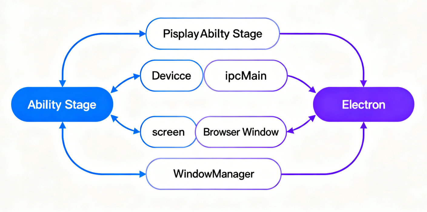
1.2 关键技术底座:鸿蒙 + Electron 适配核心模块
1.2.1 鸿蒙侧核心模块
- Ability Stage 框架:鸿蒙 3.0+ 推荐的应用开发框架,提供
windowStage窗口管理能力,支持多窗口、屏幕适配配置(鸿蒙 PC 端支持窗口缩放、最小化 / 最大化等特性); - DeviceInfo 设备信息 API:获取设备类型(phone/tablet/car/pc)、屏幕分辨率、像素密度(dpi)等关键参数;
- WindowManager 窗口管理:控制窗口大小、位置、全屏 / 分屏 / 窗口化状态,适配鸿蒙 PC 等设备的显示规范。
官方文档链接:鸿蒙 Ability Stage 开发指南、DeviceInfo API 参考
1.2.2 Electron 侧核心模块
- screen 模块:获取屏幕分辨率、显示区域、缩放比例等信息(适配鸿蒙 PC 多显示器场景);
- BrowserWindow 配置:设置窗口最小 / 最大尺寸、是否可缩放、自适应屏幕等属性(鸿蒙 PC 端需支持窗口自由调整大小);
- ipcMain/ipcRenderer:实现主进程(Electron)与渲染进程(HTML/CSS/JS)、鸿蒙原生模块的通信,传递设备适配参数(含鸿蒙 PC 的输入设备信息)。
官方文档链接:Electron screen 模块、BrowserWindow 配置项
二、基础适配:从单位到布局的底层优化
2.1 单位选型:告别 px,拥抱相对单位
固定像素(px)是适配的「天敌」,不同设备的像素密度(dpi)、分辨率差异会导致元素尺寸失真,鸿蒙 PC 的大屏高分辨率场景下该问题更突出。推荐优先使用以下相对单位:
| 单位 | 定义 | 适用场景 |
|---|---|---|
| rem | 相对于根元素(html)的字体大小 | 全局元素尺寸(按钮、文本、卡片,鸿蒙 PC 需兼顾大屏可读性) |
| vw/vh | 相对于视口宽度 / 高度的 1% | 容器布局(页面框架、侧边栏,适配鸿蒙 PC 不同屏幕比例) |
| % | 相对于父元素的尺寸比例 | 子元素自适应(列表项、图标) |
实战代码:rem 单位配置(新增鸿蒙 PC 适配)
/* 渲染进程 CSS:设置根元素字体大小为视口宽度的 1%(适配不同屏幕) */
html {
  font-size: 1vw; /* 1vw = 屏幕宽度的 1%,如 1080px 屏幕下 1rem = 10.8px */
}

/* 适配小屏幕(手机):调整根字体大小,避免元素过小 */
@media screen and (max-width: 768px) {
  html {
    font-size: 1.5vw; /* 手机屏幕下放大 rem 单位,确保按钮、文本可点击/可读 */
  }
}

/* 适配鸿蒙PC(大屏):优化字体大小,兼顾可读性与布局紧凑性 */
@media screen and (min-width: 1280px) and (max-width: 2560px) {
  html {
    font-size: 0.9vw; /* 鸿蒙PC常见分辨率(1920x1080/2560x1440)下平衡尺寸 */
  }
}

/* 适配车机(宽屏):限制最大字体大小,避免元素过大 */
@media screen and (min-width: 1920px) {
  html {
    font-size: 12px; /* 车机屏幕宽度通常 >1920px,固定最大字体大小 */
  }
}

/* 适配鸿蒙PC 4K分辨率(3840x2160):避免字体过大 */
@media screen and (min-width: 3840px) {
  html {
    font-size: 0.8vw; /* 4K大屏下缩小基准值,保持布局协调 */
  }
}

/* 组件样式示例:使用 rem 单位 */
.button {
  width: 8rem;
  height: 2.5rem;
  font-size: 1.1rem;
  padding: 0.5rem 1rem;
}

.card {
  width: 25rem;
  height: 15rem;
  margin: 1rem;
}
补充:鸿蒙 PC 像素密度适配
鸿蒙 PC 设备多为高清屏(dpi 较高),需通过 Electron 的 screen 模块获取设备像素比(devicePixelRatio),优化图片与 UI 清晰度:
// Electron 主进程:获取设备像素比,传递给渲染进程
const { screen, ipcMain } = require('electron');

ipcMain.handle('get-device-pixel-ratio', () => {
  const primaryDisplay = screen.getPrimaryDisplay();
  return primaryDisplay.scaleFactor; // 返回设备像素比(如 2.0 表示高清屏)
});

// 渲染进程:根据像素比调整图片尺寸(鸿蒙PC高清屏优化)
const { ipcRenderer } = require('electron');

async function initImageAdaptation() {
  const pixelRatio = await ipcRenderer.invoke('get-device-pixel-ratio');
  const images = document.querySelectorAll('img');
  images.forEach(img => {
    // 高清屏(pixelRatio > 1)使用 2x/3x 图片,避免模糊(鸿蒙PC常见2x屏)
    if (pixelRatio >= 3) {
      img.src = img.src.replace('.png', '@3x.png');
    } else if (pixelRatio > 1) {
      img.src = img.src.replace('.png', '@2x.png');
    }
    img.style.width = `${img.width / pixelRatio}px`; // 保持显示尺寸一致
  });
}
2.2 布局方案:Flex + Grid 实现弹性布局(新增鸿蒙 PC 适配)
Flex 布局适用于一维布局(行 / 列),Grid 布局适用于二维布局(行列交织),结合媒体查询可完美适配鸿蒙 PC 的大屏多列布局需求。
实战代码 1:Flex 实现鸿蒙 PC 端顶部导航栏适配
<!-- 渲染进程 HTML:顶部导航栏(支持鸿蒙PC鼠标交互) -->
<header class="navbar">
  <div class="logo">鸿蒙 Electron 适配</div>
  <nav class="menu">
    <a href="#" class="menu-item">首页</a>
    <a href="#" class="menu-item">功能</a>
    <a href="#" class="menu-item">设置</a>
  </nav>
  <!-- 鸿蒙PC端专属:快捷键提示 -->
  <div class="pc-shortcut">
    <span>Ctrl+S 保存</span>
    <span>Ctrl+F 搜索</span>
  </div>
</header>
/* 导航栏适配:手机端垂直排列,平板/鸿蒙PC/车机端水平排列 */
.navbar {
  display: flex;
  flex-direction: column; /* 默认垂直排列(手机端) */
  align-items: center;
  padding: 1rem;
  background-color: #1890ff;
  color: white;
}

.menu {
  display: flex;
  flex-direction: column;
  gap: 0.8rem; /* 元素间距,相对单位 */
  margin-top: 1rem;
}

/* 鸿蒙PC端专属快捷键:默认隐藏,PC端显示 */
.pc-shortcut {
  display: none;
  gap: 1.5rem;
  margin-top: 0.5rem;
  font-size: 0.9rem;
  opacity: 0.8;
}

/* 平板端(768px ~ 1280px):水平排列导航栏 */
@media screen and (min-width: 768px) and (max-width: 1280px) {
  .navbar {
    flex-direction: row;
    justify-content: space-between;
    align-items: center;
  }
  .menu {
    flex-direction: row;
    margin-top: 0;
  }
}

/* 鸿蒙PC端(1280px ~ 2560px):优化导航栏间距与交互 */
@media screen and (min-width: 1280px) and (max-width: 2560px) {
  .navbar {
    flex-direction: row;
    justify-content: space-between;
    align-items: center;
    padding: 1.2rem 2.5rem;
  }
  .menu {
    flex-direction: row;
    gap: 2.5rem;
    margin-top: 0;
  }
  .menu-item {
    font-size: 1.1rem;
    padding: 0.5rem 0;
    border-bottom: 2px solid transparent;
    transition: border-color 0.3s; /* 鸿蒙PC鼠标悬停过渡效果 */
  }
  .menu-item:hover {
    border-color: white; /* 鸿蒙PC鼠标悬停高亮 */
  }
  .pc-shortcut {
    display: flex; /* 鸿蒙PC端显示快捷键提示 */
  }
}

/* 车机端(>1280px):扩大导航栏间距,适配宽屏 */
@media screen and (min-width: 1280px) {
  .navbar {
    padding: 1.5rem 3rem;
  }
  .menu {
    gap: 2rem;
  }
  .menu-item {
    font-size: 1.2rem;
  }
}
实战代码 2:Grid 实现鸿蒙 PC 端多列内容布局
<!-- 渲染进程 HTML:内容区域(列表卡片) -->
<main class="content">
  <div class="card">卡片 1</div>
  <div class="card">卡片 2</div>
  <div class="card">卡片 3</div>
  <div class="card">卡片 4</div>
</main>
/* Grid 布局:根据屏幕宽度自动调整列数(适配鸿蒙PC多列需求) */
.content {
  display: grid;
  /* 列宽:最小 20rem,最大 1fr,自动填充 */
  grid-template-columns: repeat(auto-fill, minmax(20rem, 1fr));
  gap: 1.5rem;
  padding: 1rem;
}

.card {
  padding: 1.5rem;
  background-color: white;
  border-radius: 0.5rem;
  box-shadow: 0 2px 8px rgba(0, 0, 0, 0.1);
  transition: box-shadow 0.3s; /* 鸿蒙PC鼠标悬停效果 */
}

/* 鸿蒙PC端卡片鼠标悬停:增强交互反馈 */
@media screen and (min-width: 1280px) {
  .card:hover {
    box-shadow: 0 4px 16px rgba(0, 0, 0, 0.15);
    transform: translateY(-2px); /* 轻微上浮效果 */
  }
}

/* 手机端(<768px):单列布局,优化触摸体验 */
@media screen and (max-width: 768px) {
  .content {
    grid-template-columns: 1fr; /* 强制单列 */
    gap: 1rem;
  }
  .card {
    padding: 1.2rem;
  }
}

/* 鸿蒙PC 4K分辨率(>2560px):优化多列布局 */
@media screen and (min-width: 2560px) {
  .content {
    grid-template-columns: repeat(auto-fill, minmax(22rem, 1fr));
    gap: 2rem;
    max-width: 2800px; /* 限制最大宽度,避免内容过宽 */
    margin: 0 auto; /* 居中显示 */
  }
  .card {
    padding: 1.8rem;
  }
}

/* 车机端(>1920px):固定 4 列布局,适配宽屏 */
@media screen and (min-width: 1920px) {
  .content {
    grid-template-columns: repeat(4, 1fr);
    max-width: 2400px; /* 限制最大宽度,避免内容过宽 */
    margin: 0 auto; /* 居中显示 */
  }
}
2.3 鸿蒙侧窗口配置:适配多设备显示规范(新增鸿蒙 PC 配置)
Electron 应用在鸿蒙设备上的窗口需通过 Ability Stage 框架配置,确保符合不同设备的窗口规范(含鸿蒙 PC 的窗口化管理、多显示器支持):
// 鸿蒙 Ability Stage 代码(index.ets)
import AbilityStage from '@ohos.application.AbilityStage';
import window from '@ohos.window';
import deviceInfo from '@ohos.deviceInfo';

export default class MyAbilityStage extends AbilityStage {
  async onWindowStageCreate(windowStage: window.WindowStage) {
    // 1. 获取设备类型(phone/tablet/car/pc)
    const deviceType = deviceInfo.deviceType;
    console.log('当前设备类型:', deviceType);

    // 2. 根据设备类型配置窗口属性
    let windowOptions = {};
    switch (deviceType) {
      case 'phone':
        // 手机端:全屏显示,禁止缩放
        windowOptions = {
          windowBounds: { width: '100%', height: '100%' },
          resizable: false,
          fullScreen: true
        };
        break;
      case 'tablet':
        // 平板端:默认宽高比 4:3,支持分屏缩放
        windowOptions = {
          windowBounds: { width: '80%', height: '80%' },
          resizable: true,
          minWidth: 768,
          minHeight: 576
        };
        break;
      case 'car':
        // 车机端:固定宽高比 16:9,禁止缩放(适配车载屏幕)
        windowOptions = {
          windowBounds: { width: 1920, height: 1080 },
          resizable: false,
          fullScreen: true
        };
        break;
      case 'pc':
        // 鸿蒙PC端:支持窗口化、缩放,适配多显示器
        windowOptions = {
          windowBounds: { width: '70%', height: '80%' }, // 初始窗口大小
          resizable: true, // 支持窗口缩放
          minWidth: 1024, // 最小宽度(适配PC操作体验)
          minHeight: 768, // 最小高度
          fullScreenable: true, // 支持全屏
          titleBarStyle: 'default' // 显示标题栏(鸿蒙PC窗口规范)
        };
        break;
      default:
        // 其他设备:默认配置
        windowOptions = {
          windowBounds: { width: '80%', height: '80%' },
          resizable: true
        };
    }

    // 3. 加载 Electron 应用(通过 URL 关联)
    await windowStage.loadContent('https://your-electron-app-url', windowOptions);
    await windowStage.show();
  }
}
关键链接:鸿蒙窗口管理开发指南、deviceType 枚举值
三、分设备进阶适配:针对场景的个性化优化
3.1 手机端适配:触摸优先 + 小屏优化(保持原有内容)
3.2 平板端适配:多任务 + 分屏兼容(保持原有内容)
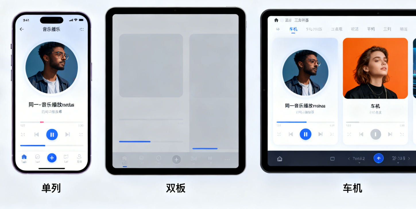
3.3 车机端适配:宽屏 + 车载场景优化(保持原有内容)
3.4 鸿蒙 PC 端适配:大屏精准操作 + 多窗口协同
鸿蒙 PC 端的核心特点是「大屏(1920x1080 及以上)、鼠标键盘交互、多窗口并行、多显示器支持、高分辨率」,适配需重点解决「大屏布局紧凑性」「精准交互反馈」「多窗口协同」「高分辨率兼容」问题:
3.4.1 鸿蒙 PC 交互优化:鼠标与键盘适配
鸿蒙 PC 用户以鼠标键盘为主要输入方式,需优化悬停反馈、快捷键支持、精准点击区域:
/* 鸿蒙PC端交互优化:鼠标悬停与键盘焦点 */
@media screen and (min-width: 1280px) {
  /* 按钮优化:精准点击区域 + 悬停效果 */
  .pc-button {
    min-width: 6rem;
    min-height: 2.2rem;
    padding: 0.5rem 1.2rem;
    cursor: pointer;
    transition: all 0.2s;
  }
  .pc-button:hover {
    background-color: #0f7ae5;
    transform: scale(1.02);
  }
  .pc-button:focus {
    outline: 2px solid #40a9ff;
    outline-offset: 2px;
  }

  /* 输入框优化:适配键盘输入 */
  .pc-input {
    padding: 0.6rem 0.8rem;
    font-size: 1.1rem;
    border: 1px solid #ddd;
    border-radius: 0.3rem;
    transition: border-color 0.2s;
  }
  .pc-input:focus {
    border-color: #1890ff;
    outline: none;
  }

  /* 列表项优化:鼠标悬停高亮 */
  .pc-list-item {
    padding: 0.8rem 1rem;
    transition: background-color 0.2s;
  }
  .pc-list-item:hover {
    background-color: #f0f7ff;
  }
}
// 鸿蒙PC端键盘快捷键适配(渲染进程)
function initPCShortcuts() {
  // 监听键盘事件
  document.addEventListener('keydown', (e) => {
    // Ctrl+S 保存
    if (e.ctrlKey && e.key === 's') {
      e.preventDefault();
      saveData(); // 自定义保存逻辑
      alert('保存成功(Ctrl+S)');
    }
    // Ctrl+F 搜索
    if (e.ctrlKey && e.key === 'f') {
      e.preventDefault();
      document.querySelector('.pc-search-input').focus(); // 聚焦搜索框
    }
    // ESC 关闭弹窗
    if (e.key === 'Escape') {
      const modal = document.querySelector('.modal');
      if (modal) modal.style.display = 'none';
    }
  });
}

// 设备类型判断后初始化PC快捷键
window.addEventListener('message', (event) => {
  if (event.data.type === 'device-info' && event.data.deviceType === 'pc') {
    initPCShortcuts();
  }
});
3.4.2 鸿蒙 PC 多窗口协同
鸿蒙 PC 支持多窗口并行与多显示器扩展,需通过 Electron 与鸿蒙 API 实现窗口管理:
// 鸿蒙PC端:多窗口创建与位置管理(鸿蒙侧)
async function openPCNewWindow(url, position = 'right') {
  const windowStage = await window.getCurrentWindow().windowStage;
  const currentWindow = await window.getCurrentWindow();
  const currentBounds = currentWindow.getBounds(); // 获取当前窗口位置与尺寸

  // 计算新窗口位置(根据当前窗口布局)
  let newBounds = {
    width: currentBounds.width * 0.8,
    height: currentBounds.height * 0.8
  };

  // 位置策略:右侧/下方排列
  if (position === 'right') {
    newBounds.x = currentBounds.x + currentBounds.width + 20;
    newBounds.y = currentBounds.y;
  } else if (position === 'bottom') {
    newBounds.x = currentBounds.x;
    newBounds.y = currentBounds.y + currentBounds.height + 20;
  }

  // 创建新窗口(鸿蒙PC多窗口配置)
  const newWindow = await windowStage.createWindow({
    name: `pc-new-window-${Date.now()}`,
    windowBounds: newBounds,
    resizable: true,
    modal: false, // 非模态窗口,支持并行操作
    titleBarStyle: 'default'
  });

  await newWindow.loadContent(url);
  await newWindow.show();

  // 监听多显示器切换
  const displays = screen.getAllDisplays();
  if (displays.length > 1) {
    // 支持拖动窗口到第二显示器
    newWindow.on('windowPositionChange', (data) => {
      const display = screen.getDisplayNearestPoint({
        x: data.x + newBounds.width / 2,
        y: data.y + newBounds.height / 2
      });
      console.log('当前窗口所在显示器:', display.id);
    });
  }
}

// Electron 主进程:接收PC端打开新窗口请求
ipcMain.on('pc-open-new-window', (event, url, position) => {
  harmonyNative.openPCNewWindow(url, position); // 调用鸿蒙PC原生能力
});

// 渲染进程:PC端按钮绑定打开新窗口
document.querySelector('.pc-open-new-window').addEventListener('click', () => {
  ipcRenderer.send('pc-open-new-window', 'https://your-new-window-url', 'right');
});
3.4.3 鸿蒙 PC 高分辨率适配
鸿蒙 PC 常见分辨率包括 1920x1080(1080P)、2560x1440(2K)、3840x2160(4K),需优化布局与字体适配:
/* 鸿蒙PC不同分辨率适配 */
/* 1080P 分辨率(1920x1080) */
@media screen and (min-width: 1920px) and (max-width: 2560px) {
  .app-container {
    max-width: 1800px;
    margin: 0 auto;
    padding: 1.5rem;
  }
  .pc-title {
    font-size: 1.8rem;
    margin-bottom: 1.2rem;
  }
}

/* 2K 分辨率(2560x1440) */
@media screen and (min-width: 2560px) and (max-width: 3840px) {
  .app-container {
    max-width: 2400px;
    margin: 0 auto;
    padding: 2rem;
  }
  .pc-title {
    font-size: 2rem;
    margin-bottom: 1.5rem;
  }
  .card {
    padding: 1.8rem;
  }
}

/* 4K 分辨率(3840x2160) */
@media screen and (min-width: 3840px) {
  .app-container {
    max-width: 3200px;
    margin: 0 auto;
    padding: 2.5rem;
  }
  .pc-title {
    font-size: 2.2rem;
    margin-bottom: 1.8rem;
  }
  .card {
    padding: 2rem;
    font-size: 1.2rem;
  }
  .pc-button {
    font-size: 1.2rem;
    padding: 0.6rem 1.5rem;
  }
}
关键链接:鸿蒙 PC 应用开发指南、鸿蒙多显示器适配文档
四、分辨率兼容:解决多分辨率下的适配难题(新增鸿蒙 PC 分辨率)
4.1 分辨率适配策略:动态计算与媒体查询结合(补充鸿蒙 PC 分辨率)
鸿蒙设备的分辨率种类繁多(手机:1080x2400、鸿蒙 PC:1920x1080/2560x1440/3840x2160、平板:2000x1200、车机:1920x1080/2560x1440),需通过「媒体查询 + 动态计算」覆盖主流分辨率:
/* 新增鸿蒙PC主流分辨率适配媒体查询 */
/* 鸿蒙PC 1080P(1920x1080) */
@media screen and (min-width: 1920px) and (max-height: 1080px) {
  html {
    font-size: 0.9vw;
  }
  .content {
    gap: 1.8rem;
  }
}

/* 鸿蒙PC 2K(2560x1440) */
@media screen and (min-width: 2560px) and (max-height: 1440px) {
  html {
    font-size: 0.85vw;
  }
  .content {
    gap: 2rem;
    max-width: 2400px;
  }
}

/* 鸿蒙PC 4K(3840x2160) */
@media screen and (min-width: 3840px) {
  html {
    font-size: 0.8vw;
  }
  .content {
    grid-template-columns: repeat(auto-fill, minmax(25rem, 1fr));
    gap: 2.5rem;
    max-width: 3200px;
  }
}

/* 原有其他设备分辨率适配(保持不变) */
/* 手机端低分辨率(如 720x1280) */
@media screen and (max-width: 720px) and (max-height: 1280px) {
  html {
    font-size: 1.8vw; /* 放大字体,确保可读性 */
  }
  .card {
    padding: 1rem;
  }
}
/* ... 其他原有媒体查询 ... */
4.2 图片分辨率适配:多倍图与动态加载(补充鸿蒙 PC 高清图)
鸿蒙 PC 高清屏(2K/4K)对图片清晰度要求更高,需补充 3x 倍图支持:
// 渲染进程:图片动态加载工具函数(新增3x倍图适配鸿蒙PC 4K屏)
function loadResponsiveImage(imgElement, baseUrl) {
  // 获取设备像素比
  const pixelRatio = window.devicePixelRatio || 1;
  let imageUrl = baseUrl;

  // 根据像素比选择对应倍图(适配鸿蒙PC 4K屏3x图)
  if (pixelRatio >= 3) {
    imageUrl = baseUrl.replace(/(\.\w+)$/, '@3x$1'); // 4K屏使用3x图
  } else if (pixelRatio >= 2) {
    imageUrl = baseUrl.replace(/(\.\w+)$/, '@2x$1'); // 2K屏使用2x图
  }

  // 加载图片
  imgElement.src = imageUrl;
  imgElement.alt = '自适应图片';

  // 图片加载失败时降级为1x图
  imgElement.onerror = () => {
    imgElement.src = baseUrl;
  };
}

// 使用示例(鸿蒙PC端Banner图适配)
const pcBanner = document.createElement('img');
loadResponsiveImage(pcBanner, '/images/pc-banner.png'); // 自动适配1x/2x/3x
document.querySelector('.pc-banner').appendChild(pcBanner);
4.3 鸿蒙 + Electron 分辨率同步方案(补充鸿蒙 PC 多显示器同步)
// Electron 主进程:初始化窗口时同步鸿蒙PC分辨率与多显示器
const { BrowserWindow, screen } = require('electron');

function createMainWindow() {
  const primaryDisplay = screen.getPrimaryDisplay();
  const { width, height } = primaryDisplay.workAreaSize; // 获取设备可用屏幕尺寸

  const mainWindow = new BrowserWindow({
    width: width * 0.7, // 鸿蒙PC初始窗口宽度为屏幕70%
    height: height * 0.8, // 初始高度为屏幕80%
    webPreferences: {
      nodeIntegration: true,
      contextIsolation: false
    },
    resizable: true,
    fullscreenable: true,
    titleBarStyle: 'default' // 鸿蒙PC窗口标题栏
  });

  // 加载应用
  mainWindow.loadURL('https://your-electron-app-url');

  // 监听屏幕分辨率变化,同步调整窗口尺寸(适配鸿蒙PC多显示器切换)
  screen.on('display-metrics-changed', (event, display, changedMetrics) => {
    if (changedMetrics.includes('workAreaSize')) {
      const newSize = display.workAreaSize;
      // 若窗口在当前显示器,同步调整尺寸
      const windowDisplay = screen.getDisplayMatching(mainWindow.getBounds());
      if (windowDisplay.id === display.id) {
        mainWindow.setSize(newSize.width * 0.7, newSize.height * 0.8);
      }
    }
  });

  return mainWindow;
}
五、问题排查与调试技巧(新增鸿蒙 PC 常见问题)
5.1 常见适配问题及解决方案(补充鸿蒙 PC 相关问题)
| 问题现象 | 可能原因 | 解决方案 |
|---|---|---|
| 布局错乱、元素溢出 | 固定像素布局、未使用相对单位 | 替换 px 为 rem/vw/vh,使用 Flex/Grid 布局 |
| 高分辨率设备图片模糊 | 未提供多倍图、未适配 devicePixelRatio | 生成 2x/3x 倍图,动态加载对应分辨率图片(鸿蒙 PC 4K 屏需 3x 图) |
| 车机端左右留白过多 | 未适配 16:9 宽高比、未固定最大宽度 | 使用 aspect-ratio 媒体查询,设置 max-width 并居中 |
| 分屏状态下内容挤压 | 未监听窗口尺寸变化 | 注册 windowSizeChange 事件,动态调整布局 |
| 手机端元素过小 / 过大 | rem 单位基准值未适配小屏 | 针对手机端调整 html font-size,使用媒体查询优化 |
| 鸿蒙 PC 窗口缩放后布局错乱 | 未处理窗口 resize 事件 | 监听 window.resize 事件,动态调整 Grid/Flex 布局列数 |
| 鸿蒙 PC 鼠标悬停无反馈 | 未针对 PC 端设置 hover 样式 | 新增媒体查询,为 PC 端元素添加 hover 过渡效果 |
| 鸿蒙 PC 快捷键无效 | 未监听键盘事件或未区分设备类型 | 仅在 PC 端初始化快捷键逻辑,避免影响其他设备 |
| 鸿蒙 PC 多窗口重叠 | 未计算窗口位置 | 基于当前窗口位置动态分配新窗口坐标 |
5.2 调试工具推荐(补充鸿蒙 PC 调试工具)
- 鸿蒙 DevEco Studio 模拟器:支持手机 / 平板 / 车机 / 鸿蒙 PC 多设备模拟,可切换 PC 不同分辨率(1080P/2K/4K);
- Electron DevTools:开启
mainWindow.webContents.openDevTools(),使用 Elements 面板实时调整 CSS(鸿蒙 PC 端可模拟鼠标悬停); - 鸿蒙设备信息工具:通过
deviceInfoAPI 打印设备参数,鸿蒙 PC 端可通过hdc shell dumpsys window查看窗口信息; - CSS 媒体查询调试:Chrome 开发者工具 → More Tools → Rendering → Emulate media features,模拟鸿蒙 PC 不同分辨率;
- 鸿蒙 PC 真机调试:通过 HDC 工具连接鸿蒙 PC 设备,执行
hdc shell am start -n 包名/Ability名启动应用调试。
关键链接:鸿蒙 DevEco Studio 模拟器使用指南、Chrome 媒体查询调试教程、鸿蒙 PC 真机调试文档
六、实战案例:完整的跨设备适配流程(补充鸿蒙 PC 适配)
以「鸿蒙 Electron 音乐播放器」为例,梳理从手机、鸿蒙 PC 到车机 / 平板的适配流程:
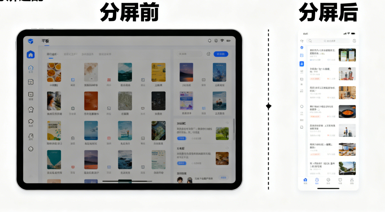
6.1 需求分析(补充鸿蒙 PC 需求)
- 手机端:竖屏为主,底部 Tab 导航,列表式展示歌曲;
- 鸿蒙 PC 端:大屏多列布局,鼠标悬停高亮,键盘快捷键控制(播放 / 暂停、上一曲 / 下一曲),多窗口支持(歌词窗口独立);
- 平板端:横竖屏兼容,分屏状态下隐藏侧边栏,全屏状态显示歌单列表;
- 车机端:16:9 宽屏布局,大字体、大按钮,支持物理按键控制播放 / 暂停。
6.2 核心代码实现(补充鸿蒙 PC 适配代码)
1. 鸿蒙侧设备判断与窗口配置(index.ets)
import AbilityStage from '@ohos.application.AbilityStage';
import window from '@ohos.window';
import deviceInfo from '@ohos.deviceInfo';

export default class MusicAbilityStage extends AbilityStage {
  async onWindowStageCreate(windowStage: window.WindowStage) {
    const deviceType = deviceInfo.deviceType;
    let windowOpts = {};

    switch (deviceType) {
      case 'phone':
        windowOpts = {
          windowBounds: { width: '100%', height: '100%' },
          fullScreen: true,
          resizable: false
        };
        break;
      case 'tablet':
        windowOpts = {
          windowBounds: { width: '85%', height: '90%' },
          resizable: true,
          minWidth: 800,
          minHeight: 600
        };
        break;
      case 'car':
        windowOpts = {
          windowBounds: { width: 1920, height: 1080 },
          fullScreen: true,
          resizable: false
        };
        break;
      case 'pc':
        // 鸿蒙PC端窗口配置
        windowOpts = {
          windowBounds: { width: '70%', height: '80%' },
          resizable: true,
          minWidth: 1024,
          minHeight: 768,
          fullScreenable: true,
          titleBarStyle: 'default'
        };
        break;
    }

    await windowStage.loadContent('https://music-app-url', windowOpts);
    await windowStage.show();

    // 监听窗口变化,传递设备信息给渲染进程(含鸿蒙PC)
    const currentWindow = await window.getCurrentWindow();
    currentWindow.webView.postMessage({
      type: 'device-info',
      deviceType,
      screenSize: currentWindow.getBounds()
    });
  }
}
2. 渲染进程布局适配(CSS,补充鸿蒙 PC 样式)
/* 全局样式 */
html {
  font-size: 1vw;
}

body {
  margin: 0;
  padding: 0;
  font-family: 'HarmonyOS Sans', sans-serif;
  background-color: #f5f5f5;
}

/* 播放器容器 */
.player-container {
  display: flex;
  flex-direction: column;
  height: 100vh;
}

/* 歌曲列表区域 */
.song-list {
  flex: 1;
  overflow-y: auto;
  padding: 1rem;
}

.song-item {
  display: flex;
  align-items: center;
  padding: 1rem;
  margin-bottom: 0.8rem;
  background-color: white;
  border-radius: 0.5rem;
  cursor: pointer;
}

/* 播放控制区域 */
.play-control {
  display: flex;
  justify-content: center;
  align-items: center;
  gap: 2rem;
  padding: 1.5rem;
  background-color: white;
  border-top: 1px solid #eee;
}

.control-btn {
  width: 4rem;
  height: 4rem;
  border-radius: 50%;
  border: none;
  background-color: #1890ff;
  color: white;
  font-size: 1.2rem;
  cursor: pointer;
}

/* 手机端适配 */
@media screen and (max-width: 768px) {
  /* 保持原有样式 */
}

/* 平板端适配 */
@media screen and (min-width: 768px) and (max-width: 1280px) {
  /* 保持原有样式 */
}

/* 鸿蒙PC端适配 */
@media screen and (min-width: 1280px) {
  html {
    font-size: 0.9vw;
  }

  .player-container {
    max-width: 2800px;
    margin: 0 auto;
    flex-direction: row;
    padding: 2rem;
    gap: 2rem;
  }

  .song-list {
    width: 30%;
    padding: 1.8rem;
    border-radius: 0.8rem;
    background-color: white;
    box-shadow: 0 2px 10px rgba(0, 0, 0, 0.05);
  }

  .song-item {
    padding: 1.2rem;
    font-size: 1.1rem;
    gap: 1rem;
    transition: all 0.2s;
  }

  .song-item:hover {
    background-color: #f0f7ff;
    transform: translateX(4px);
  }

  .play-area {
    width: 70%;
    display: flex;
    flex-direction: column;
    justify-content: center;
    align-items: center;
    background-color: white;
    border-radius: 0.8rem;
    padding: 2rem;
    box-shadow: 0 2px 10px rgba(0, 0, 0, 0.05);
  }

  .play-control {
    gap: 3rem;
    padding: 2rem;
    width: 100%;
  }

  .control-btn {
    width: 5rem;
    height: 5rem;
    font-size: 1.5rem;
    transition: all 0.2s;
  }

  .control-btn:hover {
    background-color: #0f7ae5;
    transform: scale(1.05);
  }

  /* 鸿蒙PC专属:歌词窗口按钮 */
  .pc-lyric-btn {
    margin-left: auto;
    width: auto;
    height: auto;
    border-radius: 0.3rem;
    padding: 0.6rem 1.2rem;
    background-color: #f5f5f5;
    color: #333;
  }

  .pc-lyric-btn:hover {
    background-color: #eee;
    transform: none;
  }
}

/* 车机端适配 */
@media screen and (min-width: 1280px) {
  /* 保持原有样式,与PC端通过设备类型区分 */
}
3. 交互适配(JS,补充鸿蒙 PC 交互)
// 渲染进程:设备信息接收与交互适配
let deviceType = 'phone';

window.addEventListener('message', (event) => {
  if (event.data.type === 'device-info') {
    deviceType = event.data.deviceType;
    initDeviceInteraction();
  }
});

// 初始化设备交互
function initDeviceInteraction() {
  if (deviceType === 'car') {
    initCarKeyControl();
  } else if (deviceType === 'tablet') {
    initTabletDrag();
  } else if (deviceType === 'pc') {
    initPCInteraction(); // 鸿蒙PC端交互初始化
  } else {
    initPhoneSwipe();
  }
}

// 鸿蒙PC端交互:鼠标悬停 + 键盘快捷键 + 多窗口
function initPCInteraction() {
  // 键盘快捷键控制
  document.addEventListener('keydown', (e) => {
    switch (e.keyCode) {
      case 32: // 空格键:播放/暂停
        e.preventDefault();
        togglePlay();
        break;
      case 37: // 左箭头:上一曲
        prevSong();
        break;
      case 39: // 右箭头:下一曲
        nextSong();
        break;
      case 27: // ESC:关闭歌词窗口
        const lyricWindow = document.querySelector('.lyric-window');
        if (lyricWindow) lyricWindow.style.display = 'none';
        break;
    }
  });

  // 歌词窗口独立(鸿蒙PC多窗口)
  document.querySelector('.pc-lyric-btn').addEventListener('click', () => {
    ipcRenderer.send('pc-open-new-window', 'https://music-app-url/lyric', 'right');
  });

  // 鼠标悬停歌曲列表高亮(已在CSS中配置,此处补充逻辑)
  document.querySelectorAll('.song-item').forEach(item => {
    item.addEventListener('mouseenter', () => {
      item.style.boxShadow: '0 2px 8px rgba(0, 0, 0, 0.1)';
    });
    item.addEventListener('mouseleave', () => {
      item.style.boxShadow: 'none';
    });
  });
}

// 其他设备交互逻辑(保持原有)
function initCarKeyControl() { /* ... */ }
function initPhoneSwipe() { /* ... */ }
function initTabletDrag() { /* ... */ }
function togglePlay() { /* ... */ }
function prevSong() { /* ... */ }
function nextSong() { /* ... */ }
七、总结与展望
鸿蒙 Electron 跨设备适配的核心是「弹性布局 + 设备感知 + 场景适配」,通过相对单位、Flex/Grid 布局、媒体查询等基础技术,结合鸿蒙原生 API 与 Electron 模块的协同,可实现从手机、鸿蒙 PC 到车机 / 平板的无缝适配。其中,鸿蒙 PC 作为桌面端核心场景,需重点关注大屏布局协调、鼠标键盘交互反馈、多窗口协同与高分辨率兼容,才能为用户提供精准、高效的使用体验。
未来,随着鸿蒙 4.0+ 对跨设备协同能力的增强(如分布式窗口、设备虚拟化),以及 Electron 对鸿蒙生态的深度适配,鸿蒙 PC 端的应用开发将更加高效。开发者需持续关注官方文档更新,结合实际场景灵活运用适配技巧,让应用在不同设备上均能提供一致、优质的用户体验。
欢迎加入开源鸿蒙 PC 社区:https://harmonypc.csdn.net/

讨论HarmonyOS开发技术,专注于API与组件、DevEco Studio、测试、元服务和应用上架分发等。
更多推荐
 25
25 0
0- 0


 已为社区贡献27条内容

所有评论(0)