Stepper 步骤条组件——从基础用法到复杂流程导航的完整指南
文章目录

每日一句正能量
“在力所能及的事情上多做一点,好的机会便会迎面而来。”
机会不是藏在远方的宝藏,而是藏在手头事情的延长线上。做完分内事,顺手帮同事一把;写完报告,多思考一段建议。这一“点”善意和勤勉,往往就是和他人的分水岭,也是机会认出你的信号灯。
摘要
摘要:在移动应用开发中,面对注册开户、订单下单、配置向导等需要分步骤完成的业务场景,如何为用户提供清晰、流畅的流程引导体验,是开发者必须解决的核心问题。HarmonyOS ArkUI 框架提供的 Stepper(步骤导航器) 组件,正是为此类多步骤任务场景量身打造的关键组件。本文将从组件架构、核心 API、基础用法、进阶实战以及性能优化等多个维度,深入剖析 Stepper 组件的完整开发方案,帮助开发者构建专业级的步骤导航体验。
一、引言:为什么需要 Stepper 组件?
在日常应用开发中,我们经常会遇到需要用户按顺序完成多个步骤才能达成目标的场景:
- 用户注册:填写基本信息 → 实名认证 → 绑定手机 → 设置密码 → 完成注册
- 电商下单:选择商品 → 填写收货地址 → 选择支付方式 → 确认订单 → 支付完成
- 设备配网:扫描设备 → 连接 Wi-Fi → 验证设备 → 命名设备 → 配置完成
如果将这些步骤全部堆叠在一个页面中,不仅会造成视觉拥挤、用户认知负担过重,还极易导致操作失误。Stepper 组件通过步骤可视化、进度可感知、操作可回溯的设计哲学,将复杂流程拆解为清晰的阶段节点,显著提升了用户体验与任务完成率。
HarmonyOS 的 Stepper 组件从 API Version 8 开始支持,经过多个版本的迭代优化,在 API 11 之后已全面支持原子化服务(元服务)场景,是构建鸿蒙应用多步骤流程的首选官方方案。
二、Stepper 组件架构与核心概念
在深入代码之前,我们先从架构层面理解 Stepper 组件的设计模型。
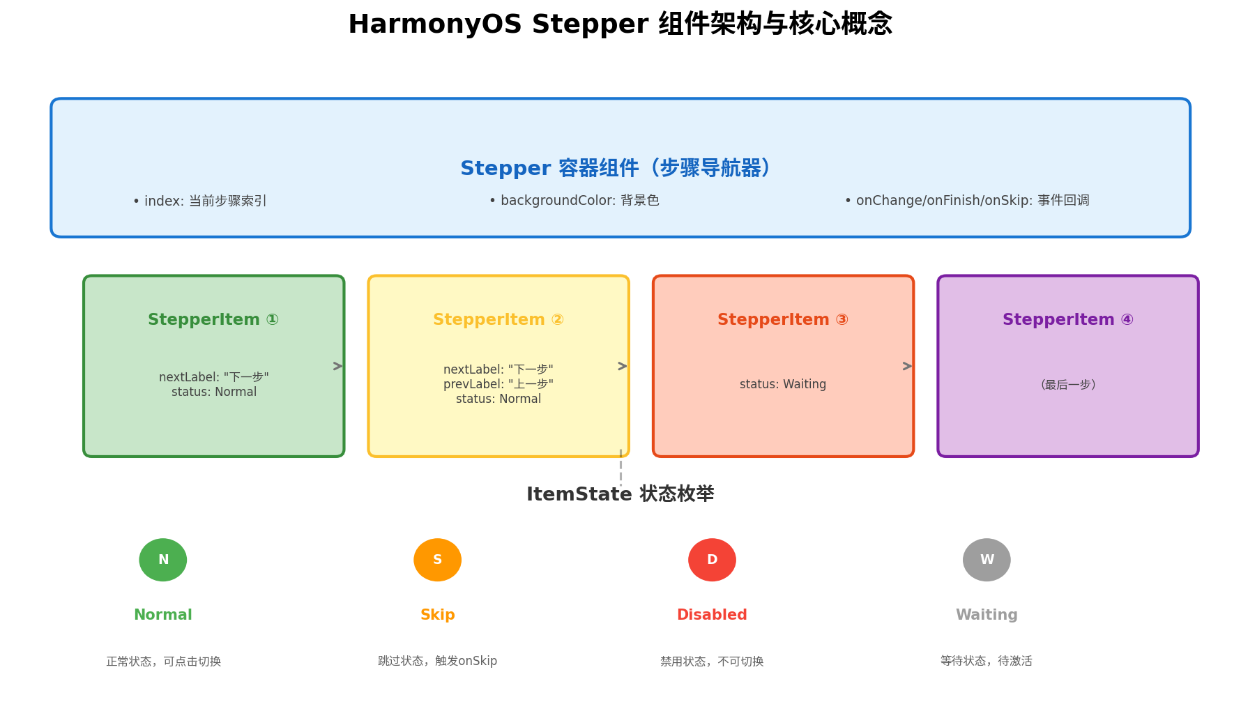
2.1 组件层级关系
Stepper 采用容器-子项的层级设计:
- Stepper:作为外层容器,负责管理整体步骤索引、背景样式以及全局事件回调。它仅能包含 StepperItem 作为直接子组件。
- StepperItem:代表单个步骤页面,承载该步骤的 UI 内容。每个 StepperItem 可独立配置导航标签(
nextLabel/prevLabel)和状态(status)。
这种设计遵循了 ArkUI “组合优于继承” 的组件化思想,开发者可以像搭积木一样自由拼装步骤流程。
2.2 ItemState 状态枚举
StepperItem 通过 status 属性控制步骤的可操作性,支持四种状态:
| 状态值 | 含义 | 视觉效果 | 交互行为 |
|---|---|---|---|
Normal | 正常状态 | 标准显示 | 可正常点击切换 |
Skip | 跳过状态 | 标记为可跳过 | 点击 nextLabel 触发 onSkip 回调 |
Disabled | 禁用状态 | 置灰显示 | 不可点击切换 |
Waiting | 等待状态 | 显示等待标识 | 需等待前置条件满足后才可激活 |
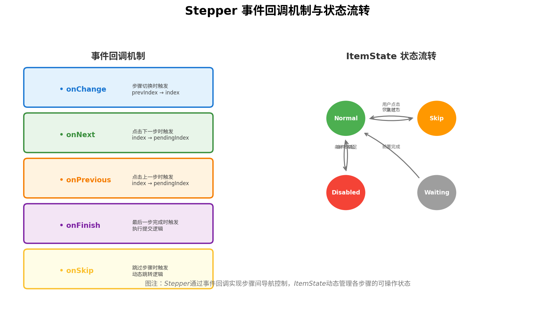
状态之间的动态流转,使得 Stepper 能够灵活应对表单校验失败、异步加载、条件分支等复杂业务场景。
三、核心 API 详解
3.1 Stepper 容器接口
Stepper(value?: { index?: number })
- index:设置当前显示的 StepperItem 索引,默认值为 0。从 API Version 10 开始支持
$$双向绑定,可实现步骤状态与外部变量的自动同步。
3.2 StepperItem 属性
| 属性 | 类型 | 说明 |
|---|---|---|
nextLabel | ResourceStr | 定义"下一步"按钮文字 |
prevLabel | ResourceStr | 定义"上一步"按钮文字(可选) |
status | ItemState | 设置当前步骤状态 |
3.3 事件回调体系
Stepper 提供了完善的事件回调机制,覆盖步骤流转的全生命周期:
| 事件 | 触发时机 | 回调参数 |
|---|---|---|
onChange | 点击 prevLabel 或 nextLabel 切换步骤时 | (prevIndex, index) |
onNext | 点击 nextLabel 进入下一步时 | (index, pendingIndex) |
onPrevious | 点击 prevLabel 返回上一步时 | (index, pendingIndex) |
onFinish | 最后一步的 nextLabel 被点击时 | 无 |
onSkip | Skip 状态的 nextLabel 被点击时 | 无 |
四、基础用法:快速上手 Stepper
下面通过一个极简示例,展示 Stepper 的基本使用方式:
// StepperBasicDemo.ets
@Styles function itemStyle() {
  .width('100%')
  .height('100%')
  .padding(24)
  .backgroundColor('#FFFFFF')
  .borderRadius(16)
}

@Extend(Text) function itemTextStyle() {
  .fontColor('#182431')
  .fontSize(28)
  .fontWeight(FontWeight.Medium)
  .margin({ top: 40, bottom: 24 })
}

@Entry
@Component
struct StepperBasicDemo {
  @State currentIndex: number = 0

  build() {
    Stepper({
      index: this.currentIndex
    }) {
      // 步骤一:欢迎页
      StepperItem() {
        Column({ space: 16 }) {
          Text('欢迎使用').itemTextStyle()
          Text('这是一个 Stepper 组件基础演示')
            .fontSize(16)
            .fontColor('#666')
        }.itemStyle()
      }
      .nextLabel('开始')

      // 步骤二:信息填写
      StepperItem() {
        Column({ space: 16 }) {
          Text('填写信息').itemTextStyle()
          TextInput({ placeholder: '请输入您的姓名' })
            .width('80%')
            .height(48)
        }.itemStyle()
      }
      .nextLabel('下一步')
      .prevLabel('上一步')

      // 步骤三:确认提交
      StepperItem() {
        Column({ space: 16 }) {
          Text('确认提交').itemTextStyle()
          Text('请确认以上信息无误后提交')
            .fontSize(16)
            .fontColor('#666')
        }.itemStyle()
      }
      .prevLabel('返回修改')
    }
    .backgroundColor('#F1F3F5')
    .onChange((prevIndex?: number, index?: number) => {
      if (index !== undefined) {
        this.currentIndex = index
        console.info(`步骤切换: ${prevIndex} → ${index}`)
      }
    })
    .onFinish(() => {
      console.info('流程完成!')
      // 此处可执行路由跳转或数据提交
    })
  }
}
代码要点解析:
- StepperItem 的排他性:Stepper 的直接子节点只能是 StepperItem,每个 Item 内部可自由构建任意 UI 结构。
- 导航标签的灵活性:通过
nextLabel和prevLabel可自定义按钮文案,最后一个 StepperItem 无需设置nextLabel,系统会自动处理为完成状态。 - 双向绑定:
index参数与@State currentIndex绑定,确保外部状态与组件内部状态同步。
五、进阶实战:智能开户流程完整实现
基础用法只能应对简单场景,在实际业务中,步骤条往往需要与表单校验、异步请求、状态回退等复杂逻辑深度结合。下面以银行智能开户场景为例,展示一个生产级的 Stepper 实现方案。
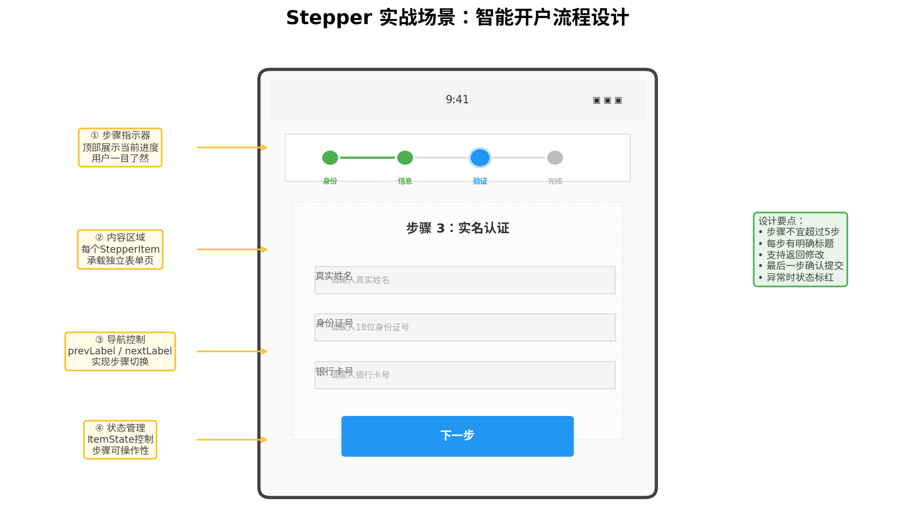
5.1 数据模型设计
首先定义步骤数据模型和表单状态:
// models/AccountOpenModel.ets

export enum StepStatus {
  NORMAL = 'Normal',
  SKIP = 'Skip',
  DISABLED = 'Disabled',
  WAITING = 'Waiting'
}

export interface StepConfig {
  title: string
  subtitle: string
  status: StepStatus
  nextLabel: string
  prevLabel?: string
}

export interface AccountForm {
  realName: string
  idCard: string
  phone: string
  verifyCode: string
  bankCard: string
  password: string
  confirmPassword: string
}

export const DEFAULT_FORM: AccountForm = {
  realName: '',
  idCard: '',
  phone: '',
  verifyCode: '',
  bankCard: '',
  password: '',
  confirmPassword: ''
}
5.2 开户页面完整实现
// pages/AccountOpenPage.ets
import { StepStatus, AccountForm, DEFAULT_FORM } from '../models/AccountOpenModel'

@Entry
@Component
struct AccountOpenPage {
  @State currentIndex: number = 0
  @State formData: AccountForm = DEFAULT_FORM
  @State isLoading: boolean = false
  @State errorMsg: string = ''

  // 步骤配置
  @State stepConfigs: StepConfig[] = [
    { title: '身份验证', subtitle: '请输入真实身份信息', status: StepStatus.NORMAL, nextLabel: '下一步' },
    { title: '手机绑定', subtitle: '验证您的手机号码', status: StepStatus.WAITING, nextLabel: '下一步', prevLabel: '上一步' },
    { title: '银行卡绑定', subtitle: '绑定您的储蓄卡', status: StepStatus.WAITING, nextLabel: '下一步', prevLabel: '上一步' },
    { title: '设置密码', subtitle: '设置交易密码', status: StepStatus.WAITING, nextLabel: '完成开户', prevLabel: '上一步' }
  ]

  // 表单校验逻辑
  private validateStep(index: number): boolean {
    this.errorMsg = ''
    switch (index) {
      case 0:
        if (!this.formData.realName || this.formData.realName.length < 2) {
          this.errorMsg = '请输入真实姓名(至少2个字符)'
          return false
        }
        if (!/^\d{17}[\dXx]$/.test(this.formData.idCard)) {
          this.errorMsg = '请输入正确的18位身份证号'
          return false
        }
        break
      case 1:
        if (!/^1[3-9]\d{9}$/.test(this.formData.phone)) {
          this.errorMsg = '请输入正确的手机号码'
          return false
        }
        if (!/^\d{6}$/.test(this.formData.verifyCode)) {
          this.errorMsg = '请输入6位短信验证码'
          return false
        }
        break
      case 2:
        if (!/^\d{16,19}$/.test(this.formData.bankCard)) {
          this.errorMsg = '请输入正确的银行卡号'
          return false
        }
        break
      case 3:
        if (!/^\d{6}$/.test(this.formData.password)) {
          this.errorMsg = '密码必须为6位数字'
          return false
        }
        if (this.formData.password !== this.formData.confirmPassword) {
          this.errorMsg = '两次输入的密码不一致'
          return false
        }
        break
    }
    return true
  }

  // 更新步骤状态
  private updateStepStatus(currentIdx: number, nextIdx: number) {
    // 当前步骤标记为完成
    this.stepConfigs[currentIdx] = {
      ...this.stepConfigs[currentIdx],
      status: StepStatus.NORMAL
    }
    // 下一步骤激活
    if (nextIdx < this.stepConfigs.length) {
      this.stepConfigs[nextIdx] = {
        ...this.stepConfigs[nextIdx],
        status: StepStatus.NORMAL
      }
    }
  }

  // 构建步骤内容
  @Builder
  StepContentBuilder(index: number) {
    Column({ space: 20 }) {
      Text(this.stepConfigs[index].title)
        .fontSize(24)
        .fontWeight(FontWeight.Bold)
        .fontColor('#182431')

      Text(this.stepConfigs[index].subtitle)
        .fontSize(14)
        .fontColor('#666')

      // 错误提示
      if (this.errorMsg && this.currentIndex === index) {
        Text(this.errorMsg)
          .fontSize(12)
          .fontColor('#F44336')
          .backgroundColor('#FFEBEE')
          .padding(8)
          .borderRadius(4)
          .width('90%')
      }

      // 根据步骤索引渲染不同表单
      this.FormBuilder(index)
    }
    .width('100%')
    .padding(24)
  }

  @Builder
  FormBuilder(index: number) {
    switch (index) {
      case 0:
        Column({ space: 16 }) {
          TextInput({ placeholder: '真实姓名', text: $$this.formData.realName })
            .width('90%')
            .height(48)
            .backgroundColor('#F5F5F5')
            .borderRadius(8)
          TextInput({ placeholder: '身份证号', text: $$this.formData.idCard })
            .width('90%')
            .height(48)
            .backgroundColor('#F5F5F5')
            .borderRadius(8)
            .maxLength(18)
        }
        break
      case 1:
        Column({ space: 16 }) {
          TextInput({ placeholder: '手机号码', text: $$this.formData.phone })
            .width('90%')
            .height(48)
            .backgroundColor('#F5F5F5')
            .borderRadius(8)
            .type(InputType.PhoneNumber)
          Row({ space: 12 }) {
            TextInput({ placeholder: '验证码', text: $$this.formData.verifyCode })
              .layoutWeight(1)
              .height(48)
              .backgroundColor('#F5F5F5')
              .borderRadius(8)
              .maxLength(6)
            Button('获取验证码')
              .height(48)
              .backgroundColor('#E3F2FD')
              .fontColor('#1976D2')
              .onClick(() => {
                // 发送验证码逻辑
                console.info('发送验证码至:', this.formData.phone)
              })
          }
          .width('90%')
        }
        break
      case 2:
        Column({ space: 16 }) {
          TextInput({ placeholder: '银行卡号', text: $$this.formData.bankCard })
            .width('90%')
            .height(48)
            .backgroundColor('#F5F5F5')
            .borderRadius(8)
            .type(InputType.Number)
            .maxLength(19)
          Text('请绑定本人名下储蓄卡')
            .fontSize(12)
            .fontColor('#999')
        }
        break
      case 3:
        Column({ space: 16 }) {
          TextInput({ placeholder: '设置6位交易密码', text: $$this.formData.password })
            .width('90%')
            .height(48)
            .backgroundColor('#F5F5F5')
            .borderRadius(8)
            .type(InputType.Password)
            .maxLength(6)
          TextInput({ placeholder: '确认交易密码', text: $$this.formData.confirmPassword })
            .width('90%')
            .height(48)
            .backgroundColor('#F5F5F5')
            .borderRadius(8)
            .type(InputType.Password)
            .maxLength(6)
        }
        break
    }
  }

  build() {
    Stepper({
      index: this.currentIndex
    }) {
      ForEach(this.stepConfigs, (config: StepConfig, index: number) => {
        StepperItem() {
          this.StepContentBuilder(index)
        }
        .nextLabel(config.nextLabel)
        .prevLabel(config.prevLabel ?? '')
        .status(config.status as ItemState)
      })
    }
    .backgroundColor('#F1F3F5')
    .onChange((prevIndex?: number, index?: number) => {
      if (index !== undefined) {
        this.currentIndex = index
        this.errorMsg = ''
      }
    })
    .onNext((index: number, pendingIndex: number) => {
      console.info(`准备从步骤 ${index} 进入步骤 ${pendingIndex}`)
      // 校验当前步骤表单
      if (!this.validateStep(index)) {
        // 校验失败,阻止切换(通过状态控制)
        this.stepConfigs[index] = {
          ...this.stepConfigs[index],
          status: StepStatus.DISABLED
        }
        // 短暂延迟后恢复,给用户提示时间
        setTimeout(() => {
          this.stepConfigs[index] = {
            ...this.stepConfigs[index],
            status: StepStatus.NORMAL
          }
        }, 1500)
        return
      }
      // 校验通过,更新状态
      this.updateStepStatus(index, pendingIndex)
    })
    .onPrevious((index: number, pendingIndex: number) => {
      console.info(`返回步骤 ${pendingIndex}`)
      this.errorMsg = ''
    })
    .onFinish(() => {
      if (!this.validateStep(3)) {
        return
      }
      console.info('开户信息:', JSON.stringify(this.formData))
      // 执行开户提交
      this.submitAccountOpen()
    })
  }

  private async submitAccountOpen() {
    this.isLoading = true
    // 模拟网络请求
    setTimeout(() => {
      this.isLoading = false
      console.info('开户成功!')
      // 跳转至成功页
    }, 2000)
  }
}
5.3 实战要点总结
- 表单校验与步骤拦截:在
onNext回调中执行当前步骤的表单校验,校验失败时通过临时修改status为Disabled阻止切换,并配合错误提示引导用户修正。 - 状态驱动渲染:使用
@State stepConfigs数组统一管理各步骤配置,通过ForEach动态生成 StepperItem,实现步骤的灵活增删。 - 数据双向绑定:利用
$$语法实现 TextInput 与数据模型的双向绑定,减少样板代码。 - 异步流程处理:在
onFinish中封装异步提交逻辑,配合加载状态提升用户体验。
六、自定义样式:打造沉浸式步骤导航
官方 Stepper 的默认样式较为朴素,在实际项目中通常需要深度定制。以下是几个常见的自定义方向:
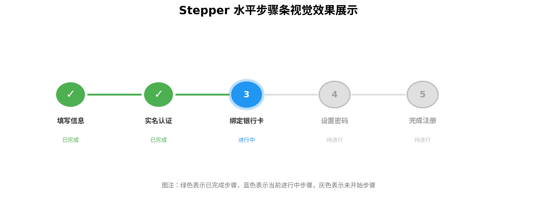
6.1 顶部步骤指示器自定义
虽然 Stepper 内置了底部导航按钮,但顶部的步骤进度指示器需要开发者自行实现:
@Builder
StepIndicator(current: number, total: number) {
  Row({ space: 8 }) {
    ForEach(Array.from({ length: total }, (_, i) => i), (index: number) => {
      Column({ space: 4 }) {
        Circle()
          .width(index === current ? 16 : 12)
          .height(index === current ? 16 : 12)
          .fill(index < current ? '#4CAF50' : (index === current ? '#2196F3' : '#E0E0E0'))
          .stroke(index === current ? '#BBDEFB' : Color.Transparent)
          .strokeWidth(3)

        Text(`步骤${index + 1}`)
          .fontSize(10)
          .fontColor(index <= current ? '#333' : '#999')
      }

      if (index < total - 1) {
        Divider()
          .vertical(false)
          .width(24)
          .color(index < current ? '#4CAF50' : '#E0E0E0')
          .strokeWidth(2)
      }
    })
  }
  .width('100%')
  .justifyContent(FlexAlign.Center)
  .padding(16)
}
6.2 步骤切换动画增强
通过 animateTo 为步骤内容切换添加过渡动画:
.onChange((prevIndex?: number, index?: number) => {
  if (index !== undefined) {
    animateTo({ duration: 300, curve: Curve.EaseInOut }, () => {
      this.currentIndex = index
    })
  }
})
6.3 深色模式适配
@State isDarkMode: boolean = false

// 在 build 中根据模式切换颜色
.backgroundColor(this.isDarkMode ? '#121212' : '#F1F3F5')
七、性能优化与最佳实践
7.1 避免过度重绘
StepperItem 的内容在步骤切换时会被频繁创建和销毁。对于包含复杂 UI(如长列表、图表)的步骤,建议使用 @Builder 配合条件渲染,避免不必要的布局计算:
@Builder
LazyStepContent(index: number) {
  if (this.currentIndex === index) {
    // 仅当前步骤完全渲染
    ComplexFormComponent()
  } else {
    // 非当前步骤保留占位
    Blank()
  }
}
7.2 状态管理规范化
对于多步骤共享的表单数据,推荐使用 AppStorage 或 LocalStorage 进行跨组件状态管理,避免通过层层传递 @State 导致代码耦合:
// 在入口页面初始化
AppStorage.setOrCreate('accountForm', DEFAULT_FORM)

// 在任意步骤中读取
@StorageLink('accountForm') formData: AccountForm = DEFAULT_FORM
7.3 步骤数据持久化
在涉及用户填写大量信息的场景中,应在 onChange 中将表单数据持久化到本地存储,防止意外退出导致数据丢失:
.onChange((prevIndex?: number, index?: number) => {
  // 保存当前步骤进度
  preferences.putSync('stepper_progress', this.currentIndex)
  preferences.putSync('form_data', JSON.stringify(this.formData))
  preferences.flush()
})
7.4 可访问性支持
为步骤按钮添加语义化标签,确保屏幕阅读器用户能够正确理解当前操作:
Button('下一步')
  .accessibilityText(`进入${this.stepConfigs[this.currentIndex + 1]?.title ?? '完成页'}`)
  .accessibilityDescription('点击进入下一步')
八、总结
本文从架构原理、核心 API、基础用法、进阶实战、自定义样式以及性能优化六个维度,全面解析了 HarmonyOS Stepper 组件的开发方案。通过智能开户流程的完整案例,展示了如何将 Stepper 与表单校验、状态管理、异步请求等实际业务深度结合。
核心要点回顾:
- Stepper 采用容器-子项架构,通过 StepperItem 承载各步骤内容
ItemState四态模型(Normal/Skip/Disabled/Waiting)支撑复杂业务场景- 完善的事件回调体系(onChange/onNext/onPrevious/onFinish/onSkip)覆盖全生命周期
- 生产级应用需关注表单校验拦截、状态驱动渲染、数据持久化三大核心问题
- 配合
@Builder、animateTo、StorageLink等 ArkUI 特性可打造极致用户体验
Stepper 组件虽然看似简单,但要在生产环境中用得优雅、稳定、可扩展,仍需开发者对业务场景有深刻理解。希望本文能为你的鸿蒙应用开发提供有价值的参考。
转载自:https://blog.csdn.net/u014727709/article/details/163450072
欢迎 👍点赞✍评论⭐收藏,欢迎指正

讨论HarmonyOS开发技术,专注于API与组件、DevEco Studio、测试、元服务和应用上架分发等。
更多推荐



 1
1 0
0- 0


 已为社区贡献861条内容

所有评论(0)