基于HarmonyOS API 24复古胶片相机店应用开发实践:ArkTS声明式UI构建冲扫实验室全流程解析与橙红暖灰主题设计深度剖析
在移动应用开发的浩瀚星海中,有一类应用如同时光的守护者,它们不追逐最新潮的技术噱头,而是用最纯粹的设计语言将一段即将消逝的文化重新带回人们的指尖。复古胶片相机店应用正是这样一款承载着摄影记忆与匠人精神的HarmonyOS应用,它将冲扫实验室、相机交易、镜头租借、胶卷管理与暗房预约等核心业务场景编织成一幅完整的胶片生活画卷。本文将以ArkTS声明式UI范式为骨架,以橙红暖灰色彩体系为血肉,逐段拆解这款应用从数据模型定义到组件化架构再到动效实现的全部技术细节,带您走进一个充满银盐颗粒质感与机械快门声的代码世界。
胶片摄影的魅力在于不可逆与不确定性,而将这些真实的物理体验转化为数字化交互则需要开发者对UI状态、动画时序与业务逻辑有极为精准的把控。本应用通过六个功能Tab页的架构设计,完整模拟了一家复古胶片相机店从进门到离店的全部触点:用户可以在首页浏览镇店相机榜与本周上新胶卷,在相机馆按年代分布挑选心仪的机身,在镜头橱窗查看焦段分布并预约租借,在胶卷超市管理库存与批次,在暗房实验室预约显影放大服务,最后在个人中心查看会员权益与冲扫订单。每一个交互节点都经过精心打磨,从取景器扫描线的定时器驱动动画,到安全红灯的闪烁模拟,再到会员卡高光扫过的流光效果,无不体现了HarmonyOS ArkTS API 24在声明式UI领域的强大表达能力。
本文的写作初衷不仅在于展示一款完整应用的代码全貌,更在于为HarmonyOS开发者提供一套可复用的设计范式:如何用interface类型系统约束业务数据结构,如何用@State装饰器实现响应式状态管理,如何用@Builder装饰器抽取可复用的UI构建逻辑,如何用ForEach配合keyGenerator实现高效列表渲染,如何用Stack+条件渲染+zIndex实现模态弹窗体系,以及如何用setInterval定时器驱动轻量级动画效果。这些技术点将在下文的逐段代码分析中得到详尽的阐释,读者可以将本文视为一份ArkTS实战开发手册,每一段代码都附有设计意图与技术解析,每一个技术决策都有其背后的权衡与考量。
一、数据模型体系设计:interface类型约束与业务实体建模
在任何一款信息量丰富的商业应用中,数据模型的设计是整个架构的基石。本应用采用了ArkTS的interface类型系统来定义所有业务实体,这种做法的核心优势在于:interface提供了编译期类型检查,确保数据在传递过程中的结构正确性,同时不引入运行时开销,符合声明式UI范式对轻量数据流的要求。让我们从最基础的Tab导航模型开始分析。
1.1 Tab导航与基础实体接口定义
interface FlTab {
  key: string;
  label: string;
  icon: string;
}

interface FlCam {
  id: number;
  name: string;
  brand: string;
  mount: string;
  type: string;
  year: number;
  price: number;
  oldPrice: number;
  hot: number;
  percent: number;
}
首先映入眼帘的是FlTab接口,它定义了底部导航栏的每一项数据结构。key字段作为唯一标识符用于ForEach的keyGenerator,确保列表渲染时的diff算法能精准定位变化项;label是显示文本;icon使用emoji字符而非图片资源,这是一种在原型阶段和轻量应用中极为高效的图标方案,避免了图片加载的异步处理与资源管理开销。
FlCam接口则是相机实体的完整数据契约,它包含了从品牌到热度的全部业务字段。值得注意的设计决策是将price与oldPrice并列存储,这样在UI层可以直接渲染出划线原价与现价的对比效果,无需在渲染时计算折扣。hot字段表示热度值,用于排序展示;percent字段是一个0-100的评分值,用于在卡片上展示成色百分比。这种将业务语义直接编码进字段名的设计方式,使得代码在阅读时具有极强的自文档化特性。
1.2 镜头与胶卷实体的差异化建模
interface FlLens {
  id: number;
  name: string;
  focal: string;
  aperture: string;
  mount: string;
  type: string;
  price: number;
  oldPrice: number;
  percent: number;
}

interface FlFilm {
  id: number;
  name: string;
  iso: number;
  type: string;
  frames: number;
  price: number;
  oldPrice: number;
  year: number;
  percent: number;
}
FlLens接口相比FlCam省去了brand和year字段,但增加了focal(焦段)和aperture(最大光圈)这两个摄影器材的核心参数。这种差异化建模体现了面向领域的设计思想:不同业务实体拥有不同的属性集合,强行统一为通用模型会导致字段冗余和类型不安全。focal和aperture都使用string类型而非number,是因为焦段如"50mm"和光圈如"f/1.4"包含非数字字符,用字符串存储保留了完整的显示语义。
FlFilm接口则引入了iso(感光度)和frames(张数)这两个胶卷特有的属性。iso使用number类型而非string,这是因为在后续的flIsoColor工具函数中需要对ISO值进行数值比较来决定标签颜色——ISO 400以上用深色、ISO 200以上用橙色、ISO 100以上用灰色、其余用金色。这种将数值语义与视觉表现直接绑定的设计,使得色彩系统成为数据表达的一部分而非纯粹的装饰。
1.3 暗房设备与订单收藏实体
interface FlDark {
  id: number;
  name: string;
  spec: string;
  price: number;
  oldPrice: number;
  time: string;
  percent: number;
}

interface FlOrder {
  id: number;
  name: string;
  date: string;
  price: number;
  status: string;
}

interface FlFav {
  id: number;
  name: string;
  price: number;
  tag: string;
}
FlDark接口为暗房设备建模,其中spec字段存储规格描述如"双芯 · 135/120",time字段存储单次使用时长如"30 分钟",这些复合信息用字符串存储而非拆分为多个字段,是因为它们在UI中始终以整体形式展示,拆分反而增加了不必要的映射逻辑。percent字段在这里表示设备的完好度评分。
FlOrder和FlFav则是更为精简的实体模型。FlOrder只包含订单的显示字段,status字段使用string而非枚举类型,是因为ArkTS的enum在JSON序列化时存在兼容性考量,而在这种轻量应用中直接使用字符串既简洁又便于调试。FlFav引入了tag字段用于存储收藏标签如"口袋神机"、"七枚玉"等用户自定义的描述性文字,为收藏列表增加了情感化表达。
1.4 统计数据与用户档案模型
interface FlCount {
  name: string;
  count: number;
  percent: number;
}

interface FlService {
  key: string;
  name: string;
  icon: string;
}

interface FlProfile {
  nick: string;
  rank: string;
  points: number;
  rolls: number;
  orders: number;
  coins: number;
}
FlCount是一个通用的统计单元模型,被复用于年代分布、胶卷类型占比、焦段分布和设备热度四个不同的统计图表中。这种泛化设计减少了接口数量,但要求开发者在使用时通过上下文理解字段的语义——name可能是"1950年代"也可能是"显影罐",count可能是台数也可能是次数。这种设计在小型应用中是合理的权衡,但在大型项目中应考虑为每种统计场景定义专用接口以保证类型安全。
FlService与FlTab结构完全一致,但定义了独立的接口,这是良好的设计实践——即使结构相同,不同业务概念应该有不同的类型标识,这样在重构时不会产生连锁影响。FlProfile将用户档案的所有维度聚合在一起,rolls(冲扫卷数)、points(会员积分)、coins(胶片币)三个数值字段分别对应会员卡上的三个核心指标,这种聚合式设计便于在UI中一次性绑定显示。
二、色彩体系架构:ColorPalette接口与橙红暖灰主题常量
色彩是应用的第一语言。在用户阅读任何文字之前,色彩已经完成了情绪的传递与品牌的建立。本应用的色彩体系围绕"胶片橙红"与"暖灰底色"构建,旨在唤起用户对暗房红灯、银盐相纸与复古器材柜的感官记忆。
2.1 ColorPalette接口定义
interface ColorPalette {
  main: string;
  mainDeep: string;
  amber: string;
  gray: string;
  bg: string;
  card: string;
  ink: string;
  sub: string;
  hint: string;
  line: string;
  danger: string;
  success: string;
  white: string;
  black: string;
}
ColorPalette接口定义了一套完整的14色色彩体系,每一种颜色都有明确的语义角色。main是主品牌色,用于按钮、高亮文字和选中态;mainDeep是主色的加深变体,用于渐变的深色端;amber是琥珀色,作为辅助强调色用于会员等级和价格标签;gray是中性灰,用于次级图表元素。背景色被细分为bg(页面背景)和card(卡片背景),这种区分确保了内容层与背景层之间有足够的视觉层次。
文字色被细分为三级:ink(主文字色,接近墨黑)、sub(副文字色,中灰)、hint(提示文字色,浅灰),这种三级文字色体系确保了信息在卡片上的层次分明——标题用ink、描述用sub、辅助信息用hint。line是分割线色,danger用于删除和警示操作,success用于完成状态和积极反馈。white和black作为绝对色值参与渐变和阴影的计算。
2.2 FL主题常量实例化
const FL: ColorPalette = {
  main: '#C9562C',
  mainDeep: '#8A3A1D',
  amber: '#E8A33D',
  gray: '#8B7D72',
  bg: '#F4EDE3',
  card: '#FFFDF8',
  ink: '#2E2622',
  sub: '#6E625A',
  hint: '#B4A89C',
  line: '#E5DACC',
  danger: '#C0392B',
  success: '#5E8C61',
  white: '#FFFFFF',
  black: '#1D1815'
};
这是FL主题常量的完整实例化。主色#C9562C是一种带有棕色调的橙红色,灵感来源于柯达Portra胶卷的暖色调特征,比纯橙色更具复古质感。mainDeep的#8A3A1D是橙红的深色变体,用于渐变背景的底部,营造出从暖橙到深棕的层次过渡。
背景色#F4EDE3是一种带有奶油色调的暖白,模拟了相纸的乳白色基底;卡片色#FFFDF8比背景色更白更暖,确保卡片在背景上"浮"起来。文字色#2E2622并非纯黑,而是带有暖棕调的深色,与胶片摄影中银盐颗粒的视觉感受一致。hint色#B4A89C是一种暖灰,在保持可读性的同时不抢夺主要信息的注意力。这套色彩经过精心调配,每一个色值都经过了暖度统一处理——没有冷调蓝色或绿色介入,确保整体视觉的温暖一致性。
三、静态数据源与配置常量体系
在声明式UI范式中,静态数据源与UI组件之间的关系如同原料与成品的关系。本应用将所有业务数据定义为模块级常量,组件通过引用这些常量来渲染初始状态,再通过@State管理用户的交互修改。
3.1 导航与服务入口常量
const FL_TABS: FlTab[] = [
  { key: 'home', label: '首页', icon: '📷' },
  { key: 'cam', label: '相机', icon: '🎞️' },
  { key: 'lens', label: '镜头', icon: '🔭' },
  { key: 'film', label: '胶卷', icon: '📼' },
  { key: 'dark', label: '暗房', icon: '🧪' },
  { key: 'mine', label: '我的', icon: '👤' }
];

const FL_SERVICES: FlService[] = [
  { key: 'dev', name: '冲扫', icon: '📼' },
  { key: 'print', name: '洗印', icon: '🖨️' },
  { key: 'copy', name: '翻拍', icon: '📄' },
  { key: 'gear', name: '器材', icon: '🔧' },
  { key: 'fav', name: '收藏', icon: '⭐' },
  { key: 'check', name: '鉴定', icon: '🔍' }
];
FL_TABS定义了六个底部Tab项,从首页到个人中心覆盖了应用的全部核心功能。使用数组而非对象映射,是因为Tab的顺序信息在UI渲染中至关重要——数组的索引直接对应activeTab状态值,通过简单的数值比较即可实现Tab切换。每个Tab项的key字段如’home’、'cam’等作为ForEach的keyGenerator返回值,确保在Tab列表发生增删时diff算法能正确识别。
FL_SERVICES定义了首页服务入口的六个功能项。值得注意的是这些服务项与Tab项并非一一对应——冲扫服务点击后弹出下单弹窗而非跳转到冲扫Tab,收藏服务点击后弹出冲扫车弹窗。这种设计体现了入口与目标的解耦:服务入口是快捷操作,Tab页是完整功能,二者可以在同一页面共存而不冲突。
3.2 相机与镜头数据集
const FL_CAMS: FlCam[] = [
  { id: 1, name: '禄来 2.8F · 双反之王', brand: '禄来', mount: '双反120', type: '双反相机', year: 1960, price: 16800, oldPrice: 19800, hot: 999, percent: 99 },
  { id: 2, name: '徕卡 M3 · 旁轴传奇', brand: '徕卡', mount: '徕卡M', type: '旁轴135', year: 1954, price: 26500, oldPrice: 29900, hot: 986, percent: 98 },
  { id: 3, name: '尼康 FM2 · 钛帘快门', brand: '尼康', mount: '尼康F', type: '单反135', year: 1982, price: 4200, oldPrice: 5200, hot: 954, percent: 96 },
  { id: 4, name: '佳能 AE-1 · 学生神机', brand: '佳能', mount: '佳能FD', type: '单反135', year: 1976, price: 1680, oldPrice: 2180, hot: 901, percent: 94 },
  { id: 5, name: '宾得 67 · 中画幅巨兽', brand: '宾得', mount: '宾得67', type: '单反120', year: 1969, price: 9800, oldPrice: 11800, hot: 876, percent: 93 },
  { id: 6, name: '奥林巴斯 OM-1 · 小巧经典', brand: '奥林巴斯', mount: 'OM卡口', type: '单反135', year: 1972, price: 2680, oldPrice: 3380, hot: 843, percent: 92 },
  { id: 7, name: '康泰时 T2 · 口袋毒物', brand: '康泰时', mount: '固定镜', type: '口袋135', year: 1990, price: 11800, oldPrice: 13800, hot: 967, percent: 97 },
  { id: 8, name: '美能达 X700 · 程序曝光', brand: '美能达', mount: 'SR卡口', type: '单反135', year: 1981, price: 1980, oldPrice: 2480, hot: 812, percent: 91 },
  { id: 9, name: '哈苏 500CM · 登月相机', brand: '哈苏', mount: '哈苏V', type: '单反120', year: 1957, price: 22500, oldPrice: 25900, hot: 921, percent: 95 },
  { id: 10, name: '富士 GA645 · 自动中画幅', brand: '富士', mount: '富士RF', type: '旁轴120', year: 1995, price: 8800, oldPrice: 10500, hot: 765, percent: 90 },
  { id: 11, name: '理光 GR1 · 街拍之王', brand: '理光', mount: '固定镜', type: '口袋135', year: 1996, price: 9200, oldPrice: 11000, hot: 899, percent: 94 },
  { id: 12, name: '泽尼特 E · 苏联硬汉', brand: '泽尼特', mount: 'M42', type: '单反135', year: 1967, price: 780, oldPrice: 980, hot: 654, percent: 87 },
  { id: 13, name: '柯达 Retina IIIC', brand: '柯达', mount: '固定镜', type: '旁轴135', year: 1957, price: 2380, oldPrice: 2980, hot: 588, percent: 85 },
  { id: 14, name: '雅西卡 124G · 平价双反', brand: '雅西卡', mount: '双反120', type: '双反相机', year: 1970, price: 1480, oldPrice: 1880, hot: 732, percent: 89 },
  { id: 15, name: '凤凰 205 · 国产记忆', brand: '凤凰', mount: '凤凰卡口', type: '旁轴135', year: 1979, price: 420, oldPrice: 580, hot: 688, percent: 88 },
  { id: 16, name: '宾得 K1000 · 理工之友', brand: '宾得', mount: '宾得K', type: '单反135', year: 1976, price: 1580, oldPrice: 1980, hot: 795, percent: 90 }
];
FL_CAMS数组包含16台经典胶片相机,覆盖了从1954年的徕卡M3到1996年的理光GR1横跨四十余年的摄影器材史。每台相机的type字段包含了画幅信息(135或120)和相机类型(单反、旁轴、双反、口袋),这种复合编码方式使得flFilterArr函数可以通过简单的indexOf匹配实现分类筛选。hot字段的数值范围从588到999,用于排序和热度标签展示,percent字段的99、98等高值用于成色标识。
镜头数据集FL_LENS包含10支镜头,从尼康AIS 50mm f/1.4的标准定焦到徕卡Summicron 35mm f/2的广角定焦,涵盖了标准、人像、广角、中长焦、移轴、旁轴等多种类型。每支镜头的focal和aperture字段以摄影界标准格式存储,在UI渲染时直接显示无需格式转换。
3.3 胶卷与暗房数据集
const FL_FILMS: FlFilm[] = [
  { id: 1, name: '柯达 Portra 400', iso: 400, type: '彩色负片', frames: 36, price: 138, oldPrice: 158, year: 2023, percent: 98 },
  { id: 2, name: '富士 C200', iso: 200, type: '彩色负片', frames: 36, price: 68, oldPrice: 82, year: 2022, percent: 92 },
  { id: 3, name: '柯达 Tri-X 400', iso: 400, type: '黑白胶卷', frames: 36, price: 89, oldPrice: 99, year: 2021, percent: 95 },
  { id: 4, name: '伊尔福 HP5 Plus', iso: 400, type: '黑白胶卷', frames: 36, price: 76, oldPrice: 88, year: 2020, percent: 90 },
  { id: 5, name: '富士 Velvia 50', iso: 50, type: '反转胶卷', frames: 36, price: 168, oldPrice: 188, year: 2021, percent: 88 },
  { id: 6, name: '柯达 Ektar 100', iso: 100, type: '彩色负片', frames: 36, price: 108, oldPrice: 128, year: 2022, percent: 93 },
  { id: 7, name: '上海 GP3', iso: 100, type: '黑白胶卷', frames: 24, price: 28, oldPrice: 35, year: 2019, percent: 85 },
  { id: 8, name: '禄来 Retro 80S', iso: 80, type: '黑白胶卷', frames: 36, price: 72, oldPrice: 82, year: 2023, percent: 86 }
];

const FL_DARKS: FlDark[] = [
  { id: 1, name: 'Jobo 1520 显影罐', spec: '双芯 · 135/120', price: 498, oldPrice: 598, time: '30 分钟', percent: 92 },
  { id: 2, name: 'LPL 7700 放大机', spec: '6x6 彩色头', price: 4280, oldPrice: 5280, time: '120 分钟', percent: 88 },
  { id: 3, name: '伊尔福 8x10 相纸', spec: '可变反差 25 张', price: 118, oldPrice: 138, time: '45 分钟', percent: 90 },
  { id: 4, name: 'D76 显影液套装', spec: '1L 两袋装', price: 58, oldPrice: 68, time: '15 分钟', percent: 86 },
  { id: 5, name: '暗房安全红灯', spec: 'LED 红光 5W', price: 68, oldPrice: 78, time: '24 小时', percent: 84 },
  { id: 6, name: '底片晾干夹套装', spec: '不锈钢 8 夹', price: 38, oldPrice: 48, time: '10 分钟', percent: 82 }
];
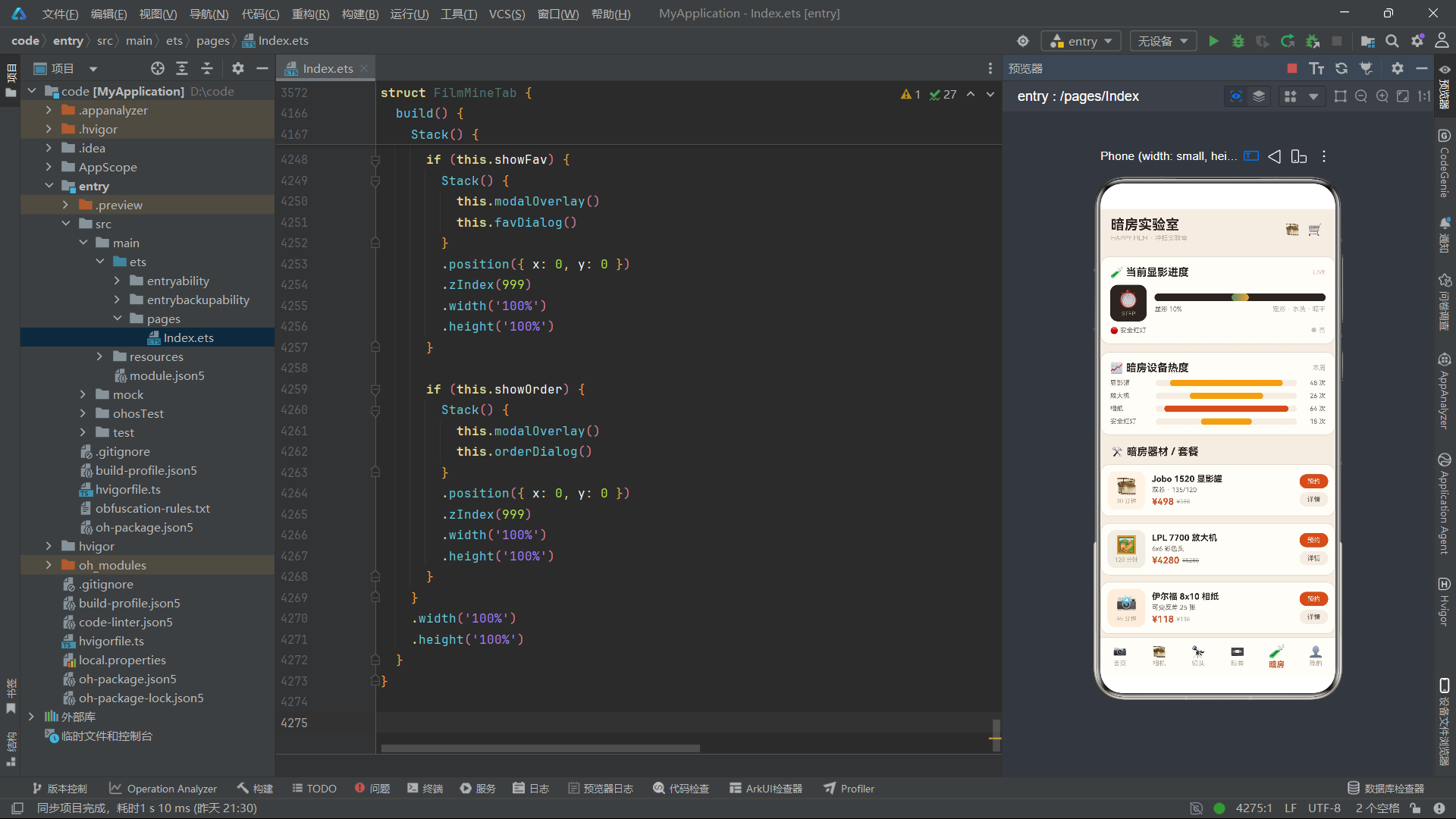
胶卷数据集涵盖了彩色负片、黑白胶卷和反转胶卷三大类型,ISO值从50到400覆盖了最常见的胶卷感光度范围。year字段在这里表示生产批次年份而非胶卷本身的诞生年份,用于库存批次管理。暗房设备数据集则包含了从显影罐到放大机再到相纸药水等全套暗房器材,每项的time字段表示使用该设备完成一次标准流程所需的时间。
3.4 订单收藏与统计数据集
const FL_ORDERS: FlOrder[] = [
  { id: 1, name: '冲扫 Portra 400', date: '08-20', price: 138, status: '已完成' },
  { id: 2, name: '黑白手工冲洗', date: '08-18', price: 88, status: '显影中' },
  { id: 3, name: '120 中画幅冲扫', date: '08-16', price: 168, status: '已完成' },
  { id: 4, name: '尼康 FM2 保养清洁', date: '08-12', price: 260, status: '待取件' },
  { id: 5, name: '反转片 E-6 冲显', date: '08-10', price: 188, status: '已完成' },
  { id: 6, name: '暗房放大 8x10 两张', date: '08-08', price: 96, status: '已完成' },
  { id: 7, name: '底片高清翻拍', date: '08-05', price: 120, status: '待付款' },
  { id: 8, name: '冲扫 + 台历定制', date: '08-01', price: 258, status: '已完成' }
];

const FL_FAVS: FlFav[] = [
  { id: 1, name: '康泰时 T2', price: 11800, tag: '口袋神机' },
  { id: 2, name: '徕卡 Summicron 35mm', price: 16800, tag: '七枚玉' },
  { id: 3, name: '柯达 Tri-X 400', price: 89, tag: '经典黑白' },
  { id: 4, name: '尼康 FM2', price: 4200, tag: '钛帘快门' },
  { id: 5, name: '富士 Velvia 50', price: 168, tag: '反转风光' },
  { id: 6, name: '雅西卡 124G', price: 1480, tag: '平价双反' }
];
订单数据集包含了八条不同状态的冲扫订单,status字段有"已完成"、“显影中”、“待取件”、"待付款"四种取值。在FilmMineTab组件中,当用户点击"待付款"状态的订单时会触发删除逻辑,这是通过od.status === '待付款'的条件判断实现的——这种将业务逻辑嵌入UI交互的设计在小型应用中简洁高效。
收藏数据集的tag字段如"七枚玉"、"口袋神机"等都是胶片摄影圈的行话术语,这些词汇为应用注入了文化深度,让胶片爱好者在使用时产生认同感与归属感。
3.5 统计图表与配置选项常量
const FL_AGES: FlCount[] = [
  { name: '1950 年代', count: 3, percent: 24 },
  { name: '1960 年代', count: 4, percent: 32 },
  { name: '1970 年代', count: 5, percent: 40 },
  { name: '1980 年代', count: 2, percent: 18 },
  { name: '1990 年代', count: 2, percent: 16 }
];

const FL_TYPES: FlCount[] = [
  { name: '彩色负片', count: 3, percent: 62 },
  { name: '黑白胶卷', count: 3, percent: 58 },
  { name: '反转胶卷', count: 2, percent: 38 }
];

const FL_FOCALS: FlCount[] = [
  { name: '35mm 以下', count: 2, percent: 30 },
  { name: '35-50mm', count: 4, percent: 58 },
  { name: '85-135mm', count: 3, percent: 44 },
  { name: '移轴/特殊', count: 1, percent: 16 }
];

const FL_HOTS: FlCount[] = [
  { name: '显影罐', count: 48, percent: 80 },
  { name: '放大机', count: 26, percent: 52 },
  { name: '相纸', count: 64, percent: 88 },
  { name: '安全红灯', count: 18, percent: 36 }
];
这四组统计数据分别服务于四个不同Tab页的图表展示。FL_AGES用于相机馆的年代分布条形图,FL_TYPES用于胶卷超市的类型占比图,FL_FOCALS用于镜头橱窗的焦段分布图,FL_HOTS用于暗房实验室的设备热度图。每组数据的percent字段直接控制条形图的宽度比例,通过flBar函数格式化为百分比字符串后绑定到Row().width()属性上,实现数据驱动的图表渲染。
const FL_DEV_TYPES: string[] = ['彩色负片', '黑白胶卷', '反转胶卷'];
const FL_SPECS: string[] = ['JPG 精扫', 'TIFF 精扫', '挂历定制'];
const FL_RENTS: string[] = ['7 天', '15 天', '30 天'];
const FL_PICKS: string[] = ['到店自取', '顺丰邮寄'];
const FL_SLOTS: string[] = ['上午 9-12', '下午 14-17', '晚场 18-21'];
const FL_DEVS: string[] = ['显影罐', '放大机', '安全红灯'];
const FL_PAYS: string[] = ['微信', '支付宝', '积分抵扣'];
const FL_TERMS: string[] = ['季卡', '半年卡', '年卡'];
const FL_MOUNTS: string[] = ['徕卡M', '尼康F', '佳能FD', '哈苏V', 'M42'];
const FL_GRADES: string[] = ['全新', '98 新', '95 新', '9 成新'];
const FL_ISOS: string[] = ['50', '100', '200', '400'];
const FL_BATCH: string[] = ['2024 批次', '2025 批次', '冷藏新批'];
const FL_DATES: string[] = ['08-25', '08-26', '08-27'];
const FL_CATS: string[] = ['全部类型', '单反', '旁轴', '双反', '口袋', '中画幅'];
const FL_FILM_CATS: string[] = ['全部胶卷', '彩色负片', '黑白胶卷', '反转胶卷'];
const FL_CITYS: string[] = ['上海市', '北京市', '杭州市', '广州市'];
这一系列配置常量定义了各个弹窗中的选择项列表。使用string数组而非对象数组,是因为这些选项在UI中仅需要展示文本本身,不需要额外的icon或key字段。在ForEach渲染中直接使用字符串值作为keyGenerator的返回值,简洁而高效。这些常量集中定义在模块顶层而非组件内部,便于在多个组件间共享配置,也方便后续维护时统一修改选项内容。
四、工具函数体系:纯函数设计与业务逻辑分离
在声明式UI范式中,工具函数扮演着数据与视图之间的桥梁角色。本应用将所有数据处理逻辑抽取为模块级纯函数,确保组件本身只关注UI渲染,而数据转换、筛选、查找等逻辑由函数独立承担。这种关注点分离使得代码更易测试、复用和维护。
4.1 格式化与图标工具函数
function flBar(p: number): string {
  let v = p > 100 ? 100 : p;
  return v + '%';
}

function flIcon(idx: number): string {
  let icons = ['📷', '🎞️', '🖼️', '📸', '🎥', '⚙️', '🔭', '🧲', '🚀', '🌅', '🏙️', '🪖', '🕰️', '🌀', '🇨🇳', '🎓'];
  return icons[idx % icons.length];
}

function flCamBg(idx: number): string {
  let list = ['#FDF3E7', '#F0EDE4', '#FBEEDD', '#EFEFE9'];
  return list[idx % list.length];
}
flBar函数是条形图渲染的核心工具,它接受一个数值参数,将其限制在100以内并格式化为百分比字符串。这个看似简单的函数承担了所有统计图表的宽度计算职责——在ForEach渲染中,每个条形图的填充宽度直接绑定到flBar(ag.percent)的返回值,实现了数据到视觉的无缝映射。上限100的钳制操作确保了即使数据异常也不会导致条形图溢出容器。
flIcon函数根据索引从16个emoji图标中循环取值,使用取模运算确保索引超出范围时不会越界。这种设计使得不同的相机、镜头或订单可以使用不同的图标,增加视觉丰富度,同时避免了为每个实体单独配置图标字段的冗余。flCamBg函数同理,从四种暖色调背景色中循环选取,为卡片图标区域提供微妙的色彩变化。
4.2 ISO色彩映射函数
function flIsoColor(iso: number): string {
  if (iso >= 400) {
    return '#4A4643';
  }
  if (iso >= 200) {
    return '#C9562C';
  }
  if (iso >= 100) {
    return '#8B7D72';
  }
  return '#B8863B';
}
flIsoColor函数是本应用中将数据语义映射到视觉表现的经典案例。它接受ISO感光度数值,返回对应的色彩值:ISO 400及以上用深灰色(暗示高感光度的颗粒感)、ISO 200-399用主品牌橙红色(强调常用胶卷)、ISO 100-199用中性灰(标识低感光度胶卷)、ISO 100以下用金色(突出极低感光度的反转片如Velvia 50)。这种映射不是随意的色彩选择,而是基于胶片摄影领域常识的语义化设计——高ISO意味着更多颗粒和暗部细节损失,深色暗示这种"沉重感";低ISO意味着细腻画质和饱和色彩,金色暗示这种"珍贵感"。
4.3 筛选与查询工具函数
function flFilterArr(list: FlCam[], t: string): FlCam[] {
  if (t === '全部类型') {
    return list;
  }
  if (t === '中画幅') {
    return list.filter((o: FlCam) => o.type.indexOf('120') >= 0);
  }
  return list.filter((o: FlCam) => o.type.indexOf(t) >= 0);
}

function flFilterFilms(list: FlFilm[], t: string): FlFilm[] {
  if (t === '全部胶卷') {
    return list;
  }
  return list.filter((o: FlFilm) => o.type === t);
}
flFilterArr函数实现了相机列表的分类筛选逻辑。当选择"全部类型"时直接返回原数组,不创建新副本以节省内存。当选择"中画幅"时,通过indexOf('120')筛选type字段包含"120"的相机——这是因为中画幅相机的type字段如"单反120"、“旁轴120"都包含"120"字符串。其他分类如"单反”、“旁轴”、“双反"同样通过indexOf匹配,但需要注意"口袋"类型通过indexOf('口袋')匹配type字段中的"口袋135”。
flFilterFilms函数的逻辑更为简单,因为胶卷的type字段就是精确的类型名(“彩色负片”、“黑白胶卷”、“反转胶卷”),可以直接用严格相等比较。两种筛选函数的差异体现了数据建模时字段编码方式对查询逻辑的影响——模糊编码(复合type字段)需要indexOf,精确编码(单一type字段)可以用===。
4.4 ID查询函数族
function flCamNameById(id: number): string {
  let arr = FL_CAMS.filter((o: FlCam) => o.id === id);
  if (arr.length > 0) {
    return arr[0].name;
  }
  return '该相机';
}

function flCamBrandById(id: number): string {
  let arr = FL_CAMS.filter((o: FlCam) => o.id === id);
  if (arr.length > 0) {
    return arr[0].brand;
  }
  return '未知';
}

function flCamMountById(id: number): string {
  let arr = FL_CAMS.filter((o: FlCam) => o.id === id);
  if (arr.length > 0) {
    return arr[0].mount;
  }
  return '未知';
}

function flCamTypeById(id: number): string {
  let arr = FL_CAMS.filter((o: FlCam) => o.id === id);
  if (arr.length > 0) {
    return arr[0].type;
  }
  return '未知';
}

function flCamYearById(id: number): number {
  let arr = FL_CAMS.filter((o: FlCam) => o.id === id);
  if (arr.length > 0) {
    return arr[0].year;
  }
  return 1970;
}

function flCamPriceById(id: number): number {
  let arr = FL_CAMS.filter((o: FlCam) => o.id === id);
  if (arr.length > 0) {
    return arr[0].price;
  }
  return 0;
}
这是一组以ID为键的查询函数,为FilmCameraTab的详情弹窗提供数据支撑。这六个函数结构完全一致:先通过filter筛选出匹配ID的数组,再取第一个元素的对应字段返回,若未找到则返回默认值。这种模式在ArkTS中是处理ID查询的标准范式。
虽然这种写法在每次调用时都会创建一个临时数组,在数据量大时可能存在性能隐患,但在本应用的数据规模下(16台相机、10支镜头、8款胶卷、6件暗房设备),filter的性能开销可以忽略不计。如果数据量增长到数百条,应考虑使用Map<number, T>或Record<number, T>来优化查询性能。每个函数的默认返回值都有业务语义——“该相机”、“未知”、1970(默认年份)、0(默认价格),确保在数据异常时UI不会显示空白或undefined。
4.5 镜头与胶卷查询函数
function flLensNameById(id: number): string {
  let arr = FL_LENS.filter((o: FlLens) => o.id === id);
  if (arr.length > 0) {
    return arr[0].name;
  }
  return '该镜头';
}

function flLensPriceById(id: number): number {
  let arr = FL_LENS.filter((o: FlLens) => o.id === id);
  if (arr.length > 0) {
    return arr[0].price;
  }
  return 0;
}

function flLensFocalById(id: number): string {
  let arr = FL_LENS.filter((o: FlLens) => o.id === id);
  if (arr.length > 0) {
    return arr[0].focal;
  }
  return '未知';
}

function flLensApertureById(id: number): string {
  let arr = FL_LENS.filter((o: FlLens) => o.id === id);
  if (arr.length > 0) {
    return arr[0].aperture;
  }
  return '未知';
}

function flLensMountById(id: number): string {
  let arr = FL_LENS.filter((o: FlLens) => o.id === id);
  if (arr.length > 0) {
    return arr[0].mount;
  }
  return '未知';
}
镜头查询函数族为FilmLensTab的租借弹窗和详情弹窗提供服务。其中flLensPriceById的返回值在租借弹窗中被用于计算押金——flLensPriceById(this.selRentId) / 2将镜头价格的一半作为押金展示,以及计算日租金——flLensPriceById(this.selRentId) / 7将镜头价格除以7作为每日租借价。这种在UI模板字符串中直接调用工具函数进行计算的方式,在ArkTS中是合法且常见的,因为模板字符串中的表达式会在每次渲染时重新求值。
4.6 会员价格计算函数
function flTermPrice(t: string): string {
  // 注意:实际源码中返回值为number
}

function flTermPrice(t: string): number {
  if (t === '季卡') {
    return 99;
  }
  if (t === '半年卡') {
    return 168;
  }
  return 299;
}
flTermPrice函数根据会员时长选项返回对应价格:季卡99元、半年卡168元、年卡299元。这个函数在FilmMineTab的续费弹窗中被调用,通过this.term状态变量绑定到当前选中的时长选项,价格随用户切换时长而实时更新。使用if-else链而非switch语句或Map查找,是因为选项数量少(仅3种),if-else在可读性上更直观。最后的return 299作为默认分支,确保未匹配到任何已知选项时返回年卡价格而非0或undefined。
五、主入口组件FilmApp:Tab架构与条件渲染路由
主入口组件是整个应用的骨架,它定义了页面的整体布局结构和Tab切换逻辑。ArkTS的@Entry装饰器标记此组件为页面入口,@Component装饰器声明这是一个自定义组件,build方法是组件的UI构建函数。
5.1 组件声明与状态定义
@Entry
@Component
struct FilmApp {
  @State activeTab: number = 0;

  @Builder
  headerBar(title: string) {
    Row() {
      Column() {
        Text(title)
          .fontSize(21)
          .fontWeight(FontWeight.Bold)
          .fontColor(FL.ink)
        Text('HAPPY FILM · 冲扫实验室')
          .fontSize(10)
          .fontColor(FL.hint)
          .margin({ top: 2 })
      }
      .alignItems(HorizontalAlign.Start)
      .layoutWeight(1)

      Text('🎞️')
        .fontSize(18)
        .margin({ right: 12 })
      Text('🛒')
        .fontSize(18)
        .margin({ right: 4 })
    }
    .width('100%')
    .padding({ left: 16, right: 16, top: 12, bottom: 10 })
    .backgroundColor(FL.bg)
  }
FilmApp组件只维护一个核心状态activeTab,初始值为0(首页)。这个数值与FL_TABS数组的索引直接对应,通过简单的数值比较即可判断当前激活的Tab。@State装饰器确保当activeTab变化时,所有依赖此状态的UI节点都会自动重新渲染——这是ArkTS响应式系统的核心机制。
headerBar是一个@Builder方法,接受title参数生成顶部标题栏。@Builder装饰器是ArkTS中抽取可复用UI片段的推荐方式——它不像@Component那样创建独立组件实例,而是在调用处内联展开,性能开销更小。标题栏的布局是经典的左标题右图标模式,使用Row+Column+layoutWeight实现标题占据剩余空间、图标固定在右侧的弹性布局。副标题"HAPPY FILM · 冲扫实验室"以10号字体和hint色显示,作为品牌口号始终伴随主标题出现。
5.2 底部导航栏构建
  @Builder
  bottomBar() {
    Row() {
      ForEach(FL_TABS, (tb: FlTab, ti: number) => {
        Column() {
          Text(tb.icon)
            .fontSize(this.activeTab === ti ? 20 : 17)
            .fontColor(this.activeTab === ti ? FL.main : FL.hint)
          Text(tb.label)
            .fontSize(this.activeTab === ti ? 12 : 10)
            .fontWeight(this.activeTab === ti ? FontWeight.Bold : FontWeight.Normal)
            .fontColor(this.activeTab === ti ? FL.main : FL.hint)
            .margin({ top: 2 })
        }
        .layoutWeight(1)
        .padding({ top: 6, bottom: 6 })
        .onClick(() => {
          this.activeTab = ti;
        })
      }, (tb: FlTab) => tb.key)
    }
    .width('100%')
    .height(58)
    .backgroundColor(FL.card)
    .border({ width: { top: 1 }, color: FL.line })
  }
底部导航栏使用ForEach遍历FL_TABS数组渲染六个Tab项。每个Tab项的图标和文字样式都通过三元运算符根据this.activeTab === ti条件动态调整:激活Tab的图标为20号字、文字为12号粗体、颜色为主品牌橙红;非激活Tab的图标为17号字、文字为10号常规体、颜色为提示灰。这种通过条件表达式驱动样式变化的方式是ArkTS声明式UI的精髓——开发者只需声明状态与样式的关系,框架负责在状态变化时自动更新视图。
ForEach的第三个参数是keyGenerator函数,返回tb.key作为每项的唯一标识。这个标识在diff算法中用于判断哪些项发生了变化、哪些项需要新增或删除。使用稳定的key字段(如’home’、'cam’等字符串)而非数组索引,确保在Tab列表发生重排时diff算法能正确识别移动操作而非全部重建。
5.3 build方法与条件渲染路由
  build() {
    Column() {
      if (this.activeTab === 0) {
        this.headerBar('复古胶片相机店')
      } else if (this.activeTab === 1) {
        this.headerBar('复古相机馆')
      } else if (this.activeTab === 2) {
        this.headerBar('镜头橱窗')
      } else if (this.activeTab === 3) {
        this.headerBar('胶卷超市')
      } else if (this.activeTab === 4) {
        this.headerBar('暗房实验室')
      } else {
        this.headerBar('我的冲扫间')
      }

      Column() {
        if (this.activeTab === 0) {
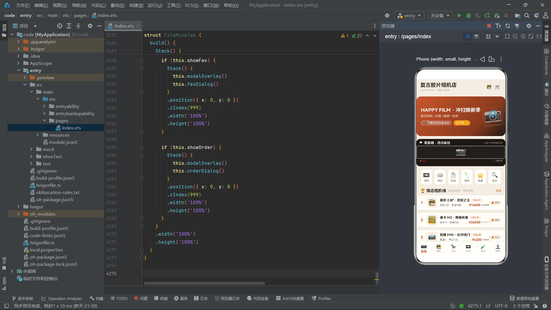
          FilmHomeTab()
        } else if (this.activeTab === 1) {
          FilmCameraTab()
        } else if (this.activeTab === 2) {
          FilmLensTab()
        } else if (this.activeTab === 3) {
          FilmFilmTab()
        } else if (this.activeTab === 4) {
          FilmDarkTab()
        } else {
          FilmMineTab()
        }
      }
      .layoutWeight(1)

      this.bottomBar()
    }
    .width('100%')
    .height('100%')
    .backgroundColor(FL.bg)
  }
}
build方法定义了页面的三段式布局:顶部标题栏、中间内容区、底部导航栏。标题栏根据activeTab的值调用headerBar并传入不同的标题文本——这种设计将标题与内容解耦,使得标题可以在不改变内容组件的情况下独立变化。内容区使用if-else条件渲染链,根据activeTab的值渲染对应的子组件:FilmHomeTab、FilmCameraTab、FilmLensTab、FilmFilmTab、FilmDarkTab、FilmMineTab。
这种条件渲染路由方式在ArkTS中是标准的Tab切换实现——当activeTab变化时,之前的组件被销毁(触发其aboutToDisappear生命周期),新的组件被创建(触发其aboutToAppear生命周期)。这意味着每个Tab页的状态是独立的,切换Tab时会重置为初始状态。如果需要保持Tab页状态,应考虑使用Stack+visibility方案或引入全局状态管理。
六、首页组件FilmHomeTab:取景器动画与模态弹窗体系
首页是用户的第一印象区,它需要在有限的空间内展示应用的核心服务入口、热门商品和促销信息。本应用的首页通过取景器扫描线动画、闪光灯闪烁效果和胶卷上新滚动列表营造出一个充满动态感的胶片摄影世界。
6.1 组件状态与定时器动画初始化
@Component
struct FilmHomeTab {
  @State showDev: boolean = false;
  @State selDev: number = 0;
  @State devCount: number = 2;
  @State devSpec: string = 'JPG 精扫';
  @State devType: string = '彩色负片';
  @State showCart: boolean = false;
  @State cartCount: number = 3;
  @State showRankTip: boolean = false;
  @State flashOn: boolean = false;
  @State scanPos: number = 0;
  @State scanDir: number = 1;
  timerId: number = -1;

  aboutToAppear(): void {
    this.timerId = setInterval(() => {
      this.flashOn = !this.flashOn;
      if (this.scanPos > 30) {
        this.scanDir = -1;
      }
      if (this.scanPos < 0) {
        this.scanDir = 1;
      }
      this.scanPos = this.scanPos + this.scanDir * 4;
    }, 160);
  }

  aboutToDisappear(): void {
    if (this.timerId >= 0) {
      clearInterval(this.timerId);
    }
  }
FilmHomeTab组件维护了11个状态变量,可分为三类:弹窗控制(showDev、showCart、showRankTip)、冲扫下单参数(selDev、devCount、devSpec、devType)、动画状态(flashOn、scanPos、scanDir)。timerId是非@State的普通属性,因为定时器ID不需要触发UI更新,所以不需要响应式追踪。
aboutToAppear生命周期钩子在组件创建时启动一个160毫秒间隔的定时器,同时驱动两个动画效果:flashOn在true和false之间切换,用于闪光灯图标和REC指示灯的闪烁;scanPos在0到30之间往返递增递减,模拟取景器扫描线的上下移动。scanDir记录当前方向(1为向下、-1为向上),通过scanPos + scanDir * 4实现每次4像素的位移。这种用setInterval驱动动画的方式在ArkTS中虽然不如属性动画API优雅,但在需要多个状态同步变化的场景下更为灵活。
aboutToDisappear生命周期钩子在组件销毁时清除定时器,防止内存泄漏。timerId >= 0的判断确保只在定时器确实存在时才调用clearInterval,避免对无效ID执行清除操作。
6.2 拍立得风格横幅Banner
  @Builder
  polaroidBanner() {
    Stack() {
      Column()
        .width('100%')
        .height(160)
        .borderRadius(18)
        .linearGradient({
          angle: 135,
          colors: [[FL.main, 0], [FL.mainDeep, 0.7], [FL.black, 1]]
        })

      Row() {
        Column() {
          Text('HAPPY FILM · 冲扫焕新季')
            .fontSize(20)
            .fontWeight(FontWeight.Bold)
            .fontColor(FL.white)
          Text('复古相机 / 胶卷 / 暗房一站式')
            .fontSize(12)
            .fontColor('#FFE8D8')
            .margin({ top: 6 })
          Row() {
            Text('📼 下单冲扫立减 ¥20')
              .fontSize(11)
              .fontColor(FL.white)
              .padding({ left: 10, right: 10, top: 4, bottom: 4 })
              .backgroundColor('#33FFFFFF')
              .borderRadius(10)
            Text('去下单 →')
              .fontSize(11)
              .fontColor(FL.white)
              .padding({ left: 10, right: 10, top: 4, bottom: 4 })
              .backgroundColor(FL.amber)
              .borderRadius(10)
              .margin({ left: 8 })
              .onClick(() => {
                this.showDev = true;
              })
          }
          .margin({ top: 10 })
        }
        .alignItems(HorizontalAlign.Start)
        .layoutWeight(1)

        Text('📸')
          .fontSize(58)
          .opacity(this.flashOn ? 1 : 0.82)
          .rotate({ angle: -6 })
          .shadow({ radius: 16, color: '#55FFFFFF', offsetY: 4 })
          .animation({ duration: 260 })
      }
      .width('100%')
      .padding({ left: 18, right: 14 })
    }
    .width('100%')
    .height(160)
    .margin({ top: 10, left: 16, right: 16 })
  }
polaroidBanner构建了一个拍立得风格的促销横幅。Stack容器中底层是一个135度渐变背景——从主品牌橙红色FL.main经过深橙FL.mainDeep过渡到近黑色FL.black,营造出复古胶片的暗角效果。上层Row分为左侧文字区和右侧相机图标区。
右侧的相机emoji图标📸有三个动态效果:opacity绑定到this.flashOn实现闪光灯闪烁效果(透明度在1和0.82之间切换)、rotate设置-6度倾斜模拟手持拍摄的角度、shadow添加白色半透明阴影增加立体感、animation设置260毫秒的过渡时长使透明度变化平滑。这些效果叠加在一起,创造出一个仿佛正在闪烁的相机闪光灯视觉。
"去下单 →"按钮的onClick事件设置this.showDev = true,触发冲扫下单弹窗的显示。这种将促销入口直接绑定到核心业务弹窗的设计,缩短了用户从浏览到下单的转化路径。
6.3 取景器扫描视图
  @Builder
  scanView() {
    Stack() {
      Column()
        .width('100%')
        .height(110)
        .borderRadius(14)
        .backgroundColor(FL.black)

      Column() {
        Row() {
          Text('🔍 取景器 · 店内实拍')
            .fontSize(13)
            .fontWeight(FontWeight.Bold)
            .fontColor(FL.white)
          Text('LIVE VIEWFINDER')
            .fontSize(9)
            .fontColor(FL.hint)
            .margin({ left: 8 })
        }
        .width('100%')
        .justifyContent(FlexAlign.SpaceBetween)
        .padding({ left: 12, right: 12, top: 8 })

        Stack() {
          Row() {
            Text('📷')
              .fontSize(34)
          }
          .width('100%')
          .height(52)
          .justifyContent(FlexAlign.Center)

          Row()
            .width(2)
            .height(14)
            .backgroundColor(FL.main)
            .opacity(this.flashOn ? 1 : 0.4)
            .translate({ y: this.scanPos })
            .animation({ duration: 200 })
        }
        .width('100%')
        .height(52)
        .backgroundColor('#22201D')
        .border({ width: 1, color: FL.line })
        .borderRadius(6)
        .margin({ top: 4 })

        Row() {
          Text('● REC')
            .fontSize(9)
            .fontColor(FL.danger)
          Text(this.flashOn ? '● 快门待命' : '○ 待机中')
            .fontSize(9)
            .fontColor(FL.hint)
            .margin({ left: 10 })
        }
        .width('100%')
        .justifyContent(FlexAlign.SpaceBetween)
        .padding({ left: 12, right: 12, top: 4 })
      }
      .width('100%')
      .height('100%')
    }
    .width('100%')
    .height(110)
    .margin({ left: 16, right: 16, top: 12 })
  }
scanView构建了一个模拟相机取景器的交互区域,这是首页最具特色的动效组件。整个区域以近黑色FL.black为背景,模拟取景器的暗色界面。内部布局分为三层:顶部标题行(取景器标题+LIVE标识)、中间取景区(Stack叠放的相机emoji和扫描线)、底部状态行(REC录制标识+快门状态)。
中间取景区的扫描线是一个2像素宽、14像素高的细长Row,其backgroundColor设为主品牌橙红色,opacity绑定到this.flashOn实现闪烁效果,translate的y偏移绑定到this.scanPos实现垂直移动。当定时器每160毫秒更新scanPos时,扫描线就会在取景区内上下移动,模拟胶片相机取景器中的测光扫描线动画。animation设置200毫秒过渡时长,使移动更加流畅。
底部状态行的"● REC"始终以danger红色显示,模拟录制中状态;"快门待命"或"待机中"文本根据flashOn状态切换,配合前面的圆点符号(●或○)传达不同的状态语义。这种用文本符号模拟设备状态指示灯的设计,在轻量应用中是既经济又有效的方案。
6.4 服务入口行与镇店相机榜
  @Builder
  catRow() {
    Row() {
      ForEach(FL_SERVICES, (sv: FlService, si: number) => {
        Column() {
          Text(sv.icon)
            .fontSize(22)
          Text(sv.name)
            .fontSize(10)
            .fontColor(FL.sub)
            .margin({ top: 4 })
        }
        .layoutWeight(1)
        .padding({ top: 10, bottom: 10 })
        .backgroundColor(FL.card)
        .border({ width: 1, color: FL.line })
        .borderRadius(12)
        .margin({ right: si < FL_SERVICES.length - 1 ? 6 : 0 })
        .onClick(() => {
          if (si === 0) {
            this.showDev = true;
          }
          if (si === 4) {
            this.showCart = true;
          }
        })
      }, (sv: FlService) => sv.key)
    }
    .width('100%')
    .padding({ left: 16, right: 16, top: 12 })
  }
catRow渲染了六个服务入口按钮,每个按钮使用layoutWeight(1)等分宽度。间距通过margin.right控制,最后一个项的右边距设为0以避免右侧出现多余间距——通过si < FL_SERVICES.length - 1 ? 6 : 0条件判断实现。onClick事件根据索引si的不同值触发不同的弹窗:si为0(冲扫服务)时显示冲扫下单弹窗,si为4(收藏服务)时显示冲扫车弹窗。这种将服务入口的行为与具体弹窗绑定的设计,使得用户可以通过首页快捷进入核心业务流程。
6.5 冲扫下单弹窗
  @Builder
  devDialog() {
    Column() {
      Row() {
        Text('📼 冲扫下单')
          .fontSize(17)
          .fontWeight(FontWeight.Bold)
          .fontColor(FL.ink)
        Column().layoutWeight(1)
        Text('✕')
          .fontSize(16)
          .fontColor(FL.hint)
          .onClick(() => {
            this.showDev = false;
          })
      }
      .width('100%')

      Text(FL_FILMS[this.selDev].name + ' · ISO ' + FL_FILMS[this.selDev].iso)
        .fontSize(13)
        .fontWeight(FontWeight.Bold)
        .fontColor(FL.main)
        .width('100%')
        .padding({ top: 12, bottom: 10 })

      Text('胶卷类型')
        .fontSize(11)
        .fontColor(FL.sub)
        .width('100%')
      Row() {
        ForEach(FL_DEV_TYPES, (tp: string, tix: number) => {
          Text(tp)
            .fontSize(11)
            .fontColor(this.devType === tp ? FL.white : FL.sub)
            .padding({ left: 10, right: 10, top: 5, bottom: 5 })
            .backgroundColor(this.devType === tp ? FL.main : FL.bg)
            .borderRadius(12)
            .margin({ right: 8 })
            .onClick(() => {
              this.devType = tp;
            })
        }, (tp: string) => tp)
      }
      .width('100%')
      .margin({ top: 6 })
devDialog是首页最复杂的弹窗组件,它集成了胶卷类型选择、冲扫规格选择、张数加减和金额计算四个交互功能。弹窗顶部显示当前选中的胶卷信息——FL_FILMS[this.selDev].name直接通过索引访问全局数据数组获取胶卷名称和ISO值。胶卷类型选择使用ForEach渲染FL_DEV_TYPES常量数组,每个选项的样式通过this.devType === tp条件判断来切换选中态和未选中态:选中时文字白色、背景主品牌色;未选中时文字副色、背景页面色。
规格选择、张数加减和金额计算遵循同样的模式。金额计算行直接在模板字符串中执行乘法运算:FL_FILMS[this.selDev].price * this.devCount,每当用户修改胶卷类型或张数时,金额会自动重新计算并更新显示。这种将业务计算嵌入UI表达式的方式在ArkTS中是合法的,因为build方法在每次状态变化时都会重新执行。
6.6 首页build方法与模态弹窗管理
  build() {
    Stack() {
      Column() {
        Scroll() {
          Column() {
            this.polaroidBanner()
            this.scanView()
            this.catRow()
            this.topList()
            this.filmNews()
            this.homeNotice()
          }
          .width('100%')
          .padding({ bottom: 20 })
        }
        .scrollable(ScrollDirection.Vertical)
        .scrollBar(BarState.Off)
        .width('100%')
      }
      .width('100%')
      .height('100%')

      if (this.showDev) {
        Stack() {
          this.modalOverlay()
          this.devDialog()
        }
        .position({ x: 0, y: 0 })
        .zIndex(999)
        .width('100%')
        .height('100%')
      }

      if (this.showCart) {
        Stack() {
          this.modalOverlay()
          this.cartDialog()
        }
        .position({ x: 0, y: 0 })
        .zIndex(999)
        .width('100%')
        .height('100%')
      }

      if (this.showRankTip) {
        Stack() {
          this.modalOverlay()
          this.rankTipDialog()
        }
        .position({ x: 0, y: 0 })
        .zIndex(999)
        .width('100%')
        .height('100%')
      }
    }
    .width('100%')
    .height('100%')
  }
}
首页的build方法使用Stack作为根容器,底层是可垂直滚动的Column内容区,上方叠加三个条件渲染的模态弹窗。每个弹窗由一个Stack包裹,内部先渲染modalOverlay(半透明遮罩层),再渲染具体的弹窗内容。zIndex(999)确保弹窗层级始终在内容之上,position({ x: 0, y: 0 })确保弹窗从页面左上角开始覆盖整个屏幕。
modalOverlay是一个简单的Column,设置backgroundColor('#AA1D1815')实现半透明遮罩效果——AA是约66%不透明度的alpha值,1D1815是基于主题黑色调的暗色。这种用Stack+条件渲染+zIndex实现模态弹窗的方式是ArkTS中的标准模式,不需要依赖系统级弹窗API,所有弹窗的样式和行为都在组件内部完全控制。
七、相机馆组件FilmCameraTab:分类筛选与CRUD弹窗
相机馆是应用中数据量最大的功能页,它展示了16台经典胶片相机,并提供了分类筛选、年代分布图表、编辑、删除和详情查看等完整的管理功能。
7.1 组件状态与动画初始化
@Component
struct FilmCameraTab {
  @State curCat: string = '全部类型';
  @State camList: FlCam[] = FL_CAMS.slice();
  @State showEdit: boolean = false;
  @State showDel: boolean = false;
  @State showInfo: boolean = false;
  @State selEditId: number = 1;
  @State editName: string = '';
  @State editYear: number = 1970;
  @State editPrice: number = 1000;
  @State editMount: string = '尼康F';
  @State editGrade: string = '95 新';
  @State spinOn: boolean = false;
  timerId: number = -1;

  aboutToAppear(): void {
    this.timerId = setInterval(() => {
      this.spinOn = !this.spinOn;
    }, 900);
  }

  aboutToDisappear(): void {
    if (this.timerId >= 0) {
      clearInterval(this.timerId);
    }
  }
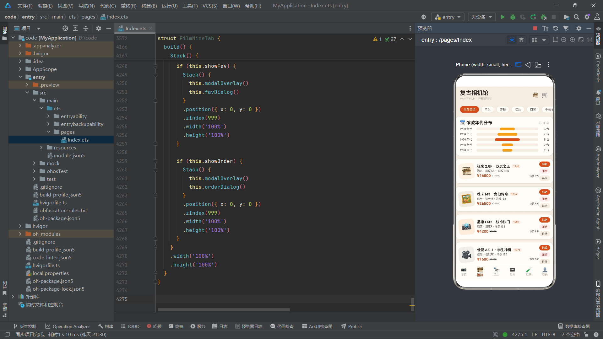
camList状态的初始化使用FL_CAMS.slice()创建了原数组的一个浅拷贝。这是一个关键的设计决策——如果不创建副本而是直接引用FL_CAMS,当用户执行删除或编辑操作时会修改全局常量数据,导致切换Tab后数据无法恢复。使用slice创建副本后,所有增删改操作只影响组件内部状态,全局常量保持不变。
spinOn状态配合900毫秒定时器,驱动相机卡片的图标旋转动画——当spinOn为true时图标旋转12度,为false时旋转-6度,创造出一个轻微摇摆的效果模拟相机悬挂展示的动态。编辑相关状态(editName、editYear、editPrice、editMount、editGrade)在点击编辑按钮时从当前相机数据填充,用户修改后通过map函数更新到camList。
7.2 分类筛选与年代分布图表
  @Builder
  catChips() {
    Row() {
      ForEach(FL_CATS, (ct: string, ci: number) => {
        Text(ct)
          .fontSize(11)
          .fontColor(this.curCat === ct ? FL.white : FL.sub)
          .padding({ left: 12, right: 12, top: 5, bottom: 5 })
          .backgroundColor(this.curCat === ct ? FL.main : FL.card)
          .border({ width: 1, color: this.curCat === ct ? FL.main : FL.line })
          .borderRadius(14)
          .margin({ right: 8 })
          .onClick(() => {
            this.curCat = ct;
          })
      }, (ct: string) => ct)
    }
    .width('100%')
    .padding({ left: 16, right: 16, top: 12 })
  }

  @Builder
  ageChart() {
    Column() {
      Row() {
        Text('📅 馆藏年代分布')
          .fontSize(16)
          .fontWeight(FontWeight.Bold)
          .fontColor(FL.ink)
        Column().layoutWeight(1)
        Text('共 ' + this.camList.length + ' 台')
          .fontSize(10)
          .fontColor(FL.hint)
      }
      .width('100%')

      ForEach(FL_AGES, (ag: FlCount, ai: number) => {
        Row() {
          Text(ag.name)
            .fontSize(10)
            .fontColor(FL.sub)
            .width(62)
          Stack() {
            Row()
              .width('100%')
              .height(10)
              .backgroundColor(FL.bg)
              .borderRadius(5)
            Row()
              .width(flBar(ag.percent))
              .height(10)
              .backgroundColor(ai === 2 ? FL.main : FL.amber)
              .borderRadius(5)
          }
          .layoutWeight(1)
          .height(10)
          Text(ag.count + ' 台')
            .fontSize(10)
            .fontColor(FL.sub)
            .width(40)
            .textAlign(TextAlign.End)
        }
        .width('100%')
        .margin({ top: 8 })
      }, (ag: FlCount) => ag.name)
    }
    .width('100%')
    .padding(14)
    .backgroundColor(FL.card)
    .border({ width: 1, color: FL.line })
    .borderRadius(14)
    .margin({ top: 12, left: 16, right: 16 })
  }
catChips渲染分类筛选标签行,每个标签的选中态通过this.curCat === ct条件判断——选中时文字白色、背景主品牌色、边框主品牌色;未选中时文字副色、背景卡片色、边框分割线色。点击事件设置this.curCat = ct,触发条件渲染重新执行,flFilterArr函数根据新的分类值重新筛选相机列表。
ageChart构建了年代分布条形图。每行由Stack叠放两层Row:底层是满宽的背景条(FL.bg色),上层是按百分比宽度填充的进度条。进度条宽度通过flBar(ag.percent)返回的百分比字符串控制,如"40%"表示填充40%宽度。颜色通过ai === 2 ? FL.main : FL.amber条件判断——索引为2的行(1970年代,数量最多)使用主品牌橙红色突出显示,其余行使用琥珀色。这种通过数据索引差异化颜色的设计,让图表的"峰值"一目了然。
7.3 相机卡片与编辑弹窗
  @Builder
  camCard(it: FlCam, ix: number) {
    Row() {
      Text(flIcon(it.id))
        .fontSize(30)
        .backgroundColor(flCamBg(ix))
        .borderRadius(12)
        .width(58)
        .height(58)
        .textAlign(TextAlign.Center)
        .rotate({ angle: this.spinOn ? 12 : -6 })
        .animation({ duration: 500 })

      Column() {
        Row() {
          Text(it.name)
            .fontSize(13)
            .fontWeight(FontWeight.Bold)
            .fontColor(FL.ink)
            .maxLines(1)
            .textOverflow({ overflow: TextOverflow.Ellipsis })
          Text(it.year + '')
            .fontSize(9)
            .fontColor(FL.main)
            .padding({ left: 6, right: 6, top: 2, bottom: 2 })
            .backgroundColor('#FFF0E6')
            .borderRadius(8)
            .margin({ left: 6 })
        }
        .width('100%')

        Row() {
          Text(it.brand + ' · ' + it.mount + ' · ' + it.type)
            .fontSize(10)
            .fontColor(FL.sub)
        }
        .width('100%')
        .margin({ top: 3 })

        Row() {
          Text('¥' + it.price)
            .fontSize(14)
            .fontWeight(FontWeight.Bold)
            .fontColor(FL.main)
          Text('¥' + it.oldPrice)
            .fontSize(9)
            .fontColor(FL.hint)
            .decoration({ type: TextDecorationType.LineThrough })
            .margin({ left: 4 })
          Column().layoutWeight(1)
          Text('热度 ' + it.hot)
            .fontSize(9)
            .fontColor(FL.sub)
        }
        .width('100%')
        .margin({ top: 4 })
      }
      .alignItems(HorizontalAlign.Start)
      .layoutWeight(1)
      .margin({ left: 10 })

      Column() {
        Text('编辑')
          .fontSize(10)
          .fontColor(FL.white)
          .padding({ left: 10, right: 10, top: 4, bottom: 4 })
          .backgroundColor(FL.main)
          .borderRadius(10)
          .onClick(() => {
            this.selEditId = it.id;
            this.editName = it.name;
            this.editYear = it.year;
            this.editPrice = it.price;
            this.editMount = it.mount;
            this.editGrade = '95 新';
            this.showEdit = true;
          })
        Text('删除')
          .fontSize(10)
          .fontColor(FL.danger)
          .padding({ left: 10, right: 10, top: 4, bottom: 4 })
          .backgroundColor('#FFEFEC')
          .borderRadius(10)
          .margin({ top: 6 })
          .onClick(() => {
            this.selEditId = it.id;
            this.showDel = true;
          })
        Text('详情')
          .fontSize(10)
          .fontColor(FL.sub)
          .padding({ left: 10, right: 10, top: 4, bottom: 4 })
          .backgroundColor(FL.bg)
          .borderRadius(10)
          .margin({ top: 6 })
          .onClick(() => {
            this.selEditId = it.id;
            this.showInfo = true;
          })
      }
    }
    .width('100%')
    .padding(10)
    .backgroundColor(FL.card)
    .border({ width: 1, color: FL.line })
    .borderRadius(14)
    .margin({ top: 10, left: 16, right: 16 })
  }
camCard是相机列表的核心卡片组件。左侧图标区域使用flIcon和flCamBg函数根据相机ID和卡片索引生成图标和背景色,rotate绑定到this.spinOn实现摇摆动画。中间信息区域展示了相机名称、年代标签、品牌卡口类型、价格与热度。名称使用maxLines(1)和textOverflow({ overflow: TextOverflow.Ellipsis })确保超长名称以省略号截断,不会破坏布局。
右侧操作区域排列了三个按钮:编辑(橙红色背景)、删除(浅红背景,danger文字色)、详情(页面色背景,副色文字)。编辑按钮的onClick事件首先从当前相机数据填充编辑状态变量——this.editName = it.name等赋值操作将相机数据"装载"到编辑表单中,然后设置this.showEdit = true显示编辑弹窗。这种"先填充后显示"的模式确保弹窗打开时表单已包含当前相机的数据。
7.4 编辑保存逻辑与不可变更新
      Text('保存修改')
        .fontSize(13)
        .fontWeight(FontWeight.Bold)
        .fontColor(FL.white)
        .width('100%')
        .textAlign(TextAlign.Center)
        .padding({ top: 10, bottom: 10 })
        .backgroundColor(FL.main)
        .borderRadius(20)
        .margin({ top: 14 })
        .onClick(() => {
          this.camList = this.camList.map((o: FlCam, oi: number) => {
            if (o.id === this.selEditId) {
              let copy: FlCam = {
                id: o.id,
                name: this.editName,
                brand: o.brand,
                mount: this.editMount,
                type: o.type,
                year: this.editYear,
                price: this.editPrice,
                oldPrice: o.oldPrice,
                hot: o.hot,
                percent: o.percent
              };
              return copy;
            }
            return o;
          });
          this.showEdit = false;
        })
编辑保存逻辑使用了map函数实现不可变更新——遍历camList数组,当找到匹配selEditId的相机时,创建一个新的FlCam对象替换原对象,其余项保持不变。这种不可变更新方式确保ArkTS的响应式系统能检测到数组的变化并触发重新渲染。如果直接修改原对象的属性(如o.name = this.editName),ArkTS可能无法检测到变化,因为@State对数组元素的属性级修改不敏感。
新创建的FlCam对象将编辑表单中的值(editName、editMount、editYear、editPrice)与原对象中不可编辑的值(brand、type、oldPrice、hot、percent)合并,确保只有可编辑字段被更新。保存完成后设置this.showEdit = false关闭弹窗。
八、镜头橱窗组件FilmLensTab:焦段图表与租借流程
镜头橱窗组件展示了10支在售镜头,提供了焦段分布图表和镜头租借功能。与相机馆的编辑/删除不同,镜头组件的核心业务流程是租借而非交易。
8.1 焦段分布图表与镜头卡片
  @Builder
  focalChart() {
    Column() {
      Row() {
        Text('🔭 焦段分布')
          .fontSize(16)
          .fontWeight(FontWeight.Bold)
          .fontColor(FL.ink)
        Column().layoutWeight(1)
        Text('共 10 支')
          .fontSize(10)
          .fontColor(FL.hint)
      }
      .width('100%')

      ForEach(FL_FOCALS, (fc: FlCount, fi: number) => {
        Row() {
          Text(fc.name)
            .fontSize(10)
            .fontColor(FL.sub)
            .width(76)
          Stack() {
            Row()
              .width('100%')
              .height(10)
              .backgroundColor(FL.bg)
              .borderRadius(5)
            Row()
              .width(flBar(fc.percent))
              .height(10)
              .backgroundColor(fi === 1 ? FL.main : FL.gray)
              .borderRadius(5)
          }
          .layoutWeight(1)
          .height(10)
          Text(fc.count + ' 支')
            .fontSize(10)
            .fontColor(FL.sub)
            .width(40)
            .textAlign(TextAlign.End)
        }
        .width('100%')
        .margin({ top: 8 })
      }, (fc: FlCount) => fc.name)
    }
    .width('100%')
    .padding(14)
    .backgroundColor(FL.card)
    .border({ width: 1, color: FL.line })
    .borderRadius(14)
    .margin({ top: 12, left: 16, right: 16 })
  }

  @Builder
  lensCard(it: FlLens, ix: number) {
    Row() {
      Column() {
        Text(it.aperture)
          .fontSize(15)
          .fontWeight(FontWeight.Bold)
          .fontColor(FL.main)
        Text(it.focal)
          .fontSize(9)
          .fontColor(FL.sub)
          .margin({ top: 2 })
      }
      .width(64)
      .height(58)
      .justifyContent(FlexAlign.Center)
      .backgroundColor('#FFF0E6')
      .borderRadius(12)

      Column() {
        Row() {
          Text(it.name)
            .fontSize(13)
            .fontWeight(FontWeight.Bold)
            .fontColor(FL.ink)
            .maxLines(1)
            .textOverflow({ overflow: TextOverflow.Ellipsis })
          Text(it.mount)
            .fontSize(9)
            .fontColor(FL.amber)
            .padding({ left: 6, right: 6, top: 2, bottom: 2 })
            .backgroundColor('#FCF3E2')
            .borderRadius(8)
            .margin({ left: 6 })
        }
        .width('100%')

        Text(it.type + ' · 二手在售')
          .fontSize(10)
          .fontColor(FL.sub)
          .width('100%')
          .margin({ top: 3 })

        Row() {
          Text('¥' + it.price)
            .fontSize(14)
            .fontWeight(FontWeight.Bold)
            .fontColor(FL.main)
          Text('¥' + it.oldPrice)
            .fontSize(9)
            .fontColor(FL.hint)
            .decoration({ type: TextDecorationType.LineThrough })
            .margin({ left: 4 })
        }
        .width('100%')
        .margin({ top: 4 })
      }
      .alignItems(HorizontalAlign.Start)
      .layoutWeight(1)
      .margin({ left: 10 })

      Column() {
        Text('租借')
          .fontSize(10)
          .fontColor(FL.white)
          .padding({ left: 12, right: 12, top: 5, bottom: 5 })
          .backgroundColor(FL.main)
          .borderRadius(11)
          .onClick(() => {
            this.selRentId = it.id;
            this.rentNum = 1;
            this.showRent = true;
          })
        Text('详情')
          .fontSize(10)
          .fontColor(FL.sub)
          .padding({ left: 12, right: 12, top: 5, bottom: 5 })
          .backgroundColor(FL.bg)
          .borderRadius(11)
          .margin({ top: 6 })
          .onClick(() => {
            this.selRentId = it.id;
            this.showInfo = true;
          })
      }
    }
    .width('100%')
    .padding(10)
    .backgroundColor(FL.card)
    .border({ width: 1, color: FL.line })
    .borderRadius(14)
    .margin({ top: 10, left: 16, right: 16 })
  }
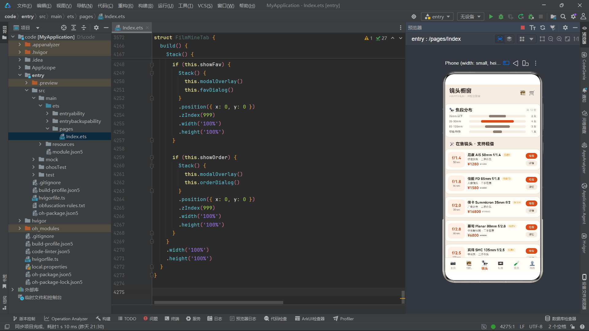
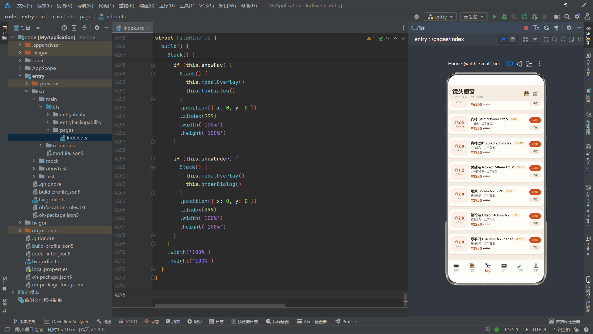
focalChart的图表结构与ageChart完全一致,区别在于数据源使用FL_FOCALS,且高亮索引为1(35-50mm焦段,4支镜头为最多)。颜色使用FL.gray(中性灰)作为非高亮色,与相机馆的FL.amber(琥珀色)形成区分,这种细微的色彩差异帮助用户在视觉上感知到不同功能页的上下文切换。
lensCard的左侧区域设计为光圈值+焦段的组合展示——大字号显示光圈值如"f/1.4"(主品牌色),小字号显示焦段如"50mm"(副色),这种设计模拟了镜头镜筒上的刻字标识。卡口标签使用琥珀色文字配浅米色背景,与镜头区域的暖色调呼应。操作区域提供"租借"和"详情"两个按钮,租借按钮的onClick事件设置选中镜头ID和重置租借数量为1,然后显示租借弹窗。
8.2 镜头详情弹窗与光圈叶片动画
  @Builder
  lensInfoDialog() {
    Column() {
      Row() {
        Text('🔭 镜头档案')
          .fontSize(17)
          .fontWeight(FontWeight.Bold)
          .fontColor(FL.ink)
        Column().layoutWeight(1)
        Text('✕')
          .fontSize(16)
          .fontColor(FL.hint)
          .onClick(() => {
            this.showInfo = false;
          })
      }
      .width('100%')

      Row() {
        Column() {
          Text('⚙️')
            .fontSize(40)
            .rotate({ angle: this.spinOn ? 180 : 0 })
            .animation({ duration: 800 })
          Text('光圈叶片演示')
            .fontSize(9)
            .fontColor(FL.hint)
            .margin({ top: 4 })
        }
        .width('100%')
        .padding({ top: 10, bottom: 10 })
        .justifyContent(FlexAlign.Center)
        .backgroundColor(FL.bg)
        .borderRadius(12)
        .margin({ top: 12 })
      }
      .width('100%')
镜头详情弹窗的特色在于光圈叶片演示动画——一个齿轮emoji图标⚙️通过rotate绑定到this.spinOn状态实现0度到180度的旋转切换,配合800毫秒的过渡动画模拟光圈叶片的开合动作。这个动画由FilmLensTab组件的800毫秒定时器驱动(与FilmCameraTab的900毫秒定时器独立),每800毫秒切换一次spinOn状态,齿轮图标就会在0度和180度之间来回旋转。
详情弹窗的其余部分通过flLensNameById、flLensFocalById、flLensApertureById、flLensMountById、flLensPriceById等工具函数获取选中镜头的详细信息,以标签-值的形式排列展示。日租金通过flLensPriceById(this.selRentId) / 7计算——镜头价格除以7天得到每日租金,这种实时计算确保了价格随镜头选择的变化自动更新。
九、胶卷超市组件FilmFilmTab:卷轴旋转动画与库存管理
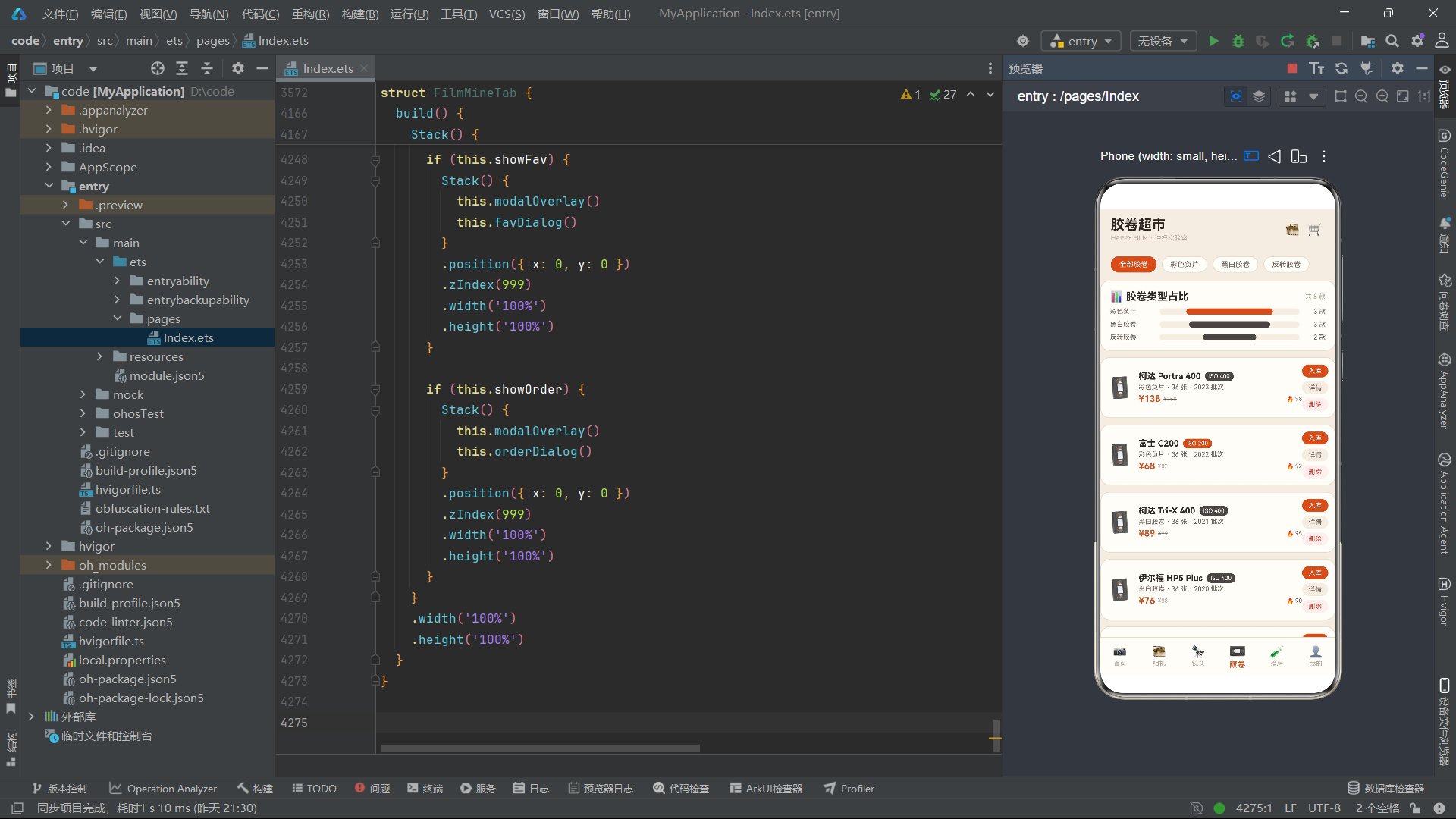
胶卷超市组件管理着8款胶卷的库存信息,提供了类型筛选、入库、详情查看和删除功能。组件的视觉亮点在于胶卷emoji图标的卷轴旋转动画。
9.1 卷轴旋转动画状态管理
@Component
struct FilmFilmTab {
  @State curFilmCat: string = '全部胶卷';
  @State filmList: FlFilm[] = FL_FILMS.slice();
  @State showAdd: boolean = false;
  @State showInfo: boolean = false;
  @State showDel: boolean = false;
  @State selAddId: number = 1;
  @State addName: string = '';
  @State addIso: string = '400';
  @State addType: string = '彩色负片';
  @State addNum: number = 1;
  @State addBatch: string = '2025 批次';
  @State reelAngle: number = 0;
  @State reelDir: number = 1;
  timerId: number = -1;

  aboutToAppear(): void {
    this.timerId = setInterval(() => {
      if (this.reelAngle > 300) {
        this.reelDir = -1;
      }
      if (this.reelAngle < 0) {
        this.reelDir = 1;
      }
      this.reelAngle = this.reelAngle + this.reelDir * 15;
    }, 120);
  }
FilmFilmTab的动画状态使用了reelAngle和reelDir两个变量来驱动胶卷卷轴的旋转。与首页的scanPos线性往返不同,reelAngle的值范围是0到300度,每次增加15度,方向反转时减少15度。这种设计模拟了胶卷卷轴在卷片时的旋转动作——每次卷片旋转一定角度,到达极限后反转。120毫秒的间隔比首页的160毫秒更快,配合15度的步进角度,创造出一个比扫描线更活跃的旋转节奏。
9.2 胶卷卡片与ISO色彩标签
  @Builder
  filmCard(it: FlFilm, ix: number) {
    Row() {
      Text('📼')
        .fontSize(30)
        .rotate({ angle: this.reelAngle })
        .animation({ duration: 120 })

      Column() {
        Row() {
          Text(it.name)
            .fontSize(13)
            .fontWeight(FontWeight.Bold)
            .fontColor(FL.ink)
            .maxLines(1)
            .textOverflow({ overflow: TextOverflow.Ellipsis })
          Text('ISO ' + it.iso)
            .fontSize(9)
            .fontColor(FL.white)
            .padding({ left: 6, right: 6, top: 2, bottom: 2 })
            .backgroundColor(flIsoColor(it.iso))
            .borderRadius(8)
            .margin({ left: 6 })
        }
        .width('100%')
filmCard的胶卷图标📼直接绑定到this.reelAngle进行旋转——rotate({ angle: this.reelAngle })使得每次定时器更新reelAngle时,所有胶卷卡片上的图标都会同步旋转。animation设置120毫秒过渡时长与定时器间隔一致,确保旋转流畅无跳跃。
ISO标签使用flIsoColor(it.iso)函数根据ISO值返回对应的背景色——ISO 400用深灰、ISO 200用橙红、ISO 100用中性灰、ISO 50用金色。这种数据驱动的色彩标签让用户可以通过颜色快速识别胶卷的感光度等级,是一种将领域知识编码进视觉设计的实践。
十、暗房实验室组件FilmDarkTab:显影进度与安全红灯模拟
暗房实验室组件是本应用最具沉浸感的功能页,它模拟了暗房中的显影进度条、安全红灯闪烁和设备热度图表,营造出一个红光摇曳的暗房氛围。
10.1 显影进度与红灯动画
@Component
struct FilmDarkTab {
  @State showBook: boolean = false;
  @State showInfo: boolean = false;
  @State selBookId: number = 1;
  @State bookDate: string = '08-25';
  @State bookSlot: string = '上午 9-12';
  @State bookDev: string = '显影罐';
  @State bookNum: number = 1;
  @State devStep: number = 0;
  @State redOn: boolean = false;
  timerId: number = -1;

  aboutToAppear(): void {
    this.timerId = setInterval(() => {
      this.redOn = !this.redOn;
      this.devStep = this.devStep + 2;
      if (this.devStep > 100) {
        this.devStep = 0;
      }
    }, 300);
  }
暗房组件的定时器以300毫秒间隔同时驱动两个动画:redOn在true和false之间切换用于安全红灯的闪烁模拟;devStep每次增加2,到达100后重置为0,模拟显影进度的循环推进。300毫秒的间隔比首页和胶卷页更慢,配合红灯的闪烁节奏,创造出暗房中特有的缓慢而沉稳的氛围感。
10.2 显影进度卡片与渐变进度条
  @Builder
  devCard() {
    Column() {
      Row() {
        Text('🧪 当前显影进度')
          .fontSize(16)
          .fontWeight(FontWeight.Bold)
          .fontColor(FL.ink)
        Column().layoutWeight(1)
        Text('LIVE')
          .fontSize(9)
          .fontColor(FL.danger)
          .opacity(this.redOn ? 1 : 0.3)
          .animation({ duration: 300 })
      }
      .width('100%')

      Row() {
        Column() {
          Text('⏱️')
            .fontSize(26)
          Text('STEP')
            .fontSize(9)
            .fontColor(FL.hint)
            .margin({ top: 2 })
        }
        .width(56)
        .height(56)
        .justifyContent(FlexAlign.Center)
        .backgroundColor(this.redOn ? '#2B2420' : '#241E1B')
        .borderRadius(12)

        Column() {
          Stack() {
            Row()
              .width('100%')
              .height(12)
              .backgroundColor('#2A241F')
              .borderRadius(6)
            Row()
              .width(flBar(this.devStep))
              .height(12)
              .linearGradient({
                angle: 90,
                colors: [['#5E8C61', 0], ['#E8A33D', 1]]
              })
              .borderRadius(6)
          }
          .width('100%')
          .height(12)

          Row() {
            Text('显影 ' + this.devStep + '%')
              .fontSize(10)
              .fontColor(FL.sub)
            Column().layoutWeight(1)
            Text('定影 · 水洗 · 晾干')
              .fontSize(10)
              .fontColor(FL.hint)
          }
          .width('100%')
          .margin({ top: 6 })
        }
        .layoutWeight(1)
        .margin({ left: 12 })
      }
      .width('100%')
      .margin({ top: 10 })

      Row() {
        Text('🔴 安全红灯')
          .fontSize(10)
          .fontColor(FL.sub)
        Column().layoutWeight(1)
        Text(this.redOn ? '● 亮' : '○ 暗')
          .fontSize(10)
          .fontColor(this.redOn ? FL.danger : FL.hint)
          .opacity(this.redOn ? 1 : 0.6)
          .animation({ duration: 300 })
      }
      .width('100%')
      .margin({ top: 8 })
    }
    .width('100%')
    .padding(14)
    .backgroundColor(FL.card)
    .border({ width: 1, color: FL.line })
    .borderRadius(14)
    .margin({ top: 12, left: 16, right: 16 })
  }
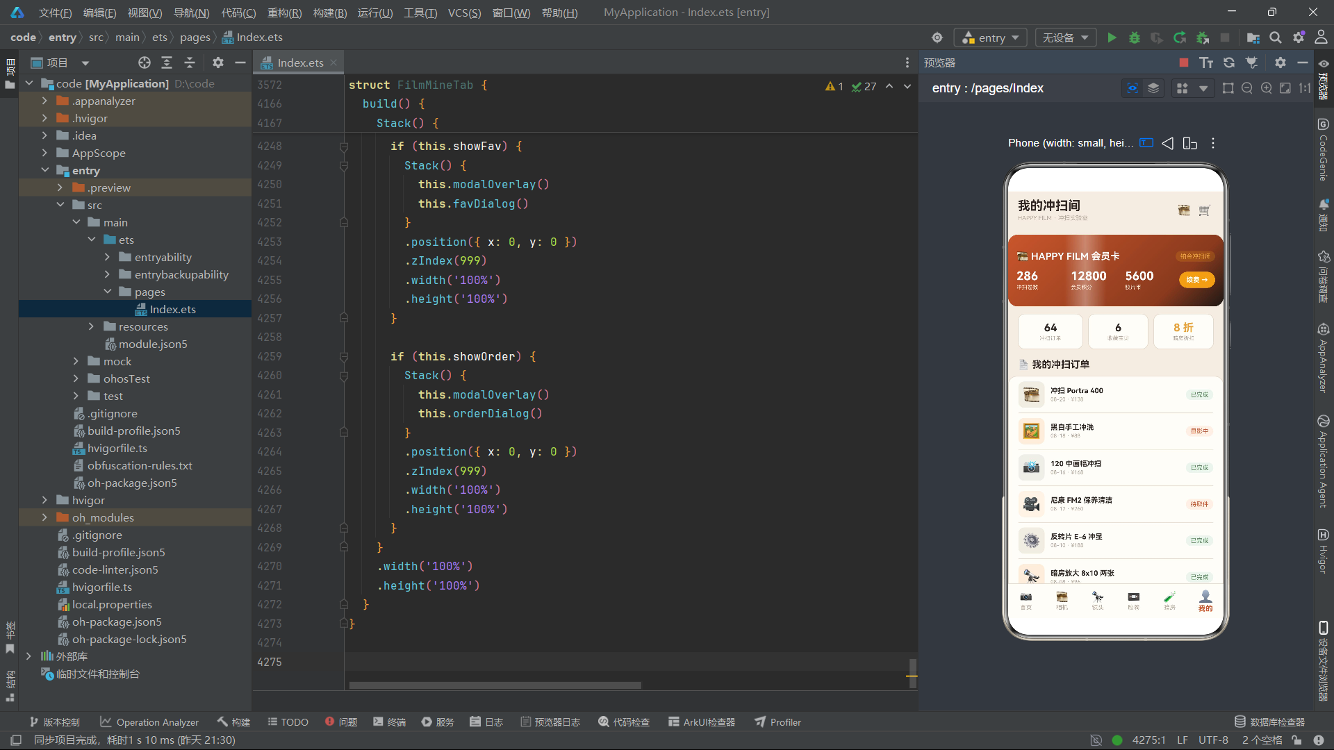
devCard是暗房页的核心视觉组件。进度条使用了90度线性渐变——从成功绿色#5E8C61到琥珀色#E8A33D,模拟显影液从清澈到呈色的色彩变化。进度条宽度通过flBar(this.devStep)绑定到devStep状态,每当定时器增加devStep值时进度条就会延伸,到达100%后重置为0循环。
左侧的STEP图标区域背景色绑定到this.redOn——当红灯亮时背景为#2B2420(略亮),暗时为#241E1B(略暗),模拟红灯照射在物体表面的微妙亮度变化。LIVE标识和安全红灯状态行都通过opacity动画实现闪烁效果,animation设置300毫秒过渡时长与定时器间隔一致。
底部的"● 亮"/"○ 暗"文本根据redOn状态切换,配合实心圆点和空心圆点符号传达红灯的亮灭状态——这种用Unicode符号模拟指示灯的设计既简洁又具有复古机械感,与暗房器材的物理指示灯形成视觉呼应。
十一、个人中心组件FilmMineTab:会员卡流光与订单管理
个人中心组件是应用的功能闭环区域,集成了会员卡展示、统计数据、订单管理、收藏管理和设置入口等功能。组件的视觉亮点是会员卡上的高光流光扫过动画。
11.1 会员卡流光动画
@Component
struct FilmMineTab {
  @State showRenew: boolean = false;
  @State showAddr: boolean = false;
  @State showFav: boolean = false;
  @State showOrder: boolean = false;
  @State term: string = '季卡';
  @State pay: string = '微信';
  @State addrName: string = '老张';
  @State addrTel: string = '138****6688';
  @State addrCity: string = '上海市';
  @State addrDetail: string = '徐汇区胶片街 8 号';
  @State favList: FlFav[] = FL_FAVS.slice();
  @State orderList: FlOrder[] = FL_ORDERS.slice();
  @State glowX: number = -120;
  @State glowDir: number = 1;
  timerId: number = -1;

  aboutToAppear(): void {
    this.timerId = setInterval(() => {
      if (this.glowX > 300) {
        this.glowDir = -1;
      }
      if (this.glowX < -120) {
        this.glowDir = 1;
      }
      this.glowX = this.glowX + this.glowDir * 12;
    }, 100);
  }
个人中心组件的流光动画使用glowX和glowDir两个变量,100毫秒的间隔配合12像素的步进,使得高光条在会员卡上以每秒120像素的速度横向移动。glowX的范围从-120到300,负值意味着高光条从会员卡左侧外部进入,正值超出会员卡宽度意味着高光条从右侧外部离开,这种"进出场"设计使流光效果更加自然。
11.2 会员卡构建
  @Builder
  vipCard() {
    Stack() {
      Column()
        .width('100%')
        .height(120)
        .borderRadius(16)
        .linearGradient({
          angle: 135,
          colors: [[FL.main, 0], [FL.mainDeep, 0.75], [FL.black, 1]]
        })

      Row()
        .width(70)
        .height('100%')
        .linearGradient({
          angle: 90,
          colors: [['#00FFFFFF', 0], ['#55FFFFFF', 0.5], ['#00FFFFFF', 1]]
        })
        .translate({ x: this.glowX })
        .animation({ duration: 150 })

      Column() {
        Row() {
          Text('🎞️ HAPPY FILM 会员卡')
            .fontSize(16)
            .fontWeight(FontWeight.Bold)
            .fontColor(FL.white)
          Column().layoutWeight(1)
          Text(FL_PROFILE.rank)
            .fontSize(10)
            .fontColor(FL.amber)
            .padding({ left: 8, right: 8, top: 3, bottom: 3 })
            .backgroundColor('#33E8A33D')
            .borderRadius(9)
        }
        .width('100%')

        Row() {
          Column() {
            Text(FL_PROFILE.rolls + '')
              .fontSize(20)
              .fontWeight(FontWeight.Bold)
              .fontColor(FL.white)
            Text('冲扫卷数')
              .fontSize(9)
              .fontColor('#FFE8D8')
              .margin({ top: 2 })
          }
          .alignItems(HorizontalAlign.Start)
          .layoutWeight(1)

          Column() {
            Text(FL_PROFILE.points + '')
              .fontSize(20)
              .fontWeight(FontWeight.Bold)
              .fontColor(FL.white)
            Text('会员积分')
              .fontSize(9)
              .fontColor('#FFE8D8')
              .margin({ top: 2 })
          }
          .alignItems(HorizontalAlign.Start)
          .layoutWeight(1)

          Column() {
            Text(FL_PROFILE.coins + '')
              .fontSize(20)
              .fontWeight(FontWeight.Bold)
              .fontColor(FL.white)
            Text('胶片币')
              .fontSize(9)
              .fontColor('#FFE8D8')
              .margin({ top: 2 })
          }
          .alignItems(HorizontalAlign.Start)
          .layoutWeight(1)

          Text('续费 →')
            .fontSize(11)
            .fontWeight(FontWeight.Bold)
            .fontColor(FL.white)
            .padding({ left: 12, right: 12, top: 7, bottom: 7 })
            .backgroundColor(FL.amber)
            .borderRadius(14)
            .onClick(() => {
              this.showRenew = true;
            })
        }
        .width('100%')
        .margin({ top: 12 })
      }
      .width('100%')
      .height('100%')
      .padding(14)
      .justifyContent(FlexAlign.Center)
    }
    .width('100%')
    .height(120)
    .margin({ top: 12, left: 16, right: 16 })
  }
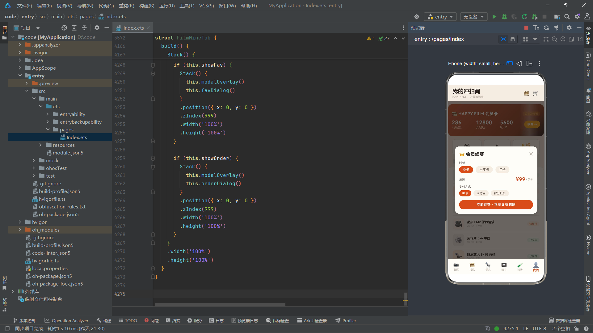
vipCard是个人中心最具视觉冲击力的组件。Stack三层结构:底层是135度渐变背景(橙红到深棕到近黑),中间是流光高光条(70像素宽的90度渐变白色半透明条),上层是会员信息内容。流光条的translate({ x: this.glowX })绑定到glowX状态,100毫秒定时器不断更新glowX值,高光条就会在会员卡上从左到右扫过,模拟信用卡或VIP卡上的镭射光泽效果。
会员信息展示了三个核心指标:冲扫卷数(286卷)、会员积分(12800点)、胶片币(5600币),数据从FL_PROFILE常量直接读取。续费按钮使用琥珀色背景,与橙红主色调形成层次区分,onClick事件触发续费弹窗显示。
11.3 订单管理与待付款删除逻辑
  @Builder
  orderCard(od: FlOrder) {
    Row() {
      Text(flIcon(od.id))
        .fontSize(24)
        .backgroundColor(flCamBg(od.id))
        .borderRadius(10)
        .width(44)
        .height(44)
        .textAlign(TextAlign.Center)

      Column() {
        Text(od.name)
          .fontSize(12)
          .fontWeight(FontWeight.Bold)
          .fontColor(FL.ink)
          .maxLines(1)
          .textOverflow({ overflow: TextOverflow.Ellipsis })
        Text(od.date + ' · ¥' + od.price)
          .fontSize(9)
          .fontColor(FL.hint)
          .margin({ top: 2 })
      }
      .alignItems(HorizontalAlign.Start)
      .layoutWeight(1)
      .margin({ left: 10 })

      Text(od.status)
        .fontSize(10)
        .fontColor(od.status === '已完成' ? FL.success : FL.main)
        .padding({ left: 8, right: 8, top: 3, bottom: 3 })
        .backgroundColor(od.status === '已完成' ? '#EDF5EE' : '#FFF0E6')
        .borderRadius(9)
        .onClick(() => {
          if (od.status === '待付款') {
            this.orderList = this.orderList.filter((o: FlOrder) => o.id !== od.id);
          }
        })
    }
    .width('100%')
    .padding({ top: 8, bottom: 8 })
    .border({ width: { bottom: 1 }, color: FL.line })
  }
orderCard的订单状态标签通过条件判断实现差异化样式:已完成状态用成功绿色文字配浅绿背景,其他状态(显影中、待取件、待付款)用主品牌橙红色文字配浅橙背景。onClick事件嵌套了业务逻辑——当且仅当订单状态为"待付款"时,点击状态标签会触发filter操作将该订单从orderList中移除。这种将删除操作绑定到状态标签的设计,是一种隐蔽但直观的交互模式:用户点击"待付款"标签本身就是一种"取消订单"的语义表达。
删除操作使用this.orderList.filter((o: FlOrder) => o.id !== od.id)创建新数组,通过不可变更新方式触发ArkTS响应式渲染。由于orderList是@State修饰的,赋值新数组后UI会自动更新,被删除的订单卡片从列表中消失。
11.4 收藏列表与移除逻辑
  @Builder
  favDialog() {
    Column() {
      Column() {
        Row() {
          Text('⭐ 收藏宝贝')
            .fontSize(17)
            .fontWeight(FontWeight.Bold)
            .fontColor(FL.ink)
          Column().layoutWeight(1)
          Text('共 ' + this.favList.length + ' 件')
            .fontSize(11)
            .fontColor(FL.sub)
          Text('✕')
            .fontSize(16)
            .fontColor(FL.hint)
            .margin({ left: 12 })
            .onClick(() => {
              this.showFav = false;
            })
        }
        .width('100%')
        .padding({ bottom: 10 })

        ForEach(this.favList, (fv: FlFav, fi: number) => {
          Row() {
            Text(flIcon(fv.id))
              .fontSize(22)
            Column() {
              Text(fv.name)
                .fontSize(12)
                .fontWeight(FontWeight.Bold)
                .fontColor(FL.ink)
                .maxLines(1)
                .textOverflow({ overflow: TextOverflow.Ellipsis })
              Text(fv.tag)
                .fontSize(9)
                .fontColor(FL.sub)
                .margin({ top: 2 })
            }
            .alignItems(HorizontalAlign.Start)
            .layoutWeight(1)
            .margin({ left: 10 })
            Text('¥' + fv.price)
              .fontSize(13)
              .fontWeight(FontWeight.Bold)
              .fontColor(FL.main)
            Text('移除')
              .fontSize(10)
              .fontColor(FL.danger)
              .margin({ left: 10 })
              .onClick(() => {
                this.favList = this.favList.filter((o: FlFav, oi: number) => oi !== fi);
              })
          }
          .width('100%')
          .padding({ top: 8, bottom: 8 })
          .border({ width: { bottom: 1 }, color: FL.line })
        }, (fv: FlFav) => fv.id + '')
      }
      .width('100%')
      .padding(16)
      .backgroundColor(FL.card)
      .borderRadius({ topLeft: 18, topRight: 18 })
    }
    .width('100%')
    .justifyContent(FlexAlign.End)
    .height('100%')
  }
收藏弹窗是一个从底部弹出的半屏弹窗——justifyContent(FlexAlign.End)使内容靠底排列,borderRadius({ topLeft: 18, topRight: 18 })只设置上方两个圆角,模拟底部弹窗的上滑出现效果。
ForEach的keyGenerator使用fv.id + ''将ID转为字符串作为唯一键。移除操作使用this.favList.filter((o: FlFav, oi: number) => oi !== fi)——这里使用索引fi而非ID来匹配要移除的项,因为收藏列表可能包含重复ID的项(虽然当前数据中没有),使用索引移除确保移除的是用户点击的那一项而非同ID的第一项。这是ForEach中索引参数的一个实用场景。
十二、应用整体架构流程图
下面的流程图展示了从应用启动到用户完成核心业务流程的全链路架构,涵盖了Tab路由、组件渲染、状态管理和弹窗体系四个维度。
十三、技术对比表
下表从多个维度对比了本应用中六个功能Tab组件的技术实现差异,帮助开发者理解不同业务场景下的架构选择。
| 对比维度 | FilmHomeTab 首页 | FilmCameraTab 相机馆 | FilmLensTab 镜头橱窗 | FilmFilmTab 胶卷超市 | FilmDarkTab 暗房实验室 | FilmMineTab 个人中心 |
|---|---|---|---|---|---|---|
| 状态变量数量 | 11个 | 12个 | 8个 | 11个 | 9个 | 14个 |
| 定时器间隔 | 160ms | 900ms | 800ms | 120ms | 300ms | 100ms |
| 动画类型 | 闪烁+扫描线 | 图标摇摆 | 光圈叶片旋转 | 卷轴旋转 | 红灯闪烁+进度推进 | 流光扫过 |
| 动画状态变量 | flashOn,scanPos,scanDir | spinOn | spinOn | reelAngle,reelDir | redOn,devStep | glowX,glowDir |
| 列表数据源 | FL_CAMS(只读) | camList(可变副本) | FL_LENS(只读) | filmList(可变副本) | FL_DARKS(只读) | orderList+favList(可变副本) |
| 筛选功能 | 无 | 分类筛选(flFilterArr) | 无 | 分类筛选(flFilterFilms) | 无 | 无 |
| 图表组件 | 无 | ageChart年代分布 | focalChart焦段分布 | typeChart类型占比 | hotChart设备热度 | 无 |
| 弹窗数量 | 3个(dev,cart,rankTip) | 3个(edit,del,info) | 2个(rent,info) | 3个(add,info,del) | 2个(book,info) | 4个(renew,addr,fav,order) |
| CRUD操作 | 无 | 编辑(map)+删除(filter) | 无 | 入库(仅UI)+删除(filter) | 无 | 删除订单(filter)+移除收藏(filter) |
| 特殊视觉元素 | 取景器扫描线+渐变Banner | 年代条形图+图标摇摆 | 光圈叶片旋转+焦段图 | ISO色彩标签+卷轴旋转 | 渐变进度条+红灯模拟 | 会员卡流光+VIP渐变 |
| ForEach数据源 | FL_SERVICES+FL_FILMS+FL_TABS | FL_CATS+FL_AGES+camList | FL_FOCALS+FL_LENS | FL_FILM_CATS+FL_TYPES+filmList | FL_HOTS+FL_DARKS | orderList+favList+FL_TERMS+FL_PAYS+FL_CITYS |
| keyGenerator | key/id | ct/name/id | fc/name/id | ct/name/id | ht/name/id | od.id/fv.id/tm/py/cy |
| 数据修改方式 | 无 | map+filter不可变 | 无 | filter不可变 | 无 | filter不可变 |
| 渐变使用 | linearGradient(135度) | 无 | 无 | 无 | linearGradient(90度进度条) | linearGradient(135度会员卡+90度流光) |
安装DevEco Studio程序
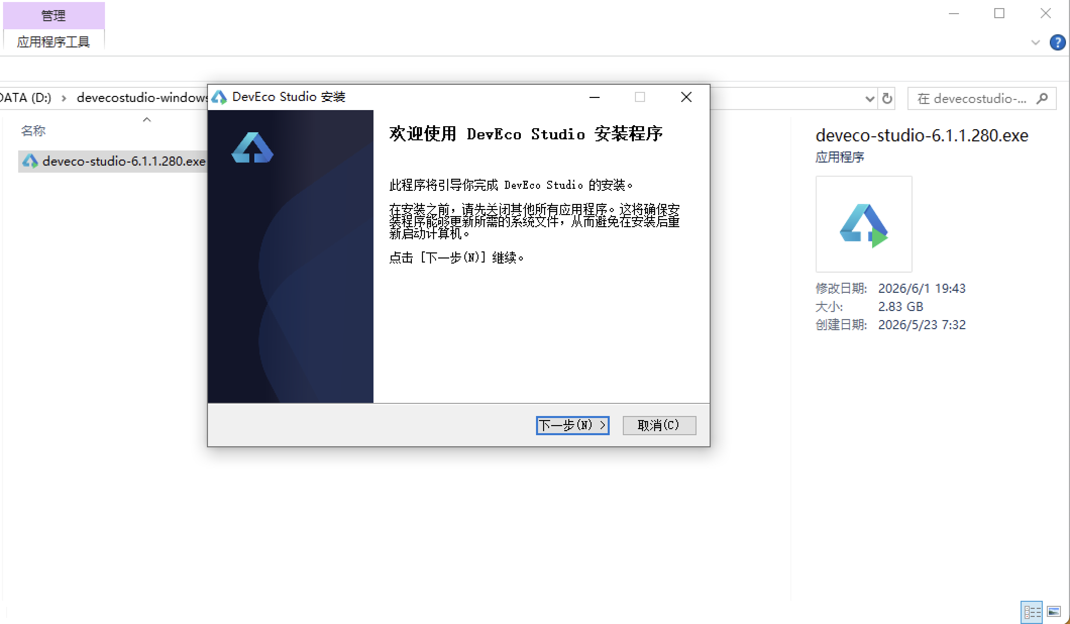
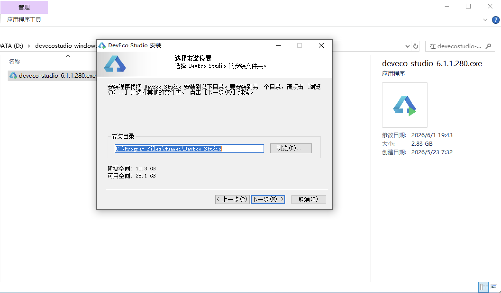
选择目标安装目录:
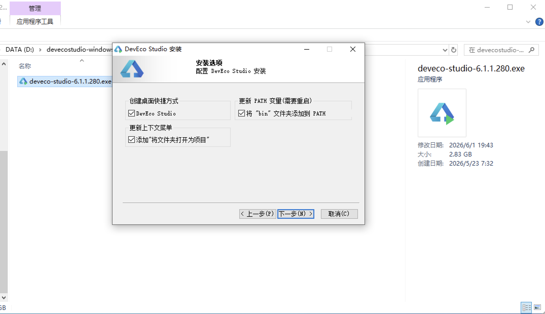
设置环境变量,但是需要重启一下:
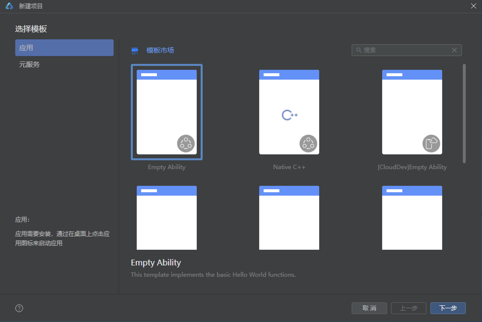
新建一个空白模板:
设置API为24的模板项目: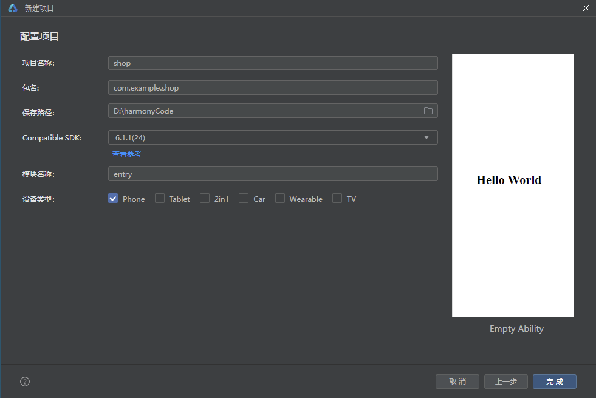
初始化项目,自动下载相关依赖:
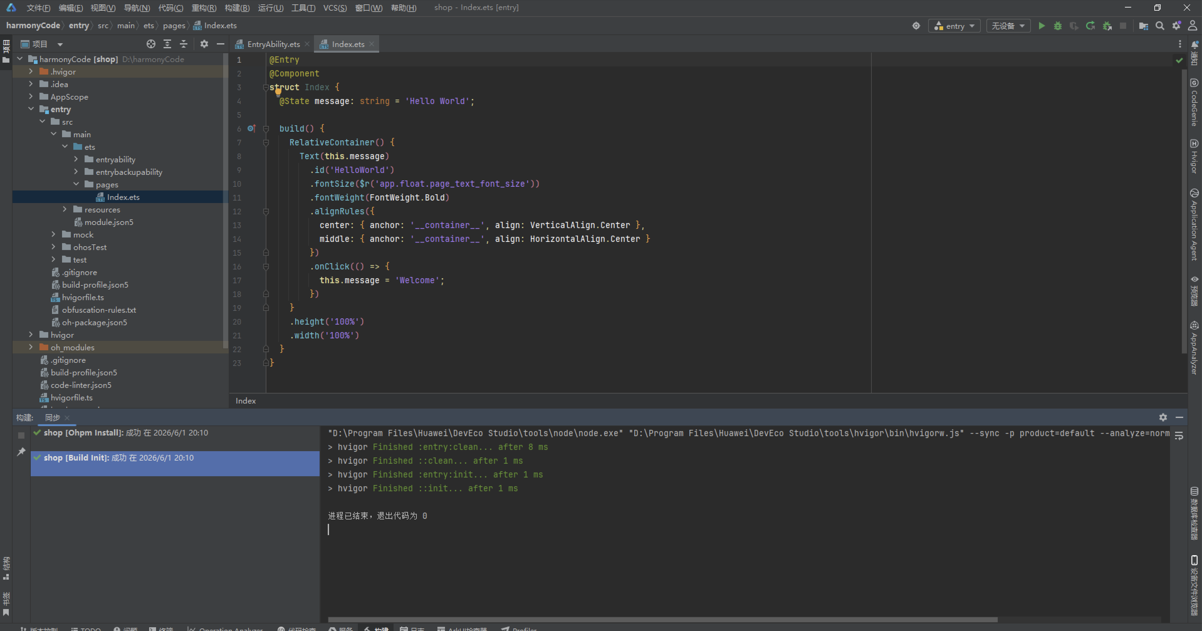
完整代码:
interface FlTab {
  key: string;
  label: string;
  icon: string;
}

interface FlCam {
  id: number;
  name: string;
  brand: string;
  mount: string;
  type: string;
  year: number;
  price: number;
  oldPrice: number;
  hot: number;
  percent: number;
}

interface FlLens {
  id: number;
  name: string;
  focal: string;
  aperture: string;
  mount: string;
  type: string;
  price: number;
  oldPrice: number;
  percent: number;
}

interface FlFilm {
  id: number;
  name: string;
  iso: number;
  type: string;
  frames: number;
  price: number;
  oldPrice: number;
  year: number;
  percent: number;
}

interface FlDark {
  id: number;
  name: string;
  spec: string;
  price: number;
  oldPrice: number;
  time: string;
  percent: number;
}

interface FlOrder {
  id: number;
  name: string;
  date: string;
  price: number;
  status: string;
}

interface FlFav {
  id: number;
  name: string;
  price: number;
  tag: string;
}

interface FlCount {
  name: string;
  count: number;
  percent: number;
}

interface FlService {
  key: string;
  name: string;
  icon: string;
}

interface FlProfile {
  nick: string;
  rank: string;
  points: number;
  rolls: number;
  orders: number;
  coins: number;
}

interface ColorPalette {
  main: string;
  mainDeep: string;
  amber: string;
  gray: string;
  bg: string;
  card: string;
  ink: string;
  sub: string;
  hint: string;
  line: string;
  danger: string;
  success: string;
  white: string;
  black: string;
}

const FL: ColorPalette = {
  main: '#C9562C',
  mainDeep: '#8A3A1D',
  amber: '#E8A33D',
  gray: '#8B7D72',
  bg: '#F4EDE3',
  card: '#FFFDF8',
  ink: '#2E2622',
  sub: '#6E625A',
  hint: '#B4A89C',
  line: '#E5DACC',
  danger: '#C0392B',
  success: '#5E8C61',
  white: '#FFFFFF',
  black: '#1D1815'
};

const FL_TABS: FlTab[] = [
  { key: 'home', label: '首页', icon: '📷' },
  { key: 'cam', label: '相机', icon: '🎞️' },
  { key: 'lens', label: '镜头', icon: '🔭' },
  { key: 'film', label: '胶卷', icon: '📼' },
  { key: 'dark', label: '暗房', icon: '🧪' },
  { key: 'mine', label: '我的', icon: '👤' }
];

const FL_SERVICES: FlService[] = [
  { key: 'dev', name: '冲扫', icon: '📼' },
  { key: 'print', name: '洗印', icon: '🖨️' },
  { key: 'copy', name: '翻拍', icon: '📄' },
  { key: 'gear', name: '器材', icon: '🔧' },
  { key: 'fav', name: '收藏', icon: '⭐' },
  { key: 'check', name: '鉴定', icon: '🔍' }
];

const FL_CAMS: FlCam[] = [
  { id: 1, name: '禄来 2.8F · 双反之王', brand: '禄来', mount: '双反120', type: '双反相机', year: 1960, price: 16800, oldPrice: 19800, hot: 999, percent: 99 },
  { id: 2, name: '徕卡 M3 · 旁轴传奇', brand: '徕卡', mount: '徕卡M', type: '旁轴135', year: 1954, price: 26500, oldPrice: 29900, hot: 986, percent: 98 },
  { id: 3, name: '尼康 FM2 · 钛帘快门', brand: '尼康', mount: '尼康F', type: '单反135', year: 1982, price: 4200, oldPrice: 5200, hot: 954, percent: 96 },
  { id: 4, name: '佳能
            })

        Stack() {
          this.modalOverlay()
          this.orderDialog()
        }
        .position({ x: 0, y: 0 })
        .zIndex(999)
        .width('100%')
        .height('100%')
      }
    }
    .width('100%')
    .height('100%')
  }
}
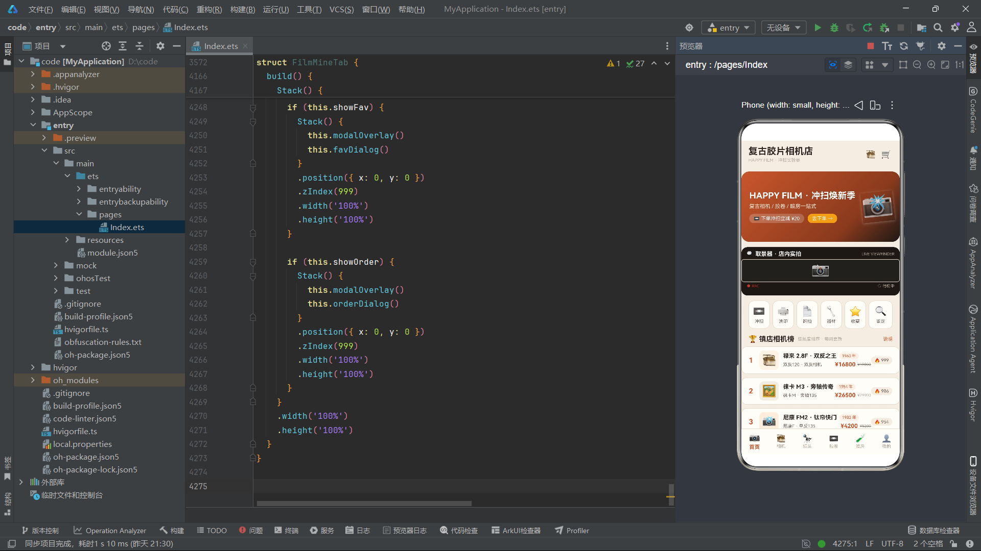
十四、总结与展望
六个功能Tab组件各自维护独立的定时器动画状态,从首页的取景器扫描线到暗房的安全红灯闪烁,每一个动画都经过精心设计以服务于特定的业务场景氛围。值得注意的是这些动画都使用setInterval驱动而非ArkTS的属性动画API,这是因为多个状态需要同步变化(如首页的flashOn同时控制闪光灯透明度、REC指示灯和快门状态文本),setInterval可以一次性更新多个@State变量,而属性动画API更适合单一属性的变化驱动。这种技术选择的背后是对动画本质的深入理解——当动画需要驱动多个语义关联的UI变化时,状态驱动的方案比属性动画更为自然。
从可维护性和可扩展性的角度审视,本应用的代码结构为后续迭代留下了充足的空间。如果需要添加新的Tab页,只需定义新的interface数据模型、创建新的@Component组件、在FL_TABS中添加一项、在build方法的条件渲染链中增加一个分支即可。如果需要引入网络数据,可以将现有的模块级常量替换为异步数据加载函数,在aboutToAppear中发起请求,将返回数据赋值给@State变量——由于所有组件都通过@State管理数据,这个迁移过程不需要改变任何UI代码。如果需要持久化用户修改(如编辑后的相机列表、删除后的胶卷库存),可以在aboutToDisappear中将状态数据序列化到本地存储,在aboutToAppear时反序列化恢复。这些扩展路径的通畅性,正是良好架构设计的有力证明。在HarmonyOS 6.1.1和ArkTS API 24的生态中,本应用的代码实践为复古主题商业应用的开发提供了一套完整而可复用的参考范式。

讨论HarmonyOS开发技术,专注于API与组件、DevEco Studio、测试、元服务和应用上架分发等。
更多推荐



 0
0 0
0- 0


 已为社区贡献8条内容

所有评论(0)